The Future of Web Dev
The Future of Web Dev
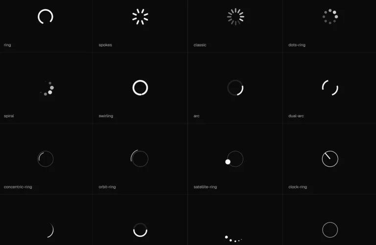
55+ Dot Matrix Loaders for React and shadcn/ui
55+ free dot matrix loaders for React, Tailwind CSS, and shadcn/ui. Install via shadcn registry and add matrix-style loading animations to your app.
Dot Matrix is a React component collection that provides 55+ dot matrix loaders built with TypeScript, Tailwind CSS, and the shadcn/ui ecosystem.
Each loader is a compact, animated indicator you install through the shadcn CLI and own as local source code.
You can use them for buttons, page transitions, async lists, and any UI state that needs a focused loading signal.
Features
- 55+ unique loader variants, each with its own dot matrix animation pattern.
- Installs through a custom shadcn registry.
- Compatible with any project that has a shadcn
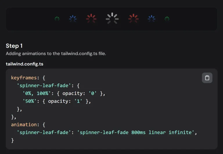
components.json. - Uses a single CSS file (
dotmatrix-loader.css) for all keyframe animations. - Exposes
sizeanddotSizeprops for quick sizing adjustments in common layouts. - Lightweight and free of extra animation libraries beyond React and CSS.
Use Cases
- Keep a profile-save button readable while a mutation remains pending.
- Show a compact activity state inside a dashboard card during a data refresh.
- Add a distinctive processing indicator beside an AI generation status.
- Use a small circular loader in command palettes, search panels, or inline filters.
- Freeze a loader for visual regression tests, empty-state artwork, or static product previews.
How To Use It
Installation
Your project needs React, Tailwind CSS, components.json, and aliases that match the shadcn CLI configuration. Initialize shadcn first when components.json does not exist.
npx shadcn@latest initAdd the Dot Matrix registry to the existing components.json file:
{
  "registries": {
    "@dotmatrix": "https://dotmatrix.zzzzshawn.cloud/r/{name}.json"
  }
}
Install a single loader:
npx shadcn@latest add @dotmatrix/dotm-square-3Install the full catalog only when the project needs several variants:
npx shadcn@latest add @dotmatrix/allAdd the shared stylesheet if the CLI does not place it in your global CSS entry:
/* app/globals.css */
@import "../components/dotmatrix-loader.css";
The relative path depends on your installed file location. Keep the stylesheet import in the global CSS file that Tailwind already loads.
Basic Usage
import { DotmSquare3 } from "@/components/ui/dotm-square-3";
export function SaveIndicator() {
  return (
    <span className="inline-flex items-center gap-2">
      <DotmSquare3
        size={18}
        dotSize={3}
        ariaLabel="Saving profile"
      />
      <span>Saving profile</span>
    </span>
  );
}
The visible status text gives the animation clear context. Keep the loader close to the control or section that triggered the pending state.
Advanced Examples
Add a loader to an async save button
"use client";
import { useState } from "react";
import { DotmSquare3 } from "@/components/ui/dotm-square-3";
type SaveProfileButtonProps = {
  onSave: () => Promise<void>;
};
export function SaveProfileButton({
  onSave,
}: SaveProfileButtonProps) {
  const [isSaving, setIsSaving] = useState(false);
  async function handleSave() {
    setIsSaving(true);
    try {
      await onSave();
    } finally {
      setIsSaving(false);
    }
  }
  return (
    <button
      type="button"
      disabled={isSaving}
      onClick={handleSave}
      className="inline-flex items-center gap-2 rounded-md border px-3 py-2"
    >
      {isSaving ? (
        <DotmSquare3
          size={18}
          dotSize={3}
          speed={1.15}
          ariaLabel="Saving profile"
        />
      ) : null}
      <span>{isSaving ? "Saving..." : "Save profile"}</span>
    </button>
  );
}
Show a pending state inside a dashboard panel
import { DotmCircular5 } from "@/components/ui/dotm-circular-5";
type ReportPanelProps = {
  isLoading: boolean;
  reportCount: number;
};
export function ReportPanel({
  isLoading,
  reportCount,
}: ReportPanelProps) {
  if (isLoading) {
    return (
      <section
        aria-busy="true"
        className="flex min-h-40 items-center justify-center"
      >
        <div className="flex items-center gap-3" role="status">
          <DotmCircular5
            size={32}
            dotSize={4}
            colorPreset="grad-ocean"
            bloom
            ariaLabel="Loading reports"
          />
          <span>Loading reports</span>
        </div>
      </section>
    );
  }
  return <p>{reportCount} reports are ready.</p>;
}
Render a static dot-matrix mark
import { DotmTriangle2 } from "@/components/ui/dotm-triangle-2";
export function StaticProcessingMark() {
  return (
    <DotmTriangle2
      size={36}
      dotSize={4}
      colorPreset="grad-neon"
      animated={false}
      ariaLabel="Processing"
    />
  );
}
Use animated={false} when the component should remain static. The installed loaders also check reduced-motion preferences before starting their motion cycle.
Available Loader Props
| Prop | Type or Values | Purpose |
|---|---|---|
size | number | Sets the main loader dimension in pixels. |
dotSize | number | Sets the individual dot size in pixels. |
color | string | Sets the base CSS color. |
colorPreset | preset name | Applies a built-in solid or gradient palette. |
speed | number | Controls animation timing. Use a positive value. |
ariaLabel | string | Supplies the loading label used by the component. |
className | string | Adds classes to the loader root element. |
dotClassName | string | Adds classes to individual dots. |
animated | boolean | Starts or stops the default animation cycle. |
hoverAnimated | boolean | Activates motion from pointer interaction. |
muted | boolean | Reduces the loader’s visual emphasis. |
bloom | boolean | Adds selective glow to brighter dots. |
halo | number | Adds a uniform glow level from 0 to 1. |
dotShape | circle, square, diamond, hearts | Changes the rendered dot shape. |
pattern | diamond, full, outline, rose, cross, rings | Chooses an active-dot mask for compatible layouts. |
opacityBase | number | Sets the resting opacity from 0 to 1. |
opacityMid | number | Sets the middle animation opacity from 0 to 1. |
opacityPeak | number | Sets the brightest animation opacity from 0 to 1. |
cellPadding | number | Sets fixed spacing between grid cells. |
boxSize | number | Sets an exact outer slot size for compatible loaders. |
minSize | number | Sets a minimum outer slot size for compatible loaders. |
The React prop is ariaLabel, not aria-label. Use camel case in JSX.
Available colorPreset values include solid-theme, solid-mint, grad-sunset, grad-ocean, grad-neon, grad-aurora, grad-fire, and grad-prism.
Available LoaderComponents
| Family | Registry Items | Count | Example Variants |
|---|---|---|---|
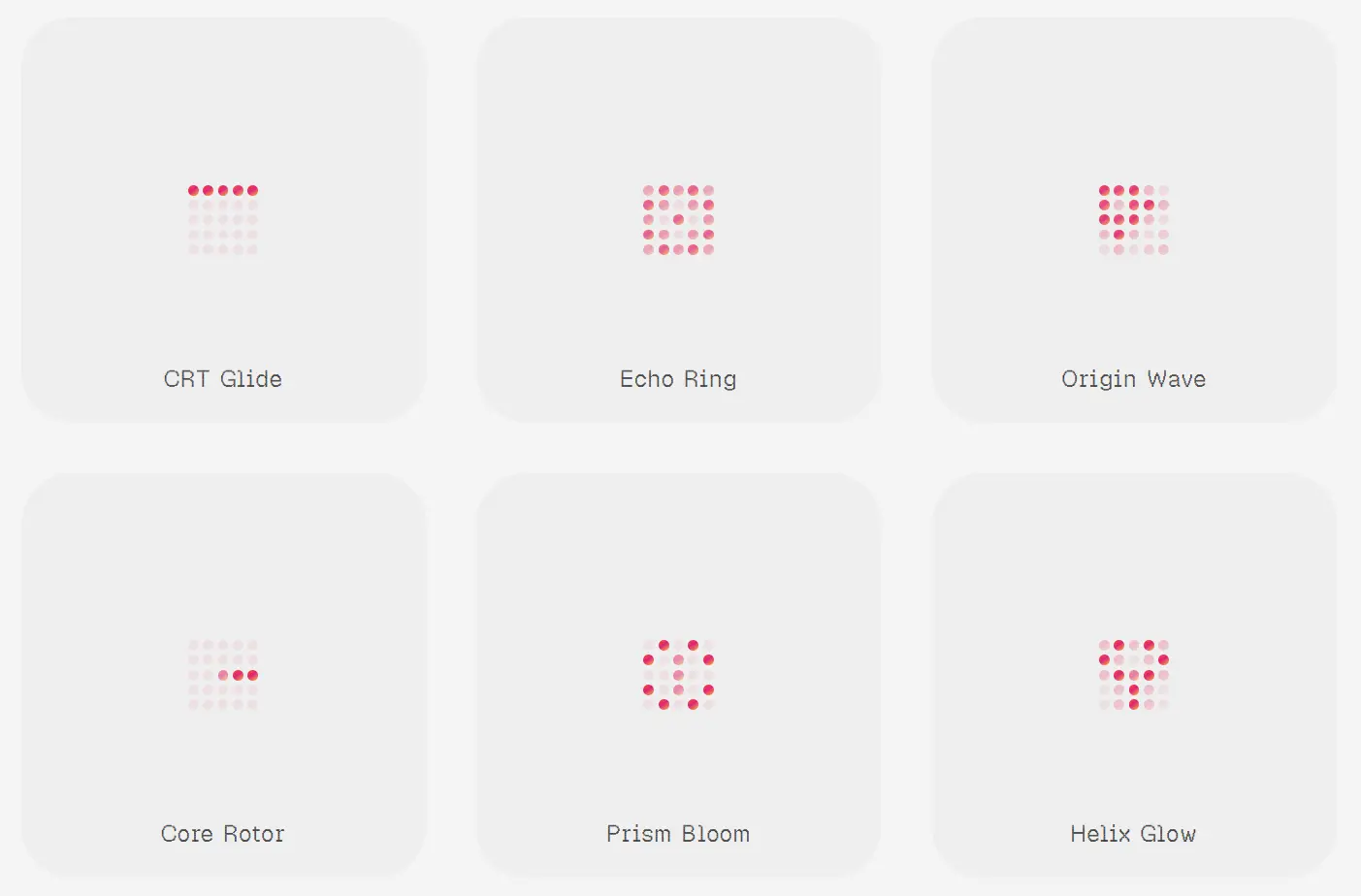
| Square matrix | dotm-square-1 through dotm-square-20 | 20 | Neon Drift, Core Spiral, CRT Glide, Sound Bars, Mobius Run. |
| Circular matrix | dotm-circular-1 through dotm-circular-20 | 20 | Halo Drift, Radar Arc, Nova Wheel, Lunar Breathe, Glyph Cycle. |
| Triangle matrix | dotm-triangle-1 through dotm-triangle-20 | 20 | Core Spokes, Altitude Wave, Row Sweep, Serpent Zip, Twin Perimeter. |
| Hex matrix | dotm-hex-1 through dotm-hex-10 | 10 | Hex Orbit, Honey Gate, Spiral Lattice, Hourglass Flip, Liquid Vortex. |
The registry slug maps to a PascalCase component export. For example, dotm-square-3 installs DotmSquare3. The @dotmatrix/all item installs every registered loader and shared runtime file.
Alternatives and Related Resources
- 36+ Copy-paste Loading Components for React
- Animated Loading Spinner Component for shadcn/ui
- Stateful Button Component for shadcn/ui Async Operations
- 10 Best React Loading Spinner and Indicator Components
FAQs
Q: Does Dot Matrix require a package installation?
A: No npm package install is required for each loader. Add the custom registry to components.json, then install a loader through the shadcn CLI.
Q: Why does the loader render but not animate?
A: Check that dotmatrix-loader.css is imported into the active global stylesheet. Also confirm that animated is not set to false and that the operating system does not request reduced motion.
Q: Does a Next.js page need "use client" to render a Dot Matrix loader?
A: Add "use client" to the component that owns state, event handlers, effects, or browser APIs. Keep static route and layout code on the server where possible.
Q: Should a loading state use a dot loader or a skeleton?
A: Use a dot loader for a local pending action such as saving, filtering, or refreshing. Use a skeleton when the page needs to preserve the expected content shape before data arrives.
Q: Which prop adds a readable status label?
A: Use ariaLabel with camel-case JSX syntax. Pair it with visible status text when the current activity is not already obvious from nearby UI.