The Future of Web Dev
The Future of Web Dev
Build Better UIs with Extended shadcn/ui Components – ExtendUI
Accelerate web development with ExtendUI's advanced component library. Built on shadcn/ui with TypeScript support and optimized performance.
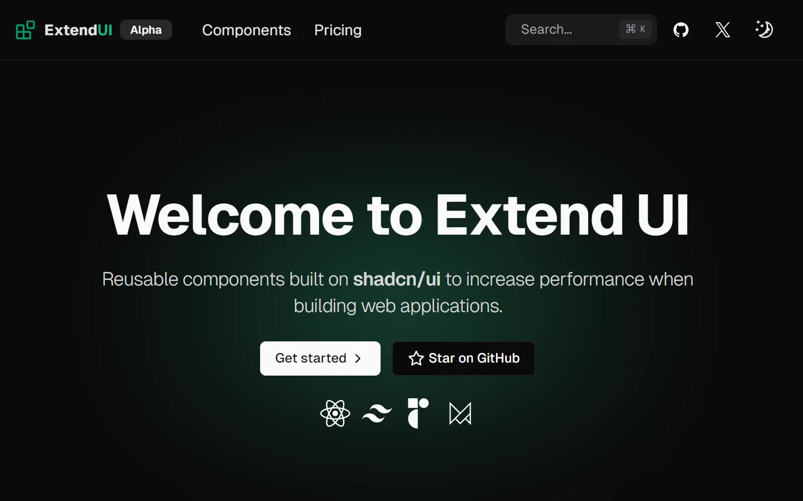
ExtendUI is a UI component library built upon shadcn/ui that provides a collection of advanced, reusable UI components to accelerate the development of modern and scalable web applications.
Features
🚀 Performance Optimized Components – Built with modern React patterns for optimal rendering performance
🔧 Easy Installation – Simple setup process with minimal configuration required
🎯 Developer-Friendly API – Intuitive component interfaces that reduce learning curve
🛠️ Customizable Styling – Flexible theming system compatible with Tailwind CSS
🔄 Regular Updates – Active maintenance with new components and improvements
🎪 Rich Component Library – Includes advanced components like steppers, file uploads, and complex forms
How To Use It
1. Create a new Next.js project with T3 stack
npm create t3-app@latest2. Configure your project settings
- Project name: Enter your desired project name
- Language: Select TypeScript
- Styling: Choose Tailwind CSS
- tRPC: Select based on your needs
- Authentication: Choose your preferred provider or none
- Database ORM: Select Prisma, Drizzle, or none
- App Router: Select Yes
- Git repository: Choose Yes to initialize
- Install dependencies: Select Yes
- Import alias: Use @/ (recommended)
3. Initialize shadcn/ui
npx shadcn@latest init4. Configure shadcn/ui settings
- Style: Select “New York”
- Base color: Choose “Zinc”
- CSS variables: Select “yes” for better customization
5. Add any available ExtendUI component to your project:
CLI
npx shadcn add https://extend-ui.com/registry/button.json
Button example usage
import { Button } from '@/components/extendui/button';<Button variant={'bouncing'} tooltipText={`I'm bouncing!`}>
Button
</Button>6. ExtendUI components accept standard React props and can be customized using Tailwind CSS classes. Each component includes TypeScript definitions for better development experience and error prevention.
Related Resources
- shadcn/ui – The foundation library that ExtendUI extends, providing base components and design system principles (https://ui.shadcn.com/)
- Tailwind CSS – Utility-first CSS framework used for styling ExtendUI components (https://tailwindcss.com/)
FAQs
Q: What is the difference between ExtendUI and shadcn/ui?
A: ExtendUI is an extension of shadcn/ui. It provides additional components that are not included in the core shadcn/ui library but follows the same design principles.
Q: Do I need to use the T3 Stack to use ExtendUI?
A: While the T3 stack is recommended for a streamlined setup, you can integrate ExtendUI into any Next.js project as long as it is properly configured with Tailwind CSS and shadcn/ui.
Q: Are ExtendUI components accessible?
A: Yes, because ExtendUI is built on shadcn/ui, which in turn is built on the accessible primitives from Radix UI, the components are designed with accessibility in mind.