The Future of Web Dev
The Future of Web Dev
Tactile React UI Component Library for Tailwind CSS – bigbullui
A React UI component library with warm paper backgrounds, perforated ticket borders, and animated controls.
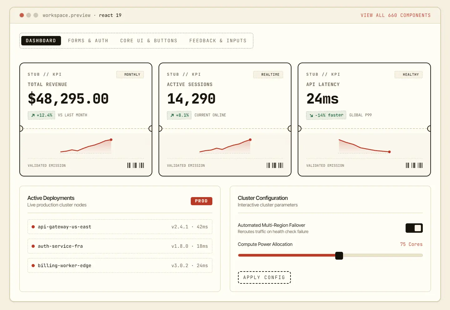
bigbullui is an open-source React UI component library with a ticket-stub design for Tailwind CSS 4 projects.
It includes 650+ UI components that help you handle everyday app UI and ticketing-specific interactions, including forms, dashboards, charts, seat maps, and boarding passes.
Features
- Paper-colored backgrounds, dashed borders, perforated ticket edges, and pressed-button motion.
- Local TSX source installed through the bigbullui CLI or individual shadcn registry entries.
- Light and dark CSS-variable themes with semantic status colors and radius tokens.
- Ready-made blocks for admin dashboards, account screens, booking flows, and marketing pages.
- Focus trapping and Escape-key dismissal in Dialog, plus reduced-motion styling in Button.
How to Install bigbullui
Add Editable Components with the CLI
Run the CLI from your Tailwind CSS 4 React project root:
npx bigbullui init
npx bigbullui add button card metric-card
Import the stylesheet after Tailwind:
@import "tailwindcss";
@import "../bigbullui.css";
Basic Usage
Import the installed source files in a React or Next.js component:
import { Button } from "@/components/ui/button";
import { MetricCard } from "@/components/ui/metric-card";
export function TicketDashboard() {
  return (
    <section className="grid gap-4">
      <MetricCard
        title="Ticket revenue"
        value="48,250"
        prefix="$"
        trend={{ value: "+14.8%", label: "vs last week" }}
        sparklineData={[24, 29, 28, 36, 35, 41, 48]}
      />
      <Button variant="outline" size="sm">View orders</Button>
    </section>
  );
}
Install through the shadcn Registry
In a project with components.json configured, install individual components or a complete page block:
npx shadcn@latest add https://ui.bigbullapp.com/r/button.json
npx shadcn@latest add https://ui.bigbullapp.com/r/admin-overview.json
Use the npm Package
npm install bigbulluiIn app/globals.css, import bigbullui’s theme and register its compiled components for class detection:
@import "tailwindcss";
@import "bigbullui/css";
@source "../node_modules/bigbullui/dist";
For src/app/globals.css, use ../../node_modules/bigbullui/dist as the @source directory.
import { Button, Card, MetricCard } from "bigbullui";Available UI Components
Form
| Component | Description |
|---|---|
| Button | Animated button with hover feedback and crisp focus. |
| Input | Text input with dashed focus border and design tokens. |
| Textarea | Multi-line text area matching Input styling. |
| Checkbox | Crisp checkbox with bold checked states. |
| Switch | Two-state toggle switch with sliding thumb. |
| Radio Group | Accessible single-select radio button set. |
| Slider | Draggable value slider with chunky thumb. |
| Select | Custom dashed listbox dropdown with keyboard navigation. |
| Stepper | Increment and decrement buttons with mono readout. |
| Pin Input | Segmented single-character boxes for codes and OTP. |
| Rating | Interactive star rating with live hover preview. |
| Copy Button | Tactile button with clipboard feedback and check state. |
| Search Bar | Dashed search field with shortcut keycap and clear action. |
| Combobox | Filterable searchable dropdown with instant keyboard filter. |
| File Dropzone | Drag-and-drop upload zone with dashed borders and file preview. |
| Color Picker | Palette swatch picker with framing and active mark. |
| Password Strength | Segmented security verification meter with animated strength bars and criteria checklist. |
| Inline Edit | Click-to-edit field with focus outline, animated save pulse, and cancel action. |
| Time Input | Curtain call showtime selector with hours, minutes, and AM/PM stepper. |
| Masked Input | Formatted code field with auto-formatted delimiters and validation mark. |
| Date Picker | Date picker input with popover calendar and quick date selection. |
| Dual Slider | Price range selector with minimum and maximum draggable handles. |
| Autocomplete | Typeahead search input with instant suggestions and keyboard select. |
| Tree Select | Hierarchical seating dropdown selector with expandable zone nodes. |
| Masked Currency | Formatted currency price input with prefix badge and numeric mask. |
| Segmented Switch | Mechanical multi-option lever switch with smooth slide carriage. |
| Signature Pad | Interactive canvas endorsement pad with clear action and receipt stamp. |
| Tag Input | Tag input with pill chip badges, remove buttons, backspace deletion, and dashed container. |
| Calendar | Month calendar with date selection, month navigation, and today indicator. |
| File Upload List | Multi-file upload queue with progress, file badges, and cancel, retry, or remove actions. |
| Toggle Group | Single-choice segmented control with roving tabindex. |
| Dropdown Menu | Popup actions menu with keyboard shortcuts and items. |
| Label | Form label with mono uppercase styling and an animated stamp-red asterisk when required. |
| Form Field | Field wrapper with label, control, description, and error message with a shake-in animation on error. |
| Field | Composable field primitives: Field, FieldLabel, FieldControl, FieldDescription, FieldError, FieldGroup, FieldSet. |
| Toggle | Two-state button with aria-pressed, springy press animation, and default/outline/accent variants. |
| Multi Select | Trigger + popover picker with search input, checkbox options, and animated removable selection chips. |
| Input Group | Input with prefix icon slot, suffix slot, and inner action button; dashed focus ring and animated underline sweep. |
| Button Group | Joins buttons with rounded outer corners, internal separators, and sliding hover highlight. |
| Loading Button | Button with loading spinner swap, width locking to avoid jumps, and a brief success check-mark stamp. |
| Checkbox Group | Checkbox options with a select-all row (indeterminate state), animated check fills, and staggered entrance. |
| Dropdown Menu V2 | V2 dropdown menu: nested submenus, checkbox items, radio groups, separators, danger items, and shortcut kbd hints. |
| Fab | Floating action button fixed in corner with hover growth, ripple press, and tooltip label on hover. |
| Size Picker | Size chip picker with out-of-stock strikes and stock dots. |
| Variant Picker | Color swatch and size variant picker with animated selection. |
| Wishlist Button | Heart wishlist button with pop fill and floating burst. |
| Add To Cart Button | Add-to-cart button with flying dot arc and check stamp. |
| LikeButton | Heart/thumb button that fills on click with burst particle animation and count increment. |
| EmojiPicker | Panel with category tabs (Smileys, Gestures, Hearts, Objects), search filter, and emoji grid with selection callback. |
| CopyChip | Small mono chip that copies to clipboard with check morph and ‘COPIED’ feedback |
| PhoneInput | Phone number input with country code selector and formatted display |
| EmailInput | Email input with live validation and typo domain suggestions |
| DateRangePicker | Two-month mini calendar grid for selecting start and end dates with nights count |
| MonthPicker | 12-month grid for selecting a month with year navigation |
| YearPicker | Year grid with page navigation for selecting a year |
| TimeRangePicker | Two time inputs with duration readout that animates on change |
| ClockPicker | Analog clock with draggable hands for time selection |
| HotkeyRecorder | Record keyboard hotkey combinations with visual chip display |
| FileInput | Styled file input with drop chips and selection count animation |
| SliderTicks | Slider with tick marks, labels, and snap-to-ticks functionality |
| Image Crop | Canvas-based image cropping with draggable crop rect, rule-of-thirds grid, resize handles, and dataURL output. |
| Hooks | SSR-safe React hooks: media query, localStorage, intersection, click-outside, copy, hotkey, and debounce. |
| Focus Trap | Pure TypeScript focus trapping helpers for accessible overlays: getFocusable and trapFocus. |
| Login Form | Login form with live validation, show/hide password, remember me and social buttons. |
| Register Form | Registration form with name, email, animated password strength and terms consent. |
| Forgot Password | Password reset flow: email input transitions to animated sent confirmation. |
| Otp Verify | 6-digit OTP verification with auto-advance, paste support and resend countdown. |
| Two Factor | 2FA setup panel with animated QR scan line, recovery codes and copy action. |
| Form Progress | Form completion progress with segmented dashed bars. |
| Stepper V2 | Vertical/horizontal stepper v2 with descriptions and done states. |
| Search Filter Bar | Combined search, sort and filter toolbar with animated chips. |
| Avatar Upload | Avatar upload circle with hover camera overlay and preview. |
| Shipping Options | Shipping option radio cards with carrier, duration and price. |
| Payment Methods | Payment method selector with card, bank, cash, wallet icons. |
| Credit Card Form | Credit card form with live number formatting and expiry mask. |
| Installment Picker | Installment plan picker: months, monthly amount, total. |
| Coupon Field | Coupon code field with validation, success check and shake error. |
| Checkbox Card | Card-style checkbox with title, description and check pop. |
| Radio Tile | Radio tile with icon, description and sliding dot. |
| Switch Card | Switch card combining title, description and toggle. |
| Field Array | Dynamic form rows: add, remove, move up/down. |
| Textarea Autosize | Auto-growing textarea with min/max height bounds. |
| Char Counter | Character counter with near-limit and over-limit states. |
| Password Input | Password input with animated show/hide eye toggle. |
| Consent Checkbox | GDPR/KVKK consent checkbox with link and required marker. |
| Address Form | Address form grid: street, city, district, postal, country. |
| Currency Select | Currency select dropdown with symbols and codes. |
| Country Select | Country select with flag emojis and codes. |
| Duration Input | Duration input: hour/minute/second steppers. |
| Serial Input | Serial number input: grouped boxes, auto-advance, paste support. |
| Radio Cards | Rich selectable radio cards with prices, perks and active ticket border. |
| Split Button | Dual-action button with primary click trigger and dropdown secondary actions. |
| Combobox V2 | Async searchable combobox with debounced loading and infinite scroll. |
| Select V2 | Grouped select with sticky headers and disabled options. |
| Input OTP | Six-box one-time code with paste split and autocomplete. |
| Form Validation | Schema-less validation hooks with rules and helpers. |
| Language Select | Language picker with native names and codes. |
| Timezone Select | IANA timezone picker with live UTC offsets. |
| Number Input | Stepped numeric input with locale grouping and currency. |
| Search Command | Inline search field with keyboard-navigated result panel. |
| Slider Range Label | Dual-handle range slider with live min/max labels. |
| File Image Preview | Image dropzone with thumbnail grid and remove. |
| Input Mask Phone | Country-aware phone mask with completion counter. |
| Date Time Picker | Combined date and time picker with live preview. |
| Range Calendar | Month grid with range highlight and night counter. |
| Inline Multiselect | Chips flow inside the input with backspace delete. |
| Signature Line | Printable signature line with typed name. |
| Stamp Field | Approval stamp box with name, date and seal. |
| Credit Card Input | Smart card input with brand detect and grouping. |
| Activity Calendar | GitHub-style contribution heatmap grid. |
| Smart Search Bar | Shortcut search bar with filter and history. |
| Star Rating Input | Hoverable five-star rating field with readout. |
| Color Palette Picker | Preset palette swatches with hex readout. |
| Pricing Slider | Seat slider with live tier cost math. |
| Virtual Card Flipper | 3D flipping bank card with CVC back. |
| Split Bill Calculator | Bill splitter with tip and per-person math. |
| Recent Searches | History list with clear action. |
| Trending Chips | Hot chip row with active stamp. |
| Saved Searches | Named queries with run and delete. |
| Mini Month | Compact calendar with today ring. |
| Passkey Button | Passwordless sign in trigger. |
| Magic Link | Email field with sent confirmation. |
| Sso Row | Provider buttons with or divider. |
| Devices List | Session rows with revoke action. |
| Delete Account | Two-step typed confirmation zone. |
| Onboarding Checklist | Stampable steps with progress rail. |
| Invite Team | Email plus role picker with log. |
| Sample Data | Demo seed loader with state stamp. |
| Otp V2 | Segmented OTP with paste fill. |
| Newsletter Box | Email capture with success stamp. |
| Theme Preset Picker | Swatch preset cards. |
| Form Builder | Add rename remove fields. |
| Conditional Fields | Inputs by ticket type. |
| Nps Survey | Zero to ten score buttons. |
| Bug Report | Mini filing form with severity. |
Display
| Component | Description |
|---|---|
| Mention Input | Mention input with instant @ autocomplete popover. |
| Transfer List | Two-column transfer list between available and claimed items. |
| Theme Toggle | Theme switcher with day and night flip animation. |
| Seat Map | Interactive arena seating chart matrix grid with row letters, seat numbers, tier types, and price calculator. |
| Keypad | Numeric PIN keypad with tactile mechanical keys, visual pulse, and masked PIN display. |
| Ticket Card | Complete admission ticket with notched edges and seat details. |
| Coupon | Discount coupon with scissor cutout lines and promo code copy. |
| Boarding Pass | Flight pass with origin, destination and receipt section. |
| Price Tag | Price tag with eyelet string hole and sale mark. |
| Luggage Tag | Baggage claim tag with handle loop and destination code. |
| Barcode | Dynamic SVG barcode with mono serial readout. |
| Stamp Seal | Rotated rubber stamp badge with double dashed circular ring. |
| Card | Double-frame surface container with header, content, and footer. |
| Avatar | Initials or photo badge with dashed ring. |
| Star | Current-color star glyph for ratings and counts. |
| Table | Data table with dashed row dividers and mono headers. |
| Marquee | Smooth ticker reel that pauses on hover. |
| Timeline | Vertical chronological events with dashed connection stem. |
| Sparkline | Lightweight SVG trend sparkline with animated end-point. |
| Bar Chart | Mini data bar chart with dashed guideline grids and hover zoom. |
| Data Table | Sortable, searchable data table with row selection and pagination. |
| Video Frame | Cinema screening container with sprocket edges and play overlay. |
| Audio Mini | Compact audio player with animated equalizer bars and duration counter. |
| Lightbox | Fullscreen media viewer with film frame edges and image paging. |
| Stack | Stacked container with staggered angles and hover fan-out. |
| Container | Centered layout wrapper with notch cutouts. |
| Kanban Lite | Queue and stage progression board with notch cards. |
| Gantt Lite | Interactive festival and stage timetable schedule with animated now indicator. |
| Stopwatch | Precision timer with lap tear-offs and digital readout. |
| Countup | Mechanical turnstile odometer counter with animated tally and slot frames. |
| NFC Badge | Contactless gate pass tap simulator with animated radio wave ripple pulse, status badge, lanyard notch, and admission chime. |
| QR Reader | Turnstile simulated camera QR and barcode scanner viewfinder with animated laser sweep and targeting reticle. |
| Audio Waveform | Interactive multi-bar audio wave visualizer for concert recordings with live animated frequency bars and timestamp readout. |
| Ticket Fold | 3D accordion fold pass that unfolds with smooth perspective rotation and tear-away slip. |
| Split Flap | Mechanical departure board with flipping characters and retro terminal styling. |
| Watermark | Repeating watermark pattern with security angle. |
| Turnstile Gate | Mechanical rotor barrier with pass counter, status LED, and push animation. |
| Collapsible | Standalone expandable disclosure card with notch header, animated height reveal and status mark. |
| Aspect Ratio | Proportional media container with preset ratios, framed border, and corner guides. |
| Pricing Table | 3-tier matrix with billing switcher, highlighted plan and feature checklist. |
| Metric Card | Dashboard KPI card with value, trend delta and period label. |
| Code Block | Code snippet block with filename tab, language badge and copy button. |
| Activity Feed | Activity timeline with avatars, action badges, and relative timestamps. |
| Credit Card | Payment card preview with card-brand detection and a 3D flip to reveal the CVV. |
| Empty | Perforated placeholder box for zero-state views. |
| Donut Chart | Interactive SVG donut and pie chart with segment hover highlight, tooltips, center total readout, and custom color legend. |
| Accordion | Collapsible disclosure items with smooth height transitions. |
| Countdown | Live ticking event timer with segmented cards. |
| Carousel | Sliding track carousel with prev/next arrows, dot indicators, keyboard arrows, and optional autoplay. |
| Avatar Group | Overlapping avatar stack with +N overflow chip that fans out on hover. |
| Item | Generic row surface with leading media, title, description, and trailing actions; hover lift with accent bar slide-in. |
| Listbox | Single/multi selectable list with keyboard navigation, ARIA roles, and check marks that slide in. |
| List | List with dashed, numbered and icon variants plus staggered item entrances and List/ListItem composition. |
| Quote | Blockquote with dashed left frame, stamp entrance and mono uppercase cite line. |
| Figure | Framed media figure with double-frame surface and delayed figcaption fade-in. |
| DescriptionList | Term/description pairs with mono uppercase terms, muted descriptions and staggered row entrances. |
| MediaObject | Horizontal media plus content row with title, description, meta chips and hover lift. |
| LinkCard | Whole-card link with sliding arrow, darkening border on hover and fade-up entrance. |
| LogoCloud | Grid or marquee row of monogram logo tiles in dashed frames with hover reveal. |
| Faq | Self-contained accordion Q&A with one-open behavior, grid-rows height reveal and rotating plus icon. |
| Testimonial | Quote card with initials avatar, name, role and staggered star rating pop-in. |
| TeamGrid | Grid of member cards with initials avatars, roles, optional links and staggered hover-lift entrances. |
| FeatureGrid | Feature tiles with icon slot, stamp-on-hover icons, darkening borders and staggered entrance. |
| Line Chart | Multi-series line chart with stroke-dasharray animation and hover tooltips |
| Area Chart | Filled area chart with gradient fills and hover highlights |
| Stacked Bar Chart | Horizontal stacked bars with segmented rows and legend chips |
| Gauge | Half-donut SVG gauge with needle animation and value readout |
| Radar Chart | Spider web chart with polygon axes and data polygon animation |
| Heatmap | Grid of colored cells showing value intensities with diagonal stagger |
| Calendar Heatmap | GitHub-style Git calendar heatmap grid |
| Funnel Chart | Horizontal funnel stages showing conversion percentages between steps |
| Scatter Plot | SVG scatter plot with dashed axes and hover enlargements |
| Waterfall Chart | Floating bars showing incremental changes with connecting guides |
| Candlestick Chart | OHLC candlestick chart for financial data visualization |
| Leaderboard | Ranked leaderboard with medal tiles for top 3 and count-up scores |
| Scoreboard | Two-team score card with rolling digit animation |
| JSON Viewer | Collapsible JSON tree with mono keys and color-typed values |
| Diff Viewer | Unified diff viewer showing added/removed/context lines |
| Terminal | Fake terminal card with sequential line reveal and blinking cursor |
| Log Viewer | Scrolling log stream with level badges and filter chips |
| Treemap Chart | Squarified treemap with recursive rectangles and staggered labels |
| Spotlight | Full-viewport dim overlay with cutout hole positioned via target ref/bounding box; pulse ring around target; caption card. |
| ImageCompare | Before/after slider with clip-path inset controlled by draggable divider; BEFORE/AFTER labels. |
| ZoomImage | Image with hover magnifier lens tracking cursor; framed double border. |
| VirtualList | Windowed list for fixed-height rows: scrollTop math, visible slice renders, spacer divs; smooth scroll. |
| Reveal | IntersectionObserver: children animate in when entering viewport with fade-up/scale variants, delay prop, once re-trigger option. |
| Product Card | Product card with image slot, price, discount badge and wishlist heart. |
| User Card | Profile card with avatar, role, meta chips and action slot. |
| Article Card | Blog article card with category badge, excerpt and author meta. |
| Event Card | Event card with perforated date block, venue and time chips. |
| Invoice | Invoice layout with line items, tax breakdown and stamped total. |
| Receipt | Thermal receipt with zigzag tear edge, mono lines and barcode footer. |
| Checkout Summary | Cart summary with quantity steppers, tax row and checkout CTA. |
| Order Card | Order status card with step dots and item summary. |
| Stamp Card | Loyalty punch card with stamped circles and reward row. |
| Gift Card | Gift card with ribbon stripe, amount and balance bar. |
| Id Card | Employee ID card with hologram shine sweep and barcode. |
| Rsvp Card | Invitation RSVP card with attending toggle and wax stamp. |
| ChatWindow | Full chat panel with message list, input bar, and typing indicator slot. |
| ChatBubble | Single message bubble with tail, status ticks, and hover press feedback. |
| TypingIndicator | Three bouncing dots with user name label indicating who is typing. |
| CommentThread | Nested comments with avatars, collapse/reply actions, and dashed indent guides. |
| ReactionBar | Emoji buttons with counts, active reaction pops, and hover tooltips. |
| ShareMenu | Platform icon row (X, Facebook, LinkedIn, Link) with copy link feedback and stamp stamp. |
| StoryViewer | Circular story ring with progress animation, avatar names, and tap zones for prev/next. |
| PostCard | Social post with header, body, gradient media placeholder, and action row with like/comment/share counts. |
| FollowerList | Rows with avatars, names, handles, and Follow buttons that morph between states. |
| VoiceMessage | Chat audio bubble with play/pause button and animated waveform bars showing audio duration. |
| AudioPlayer | Full deck audio player with play/pause morph button, seek bar, time readout, volume slider, and track info |
| VideoPlayer | Video frame with sprocket styling, hover fade-in controls, progress bar with scrub preview |
| Playlist | Track rows with equalizer bars for active track, title/artist, duration, and slide-in marker |
| VolumeSlider | Vertical or horizontal slider with fill animation, mute toggle, and ARIA roles |
| PodcastPlayer | Episode card with art slot, play button, speed selector chips, skip buttons, and chapter ticks |
| VideoThumbnail | Poster frame with duration badge, play overlay circle that scales on hover with ripple ring, and title strip |
| MediaControls | Compact transport bar with prev/play/next/stop buttons, progress micro-bar, and time display |
| TimeAgo | Relative time display showing ‘5 MIN AGO’ with live re-render tick every 30s |
| LiveClock | Digital clock showing HH:MM:SS with optional timezone and variant support |
| Typewriter | Types text char-by-char with blinking block cursor, loops through phrases |
| HighlightText | Highlights query matches inside text with accent background and animated reveal |
| Truncate | Single/multi-line clamp with optional expand toggle (MORE/LESS) |
| TextDiff | Word-level diff showing added/removed words with animation |
| CurrencyDisplay | Formatted money with symbol, mono integer part, smaller muted decimals, optional count-up animation |
| ReceiptPrinter | Thermal printer that feeds mono receipt lines out of a printer slot with a stepped paper animation. |
| QueueTicket | Take-a-number queue ticket with a big tear-off number tab, NOW SERVING ring and queue stats. |
| NowServing | Split-flap style NOW SERVING board whose digits flip on value change with a blinking chime dot. |
| Passport | Double-frame passport cover with monogram, holder fields and staggered visa stamp marks. |
| WaxSeal | Circular wax blob with a pressed-in monogram entrance and an optional cracked break state. |
| Envelope | Envelope whose flap opens with a 3D rotateX and the letter inside rises, on hover or via an open prop. |
| AirmailLetter | Airmail bordered letter with red/blue diagonal stripes, mono lines, a postmark corner and an unfold entrance. |
| Postmark | Circular postal cancellation stamp with wavy lines, city and date arcs that stamps in on mount. |
| CassetteTape | Cassette with two spinning reels, shifting tape amounts and a handwritten-style label with play toggle. |
| VinylRecord | Spinning vinyl with radial grooves, center label, a tonearm that slides in and a wobble on drop. |
| FlipClock | Mechanical split-flap HH:MM clock whose digit cards flip on change with a blinking colon. |
| NeonSign | Neon sign with layered glow text-shadow, flicker-in entrance and a subtle per-letter buzz. |
| MarqueeBulbs | Marquee board framed by chase-blinking bulbs with scrolling center text. |
| BackstagePass | Laminated ALL ACCESS pass with lanyard hole, rotated stripe strip, shine sweep on hover and fake barcode. |
| Wristband | Festival wristband with patterned repeating stripes, snap closure, serial and a subtle breathing animation. |
| Lanyard | Strap with clip that sways gently from the top and holds an attached card slot for children. |
| TicketStubV2 | Rip-off event stub whose tear line detaches the stub with rotate-and-fall on tear, plus serial and barcode. |
| QR Code | Generates QR codes with Reed-Solomon error correction, mask evaluation, and finder patterns. Includes encodeQrMatrix helper. |
| Rich Text Editor | Minimal contentEditable editor with toolbar (bold, italic, underline, lists, links, quote, code) and word/char counter. |
| Sankey Chart | Two-level flow diagram with bezier ribbons, value-based width, hover tooltips, and entrance animations. |
| Org Chart | Hierarchical tree of boxes with connector lines, expand/collapse nodes, avatar initials, and entrance animations. |
| Use Ticket Audio | SSR-safe WebAudio helper for stamp/punch feedback sounds: lazy AudioContext, volume control, and reduced-motion guard. |
| Tilt Card | 3D cursor-tracking tilt card with springy reset and glare highlight. |
| Flip Card | Two-face card with rotateY flip animation, hover or click trigger. |
| Spotlight Card | Card with cursor-following radial spotlight glow. |
| Drag Sort | HTML5 drag-and-drop reorderable list with grab handles and drop indicators. |
| Session List | Active session manager: device icons, location, revoke buttons. |
| Api Key Card | API key card with masked value, reveal toggle, copy and regenerate actions. |
| Permissions Matrix | Role � permission checkbox matrix with animated check pops. |
| Audit Log | Audit trail with actor avatars, color-coded action badges and timestamps. |
| Stats Overview | Overview layout: KPI tile row, mini bar chart panel and recent records table. |
| User Table | User management table with role badges, status dots and remove action. |
| Settings Section | Settings section: title, description rows and save confirmation stamp. |
| Profile Settings | Profile settings with avatar slot, fields and animated danger zone. |
| Billing Panel | Billing panel: plan card, usage meters and invoice list. |
| Usage Meter | Quota meter with color-coded fill bar and over-limit pulse warning. |
| Team Members | Team member management: invite input, role chips, remove action. |
| Webhook List | Webhook list with URL, event chips, test button and remove. |
| Feature Flag Panel | Feature flag panel with toggle switches and rollout percentages. |
| Queued Jobs | Job queue panel with status, progress bars and cancel action. |
| Bento Grid | Bento grid: variable-sized cells with hover lift and staggered entrance. |
| Split Screen | Split layout: left content and right emphasis panel with ratio control. |
| Centered Card | Centered single card layout for login/register pages. |
| Two Column List | Two-column notebook-style list with dashed separators. |
| Masonry Columns | CSS columns masonry: cards flow by height with break-inside protection. |
| Data Grid | Heavy data grid: sortable columns, pagination, sticky header. |
| Tree Table | Hierarchical table rows with expand/collapse chevrons. |
| Kanban V2 | Drag-and-drop kanban board v2 with animated column transfers. |
| Board Checklist | Task checklist: checkboxes, assignee, priority badges and progress bar. |
| Task List | Task rows with assignee chips and priority badges. |
| Timeline Vertical V2 | Two-sided vertical timeline v2 with alternating cards. |
| Feed Masonry | Masonry feed of mixed-height content cards. |
| Inbox List | Email inbox list: unread dots, senders, stars, subject previews. |
| Activity V2 | Filterable activity feed v2 with action badges and avatars. |
| Rank List | Ranked list with drag-to-reorder and score readouts. |
| Table Summary | Table footer summary rows with bolded totals in dashed frame. |
| Empty Col Span | Empty table cell placeholder with floating icon animation. |
| Row Expand | Expandable row detail panels with height animation. |
| Column Toggle | Column show/hide dropdown menu for data grids. |
| Mention List | @mention suggestion panel with avatars and keyboard highlight. |
| Dm Thread | Direct message thread: header with presence, bubbles, input. |
| Poll | Interactive poll with animated result bars and vote confirmation. |
| Quiz Card | Mini quiz card with options and correct/incorrect feedback. |
| Bio Card | Bio card with social link icons and follow action. |
| Mention Highlight | Highlight @mentions and #hashtags inside running text. |
| Badge List | Achievement badge grid with earned/locked states and shine sweep. |
| Gift Message | Gift message card with ribbon wiggle and open animation. |
| Voice Note List | Voice note list: play buttons, waveforms, durations. |
| Price Compare | Price comparison table across sellers with best-offer highlight. |
| Cart Badge | Cart count badge that pulses on item add. |
| Order Tracking | Order tracking strip: status dots with dates and courier. |
| Refund Card | Refund status card with amount and reason. |
| Wallet Card | Wallet balance card with top-up and mini transactions. |
| Crypto Ticker | Crypto price ticker with animated up/down arrows. |
| Exchange Rate | Exchange rate converter with two-way live calculation. |
| Budget Progress | Budget spending bar with category breakdown and overrun warning. |
| Subscription Card | Subscription card: plan, renewal date, features, cancel. |
| Gallery Grid | Image gallery grid with fullscreen lightbox and keyboard paging. |
| Image Carousel | Image carousel with arrows, dots and swipe feel. |
| Thumbnail Strip | Horizontal thumbnail strip with animated selection frame. |
| Video List | Video results list: thumbnails, duration badges, channel names. |
| Audio Recorder | Microphone recording simulator with waveform and send action. |
| Media Embed | Embedded media frame: 16:9, skeleton shimmer, dashed border. |
| Poster Card | Event poster card with gradient overlay and date corner. |
| Screenshot Frame | Browser-chrome screenshot frame with URL bar and controls. |
| Quote Wall | Masonry quote wall built on Quote cards. |
| Glossary List | Glossary list with letter index tabs and term definitions. |
| Changelog List | Changelog list: version badges, added/fixed/breaking sections. |
| Recipe Card | Recipe card: ingredients/steps tabs, time and servings. |
| Code Editor | Code editor: line-number gutter, Tab insertion, scroll sync. |
| Markdown Editor | Markdown write/preview tabs with built-in renderer. |
| Markdown Preview | Standalone markdown renderer: headings, lists, code, links, bold. |
| Html Preview | Sandboxed HTML preview frame. |
| Diff Editor | Editable side-by-side diff view. |
| Json Editor | JSON editor with live validation, error line and format button. |
| Regex Tester | Regex tester: pattern, test string, highlighted matches and count. |
| Cron Builder | Cron expression builder: 5 fields, presets, live description. |
| Color Token Table | Theme token table: swatch, value, copy action. |
| Snippet Card | Code snippet card with language badge and copy button. |
| Console Panel | Console panel: colored output lines, input row, autoscroll. |
| Env Editor | Environment variable editor: secret masking, add/remove rows. |
| World Map | Stylized world map grid with region value intensity and hover readout. |
| Bubble Chart | Bubble chart with size-coded circles and hover magnify. |
| Word Cloud | Word cloud with weight-based font sizing and hover accent. |
| Network Graph | Node-edge network graph with bezier links and hover highlight. |
| Sunburst Chart | Two-ring sunburst chart with segment hover dimming. |
| Ticket Validator | Ticket validator device with blinking green/red result light. |
| Punch Clock | Punch clock with live digital time and in/out stamp feed. |
| Mailbox | Mailbox with flag raise and letter send animation. |
| Medal Display | Medal board with gold/silver/bronze tiers and shine sweep. |
| Trophy Shelf | Trophy shelf with earned/empty slots and drop-in animation. |
| Megaphone | Announcement megaphone with animated sound waves. |
| Score Keeper | Two-team score keeper with pulse on score change. |
| Match Ticker | Live match ticker with scrolling scores and LIVE badges. |
| Badge Ribbon | Award rosette badge ribbon with swallow-tail streamers and certified stamp. |
| Bullet Chart | Target versus actual progress meter with qualitative ranges and goal marker. |
| Histogram | Frequency distribution histogram with hover count readout and grow animation. |
| Milestone Chart | Horizontal milestone timeline progress line with reached checkpoints. |
| Stat Tile | KPI metric box with big tabular numbers, delta change and sparkline bars. |
| Kpi Strip | Responsive grid strip of KPI metric tiles with deltas and spark bars. |
| Box Plot | Quartile box plot with whiskers and median. |
| Violin Chart | Kernel density violins with median ticks. |
| Spark Bars | Mini bar sparkline with peak readout. |
| Spark Line Group | KPI card grid with mini trend lines. |
| Donut Multi | Concentric multi-ring donut with legend. |
| Pie Interactive | Hover-exploding pie with live readout. |
| Chord Diagram | Circular flow ribbons with hover dimming. |
| Icicle Chart | Rectangular hierarchy partition chart. |
| Stream Graph | Stacked flowing area layers with legend. |
| Horizon Chart | Banded area chart for dense time series. |
| Density Plot | Smooth distribution curve with rug ticks. |
| QQ Plot | Quantile-quantile scatter against diagonal. |
| Control Chart | Process chart with UCL/LCL violation dots. |
| Matrix Chart | Row-column heat cells with labels. |
| Org Tree V2 | Collapsible org tree, vertical or horizontal. |
| Table Empty Col | Empty table cell placeholder with message. |
| Code Tabs | Multi-language code block with tabs and copy. |
| File Tree | Collapsible folder tree with active selection. |
| JSON Inspector | Collapsible colored API response viewer. |
| Shortcut Recorder | Press-to-record keyboard shortcut field. |
| Badge Printer | Thermal badge printer with feed-out animation. |
| Stopwatch V2 | Digital LED chronometer with laps. |
| Passport Stamp Grid | Consulate stamp showcase for achievements. |
| Library Due Date Card | Date-stamped return tracker card. |
| Coat Check Tag | Two-part perforated claim coupon. |
| Warranty Certificate | Sealed ornate certificate card. |
| Train Departure Board | Mechanical flap departure panel. |
| Scratch Card | Scratch-to-reveal coupon card. |
| Passport ID Card | Photo ID card with MRZ strip. |
| Waitlist Queue Card | Numbered early-access queue ticket. |
| Social Proof Toast | Live purchase notification toast. |
| Cargo Shipping Label | Tracking label with barcode and fragile stamp. |
| Flight Timeline Card | Route boarding card with delay stamp. |
| Parking Ticket Meter | Plate countdown stub with expiry. |
| Thinking Block | Collapsible reasoning trace with numbered steps. |
| Prompt Input | Prompt composer with token estimate and send. |
| Streaming Text | Character-by-character stream with cursor. |
| Token Counter | Token meter with context limit bar. |
| Prompt History Drawer | Saved prompt drawer with restore action. |
| Model Picker | Compact model selector with meta readout. |
| Feedback Vote | Up and down vote pair with live tally. |
| Agent Artifact Card | Framed agent output with copy and open. |
| Prompt Diff Compare | Side-by-side prompt diff with highlights. |
| Voice Chat Visualizer | Animated voice bars for live chat state. |
| Citation Bubble | Citation marker with source popover. |
| Printable Ticket | Print-ready admission ticket stub. |
| Printable Invoice | Print-ready invoice with totals. |
| Boarding Pass Print | Print-ready boarding pass with stub. |
| Badge Printer Template | Print-ready staff badge template. |
| Audio Toggle | Speaker mute toggle with status label. |
| Prompt Box | Prompt composer with stamp submit. |
| Chat Thread | Role-stamped chat message thread. |
| Suggestion Chips | Pickable suggestion chip row. |
| JWT Decoder | Header payload signature inspector. |
| Base64 Tool | Encode decode panel with copy. |
| Cron Humanizer | Cron expression plain English explainer. |
| Color Contrast | WCAG contrast checker with pass stamps. |
| Regex Visualizer | Match highlighter with validity flag. |
| JSON Formatter | Pretty printer with error stamp. |
| Lorem Typer | Placeholder paragraph generator. |
| Pivot Lite | Sales pivot by section tier. |
| Filter Builder | Rule list with add remove. |
| CSV Importer | Drop reader with grid preview. |
| Audit Timeline | Audit events with tone dots. |
| Compare Table | Plan comparison with highlight. |
| Theme Stamping Machine | Swatch stamper with press count. |
| Docs Prop Playground | Live prop editor with preview. |
| Docs StackBlitz Button | Open stub example live. |
| Ticket Deck DND | Draggable deck with keyboard reorder. |
| Joystick | Analog touch stick with normalized axes and 44px knob. |
| D Pad | Cross layout directional pad with four touch targets. |
| Action Buttons | Diamond cluster of large touch action buttons. |
| Combo Buttons | Timed sequence input with draining timer bar. |
| Health Bar | Segmented vitality meter with low-health pulse. |
| Mana Bar | Smooth energy meter with shimmer sweep. |
| Xp Bar | Experience track with level badge and animated fill. |
| Boss Bar | Encounter header with phase ticks and drain track. |
| Team Frames | Party roster with mini HP tracks and status dots. |
| Damage Vignette | Edge flash overlay that pulses on every hit. |
| Low Hp Pulse | Critical health edge glow with throb pulse. |
| Respawn Timer | Countdown ring with skip respawn action. |
| Score Popup | Floating points burst with rise fade. |
| Combo Counter | Hit streak readout with heat scaling. |
| Kill Feed | Stacked elimination log with weapon tags. |
| Countdown Start | Match opener with auto 3-2-1 tick. |
| Achievement Toast | Unlock banner with stamp seal mark. |
| Battle Pass Track | Tier rail with XP progress fill. |
| Tournament Bracket | Head to head rounds with winner marks. |
| Inventory Grid | Tappable slot matrix with fill states. |
| Item Slot | Rarity framed cell with count badge. |
| Loot Box | Sealed crate with shake open action. |
| Gacha Pull | Single-draw capsule reveal card. |
| Daily Rewards | 7-day claim strip with current day. |
| Shop Grid | Purchasable cards with price and buy. |
| Quest List | Objectives with progress bars and track. |
| Quest Tracker | Pinned HUD objective chip with mini bar. |
| Dialogue Box | Speaker panel with paged lines. |
| Tutorial Highlight | Coach-mark ring with hint capsule. |
| Matchmaking Lobby | Ready-check roster with search state. |
| Friend List | Presence roster with invite actions. |
| Clan Card | Guild banner with roster and join. |
| Voice Indicator | Speaking bars with mute state. |
| Ping Indicator | Latency badge with signal bars. |
| Pause Menu | Overlay panel with resume restart quit. |
| Settings Sheet | Bottom drawer frame with close control. |
| Sensitivity Slider | Touch look-speed control slider. |
| Crosshair Picker | Reticle style grid with live preview. |
| Replay Controls | Transport bar with seek track. |
| Filters Drawer | Collapsible filter panel with counts. |
| Resource Scheduler | Bookable slot grid per resource. |
| Agenda List | Timed entries with done marks. |
| Density Toggle | Comfortable compact segmented switch. |
| Export Menu | Format dropdown with stamp frame. |
| Bulk Actions | Selection bar with stamp actions. |
| Storage Donut | Ring with center usage readout. |
| Gallery Lightbox | Thumb grid with paged viewer. |
| Radial Bar | Concentric rings per series value. |
| Composed Chart | Bars plus line overlay chart. |
| Prompt History | Past prompts with reuse action. |
| Usage Quota Ring | Quota ring with over-limit stamp. |
| Api Tester | Method picker with fake latency. |
| Webhook Log | Delivery rows with status codes. |
| Csv Mapper | Column to field mapping rows. |
| Print Invoice | Printable invoice stub with tear line. |
| Story Ring | Segmented avatar story ring. |
| Poll Results | Animated percentage result bars. |
| Seasonal Snow | Winter card with falling snow. |
| Seasonal Pumpkin | Autumn harvest greeting card. |
| Changelog Entry | Version badge with change rows. |
| Roadmap Board | Now next later vote columns. |
| Wall Of Love | Masonry testimonial grid. |
| Spreadsheet Lite | Editable mini cell grid. |
| Import Review | Approve or drop import rows. |
| Pricing Calculator | Seat stepper live total. |
| Stats Band | Horizontal KPI strip. |
| Testimonial Carousel | Rotating quotes with dots. |
| Logo Marquee | Infinite monogram ticker. |
| Feature Vote | Idea rows with vote counts. |
| Digest Preview | Weekly roundup email card. |
Feedback
| Component | Description |
|---|---|
| Badge | Micro status pill with subtle entrance transition. |
| Progress | Marching striped progress indicator bar. |
| Alert | Notice box with tone bar and status eyebrow. |
| Tooltip | Floating helper tooltip on hover and keyboard focus. |
| Dialog | Accessible modal dialog with focus trap and scale animation. |
| Toast | Transient stacked notices with auto-dismiss. |
| Sheet | Slide-over drawer panel with focus trap and scroll lock. |
| Popover | Floating content panel anchored to an interactive trigger. |
| Spinner | Rotary loading indicator with dashed track and stamp accent. |
| Skeleton | Dashed placeholder box with gentle pulse animation. |
| Cookie Banner | Fixed privacy consent banner with accept and decline actions. |
| Confetti Burst | CSS celebration burst with stamp-colored pieces flying outward. |
| Tour | Interactive step-by-step guided onboarding card with progress indicators. |
| Hover Card | Popover preview on hover and focus with configurable delays and alignment. |
| Drawer | Bottom slide-up drawer with pull handle, backdrop blur, and focus trap. |
| Announcement Bar | Dismissible announcement ribbon with countdown badge and action button. |
| Status Dot | Live status beacon with radar sweep pulse, glow rings and occupancy levels. |
| Skeleton V2 | Shimmer sweep skeleton with text-line and card composition presets. |
| Alert Dialog | Confirm/cancel modal with destructive variant for irreversible actions, Escape/backdrop close, and animated content. |
| Progress Circle | Circular progress ring with stroke-dashoffset animation and center percentage |
| ConfirmDialog | Self-contained confirm dialog with focus trap and stamp entrance for confirm button in destructive mode. |
| Result | Full-panel status screen with icon circle, title, description, and actions slot; confetti-ish subtle burst on success. |
| LoadingDots | Three dots bounce in sequence with keyframe animation; sizes sm/md/lg and tone prop. |
| LoadingOverlay | Absolute/fixed veil with backdrop blur and spinner; fade in/out with opacity transition. |
| NotificationCenter | Bell button with unread badge + dropdown panel with notification rows, mark-all-read, empty state. |
| CoachMark | Single floating tip bubble anchored to trigger children with arrow, title, body, dismiss; pop-in with springy scale. |
| Cart Drawer | Slide-over cart drawer with quantity controls and animated removal. |
| LiveBadge | LIVE indicator with blinking dot, mono uppercase label, and optional viewer count that ticks |
| Fireworks | Rockets that rise and burst into radial particle rings, looping while active. |
| Security Score | Security score with animated arc gauge and per-check pass/fail list. |
| Role Badge | Role badge set: admin, editor, member, viewer with distinct tones. |
| Danger Zone | Red-framed destructive actions area with two-step confirm. |
| Invite Modal | Invite modal with email, role radio group and sent confirmation. |
| Upgrade Prompt | Upgrade call-to-action card with shine sweep, feature list and dismiss. |
| Maintenance Banner | Maintenance notification bar with countdown chip and dismiss. |
| Offline Banner | Offline banner listening to navigator.onLine with reconnecting state. |
| Error Page | 404/500/403 full-page layout with stamped code and return action. |
| Permission Denied | Access denied panel with lock icon and request-access flow. |
| Save Indicator | Auto-save status chip: idle, saving, saved, error states. |
| Connection Status | Connection badge with pinging dot and optional latency readout. |
| Version Badge | Version badge set: new, beta, stable, deprecated tones. |
| Sync Status | Sync status chip with spinning icon and last-sync timestamp. |
| Upload Progress | Single file upload with circular progress ring and cancel. |
| Migration Banner | Data migration banner with progress bar and expandable detail. |
| Rate Limit Note | Rate limit notice with countdown timer. |
| Notification Feed | Full-page notification feed with type icons and read states. |
| Drawer Nav | Mobile hamburger drawer sliding from the left with staggered links. |
| Stock Status | Stock status badge: in stock, low stock pulse, sold out. |
| Callout | Tactile admission callout note with dashed borders, status tones and dismiss action. |
| Meter | Turnstile capacity meter with notched frame, optimal indicator and tick marks. |
| Trend Badge | Dynamic rate and velocity indicator badge with live pulse indicator. |
| Feedback Widget | Floating ticket feedback button and form. |
| Bottom Sheet | Mobile sheet with pull handle. |
| Swipe Actions | Swipeable row revealing actions. |
| Pull Refresh | Refresh wrapper with sync stamp. |
| Action Sheet | Option list with danger stamp. |
| Status Page | Service rows with summary stamp. |
| Deploy Timeline | Release phase stamp rail. |
| Env Switcher | Production staging preview switch. |
| Install Prompt | PWA install banner stub. |
| Update Toast | Version stamp with reload action. |
| Offline Queue | Pending rows with retry stamp. |
| Empty Search | Zero-result state with clear. |
| Empty Offline | Disconnected state with retry. |
| Error 500 | Stamped server error panel. |
| Maintenance Page | Intermission notice with ETA. |
| Cookie Prefs | Granular consent toggles. |
| Push Permission | Showtime alert opt-in card. |
| Component | Description |
|---|---|
| Kbd | Keycap indicator with raised bottom border for shortcuts. |
| Separator | Horizontal or vertical dashed divider. |
| Section Heading | Theater and arena section divider banner with dashed rules and zone badges. |
| Sticky Bar | Floating bottom checkout bar with item counter and admission button. |
| Resizable | Splitter layout panels with draggable resize handle, min/max limits and collapse button. |
| Scroll Area | Scrollable container with custom dashed scrollbars and edge-fade indicators. |
| Tabs | Segmented panel switch with roving keyboard focus. |
| Pagination | Numbered buttons with ellipsis and page stepping. |
| Breadcrumb | Hierarchical trail with slash separators. |
| Steps | Data-driven wizard progression with numbered stamps. |
| Command Palette | Modal search command palette with keyboard shortcuts, categorization, and filter. |
| Context Menu | Right-click menu with smooth reveal, shortcuts, and dashed divider. |
| Scroll Top | Floating elevator button that scrolls smoothly to page top. |
| Menubar | Theater box office menu bar with dropdown menus, shortcuts, and dashed frames. |
| Navbar | Navigation bar with brand monogram and active links. |
| Tree Nav | Hierarchical explorer with collapsible nodes and icons. |
| Sidebar | Collapsible navigation sidebar drawer with notch cutouts. |
| Breadcrumb Dropdown | Hierarchical route breadcrumb with popover dropdown for intermediate tiers. |
| Dock | Floating application dock bar with hover magnification and active indicators. |
| Navigation Menu | Horizontal nav bar whose items reveal an animated panel below with height/fade reveal and sliding indicator. |
| Divider With Text | Centered label over dashed separator lines with a line-grow scaleX animation on mount. |
| Heading | Semantic heading with level-based scale, optional mono eyebrow and per-level entrance animation. |
| Text | Typographic paragraph primitive with default, muted, small, lead and mono variants. |
| PageHeader | Page title with stamp entrance, fading description, actions slot and optional mono eyebrow. |
| Hero | Landing hero with accent highlight word, primary/secondary actions and bottom marquee strip. |
| Footer | Site footer with brand monogram, staggered link columns and dashed-top bottom bar. |
| CtaSection | Double-frame call-to-action band with stamp-seal corner badge and stamping action button. |
| SpeedDial | FAB that fans out mini action buttons in an arc with staggered scale-in when open; Escape closes. |
| InfiniteScroll | IntersectionObserver sentinel: when visible calls onLoadMore, shows animated loader row; wraps children. |
| LoadMore | Button row “LOAD MORE” with progress mono counter; on click reveals hidden children with stagger. |
| ScrollShadow | Wrapper with top/bottom shadow indicators that fade in only when scrollable in that direction; dashed scrollbar styling. |
| Jumbotron | Oversized scoreboard with pixel-style mono type, scanline sweep and scoreboard slots for home and away. |
| TabBar | Fixed bottom navigation bar with sliding active indicator pill and badge support |
| PagerDots | Navigation page indicators with active dot that stretches and variant styles |
| Toc | Table of contents with IntersectionObserver scroll-spy and dashed active underline |
| AppShell | Page skeleton with top bar, collapsible sidebar, and main content area with built-in skip-link |
| SkipLink | Accessibility skip-link that becomes visible on keyboard focus with translate animation |
| BackLink | Chevron button with label that slides on hover, with focus ring |
| FlyoutMenu | Hover dropdown menu with scale-in origin-top panel and keyboard navigation |
| ScrollSpyNav | Horizontal sticky navigation with active pill that slides under the active section, smooth scroll with reduced-motion fallback |
| Admin Shell | Admin panel skeleton: collapsible sidebar nav, top bar, content area. |
| Sticky Footer | Sticky bottom bar that stays visible during scroll. |
| Hero Split | Split hero: left text block and right framed visual slot. |
| Footer Minimal | Single-row minimal footer: brand, links, copyright. |
| Responsive Nav | Auto-switching nav: desktop horizontal links, mobile hamburger panel. |
| Keyboard Nav Helper | Keyboard shortcut overlay opened with the ? key. |
| Wizard | Multi-step wizard with validation shake, progress markers and summary. |
| Mega Menu | Full-width mega menu with columns, links and featured box. |
| Footer Nav | Site-map footer with link columns. |
| Anchor Nav | Sticky section anchor nav with IntersectionObserver spy. |
| Quick Actions | Quick action toolbar with shortcuts and danger variants. |
| History Nav | Back/forward history strip with breadcrumb entries. |
| Page Tabs | In-page tabs synced to URL query parameter. |
| Mobile Menu | Full-screen mobile menu with staggered link entrance. |
| Sidebar V2 | Two-level collapsible sidebar v2. |
| Flyout V2 | Hover flyout menu v2 with keyboard support. |
| Scroll Spy V2 | Horizontal scroll-spy nav v2 with sliding active pill. |
| Pagination V2 | Hybrid pagination: numbered plus infinite scroll trigger. |
| Route Loader | Minimal top progress loader bar with smooth transit animation. |
| Sidebar Layout | Sticky sidebar plus fluid content layout. |
| Tabbar V2 | Bottom tabs with badges. |
| Onboarding Pager | Dotted pager with prev next. |
| Shift Planner | Staff shift board with claims. |
| Booking Calendar | Month grid with booked stamps. |
| Countdown V2 | Flip card live countdown. |
| Timeline Gantt | Show timeline bar grid. |
| Recurrence Picker | Rule picker with weekday stamps. |
| Sticky Split | Two-pane frame with sticky rail. |
| Dockable Panels | Toggleable panels around a stage. |
| Path Breadcrumb | File-path trail with separators. |
| Master Detail | List pane with detail pane. |
| Holy Grail | Header footer nav content aside shell. |
| Split View | Draggable divider two-pane layout. |
| Sitemap List | Grouped link columns. |
| Keyboard Shortcuts | Action rows with keycaps. |
| Command K Root | Filterable command launcher. |
Page Blocks
Admin dashboards
| Block | Description |
|---|---|
| Admin Overview | Overview dashboard with KPI cards, recent orders, and activity. |
| Admin Analytics | Analytics dashboard with traffic metrics, top pages, and regional data. |
| Admin Ecommerce | Commerce dashboard with sales metrics, products, and orders. |
| Admin CRM | CRM dashboard with pipeline metrics, leads, and deal stages. |
| Admin Finance | Finance dashboard with cash-flow metrics and invoices. |
| Admin SaaS | Subscription dashboard with revenue metrics, plans, and cohorts. |
App boards
| Block | Description |
|---|---|
| App Mail | Email inbox with folders, message list, and reading panel. |
| App Tasks | Task board organized by work status and assignee. |
| App Chat | Chat workspace with conversations and message history. |
| App Calendar | Calendar application with scheduled events. |
| App Users | User management view with account records. |
| App Files | File management interface with browsable items. |
| App Kanban | Kanban board for cards grouped by workflow stage. |
| App Notes | Notes workspace for creating and organizing entries. |
| App Invoices | Invoice management view with billing records. |
| App Contacts | Contact directory with profile details. |
| App Bookmarks | Bookmark organizer for saved links. |
| App Player | Media player screen with playback controls. |
Auth passes
| Block | Description |
|---|---|
| Auth Login | Sign-in screen with account credentials. |
| Auth Register | User registration screen with account fields. |
| Auth Forgot | Password recovery request form. |
| Auth Reset | Password reset form with new password fields. |
| Auth Verify | Account verification screen for one-time codes. |
| Auth 2FA | Two-factor authentication verification screen. |
System pages
| Block | Description |
|---|---|
| Settings Account | Account settings page for profile preferences. |
| Page Pricing | Pricing page with subscription plan details. |
| Page FAQ | Frequently asked questions page with expandable answers. |
| Page 404 | Not-found page for missing routes. |
| Page Empty | Empty-state page with a primary action. |
| Form Wizard | Multi-step form with progress and navigation. |
Marketing
| Block | Description |
|---|---|
| Landing Hero | Landing-page hero with headline and actions. |
| Landing Heroes 2 | Alternative landing-page hero layout. |
| Landing Features | Feature highlights arranged for a landing page. |
| Landing Testimonials | Customer testimonial section. |
| Landing Cta | Call-to-action section for landing pages. |
| Landing Footer | Landing-page footer with site links. |
| Landing Logos | Logo strip for brands or partners. |
Content sections
| Block | Description |
|---|---|
| Block Contact | Contact section with business details and form fields. |
| Block Team | Team member profiles and roles. |
| Block Stats | Statistics section with featured metrics. |
| Block Gallery | Image gallery section with framed media. |
| Block Timeline | Chronological timeline section for milestones. |
| Block Newsletter | Newsletter signup section with email field. |
Operations
| Block | Description |
|---|---|
| Admin Logistics | Logistics dashboard for shipments and status tracking. |
| Admin HR | Human-resources dashboard for staff information. |
| Admin Support | Support dashboard for customer requests. |
| Admin Marketing | Marketing dashboard for campaign metrics. |
| Admin Academy | Learning management dashboard for courses and students. |
Storefront
| Block | Description |
|---|---|
| Page Product | Product detail page with purchasing controls. |
| Page Checkout | Checkout page with order and payment fields. |
| Page Cart | Shopping cart page with selected items. |
| Page Storefront | Storefront page with product browsing. |
| Page Order Success | Order confirmation page with purchase details. |
Service pages
| Block | Description |
|---|---|
| Block Event Landing | Event landing section with event information and actions. |
| Block Customer Portal | Customer account portal with service information. |
| Developer API Keys | Developer dashboard for viewing and managing API keys. |
| Block Live Chat | Live support chat interface. |
| Block User Profile Dossier | User profile panel with account details. |
Bookings & local
| Block | Description |
|---|---|
| Block Restaurant | Restaurant page with menu and reservation details. |
| Block Real Estate | Property listing page with real-estate details. |
| Block Course | Course landing page with learning information. |
| Block Clinic | Clinic page with healthcare service details. |
| Block Event Ticketing | Seat selection and ticket checkout with confirmation. |
| Block Hotel | Hotel page with rooms and booking details. |
| Block Job Board | Job listing page with positions and applications. |
| Block Portfolio | Portfolio showcase for work and projects. |
| Block Gym | Gym page with fitness services and memberships. |
| Block Car Rental | Car rental page with vehicle choices and booking. |
| Block Pet Adoption | Pet adoption page with available animal profiles. |
| Block Conference | Conference page with event and session details. |
Pages
| Block | Description |
|---|---|
| Page Blog | Blog index page with article previews. |
| Page Article | Article detail page for long-form content. |
| Page Careers | Careers page with open roles. |
| Page Contact | Contact page with ways to get in touch. |
| Page About | Company information and about page. |
Alternatives and Related Resources