The Future of Web Dev
The Future of Web Dev
Liquid Glass React UI Component Library – LiquiKit
Build glass-styled React forms, menus, and navigation with LiquiKit, a UI component library based on Base UI and installed through shadcn.
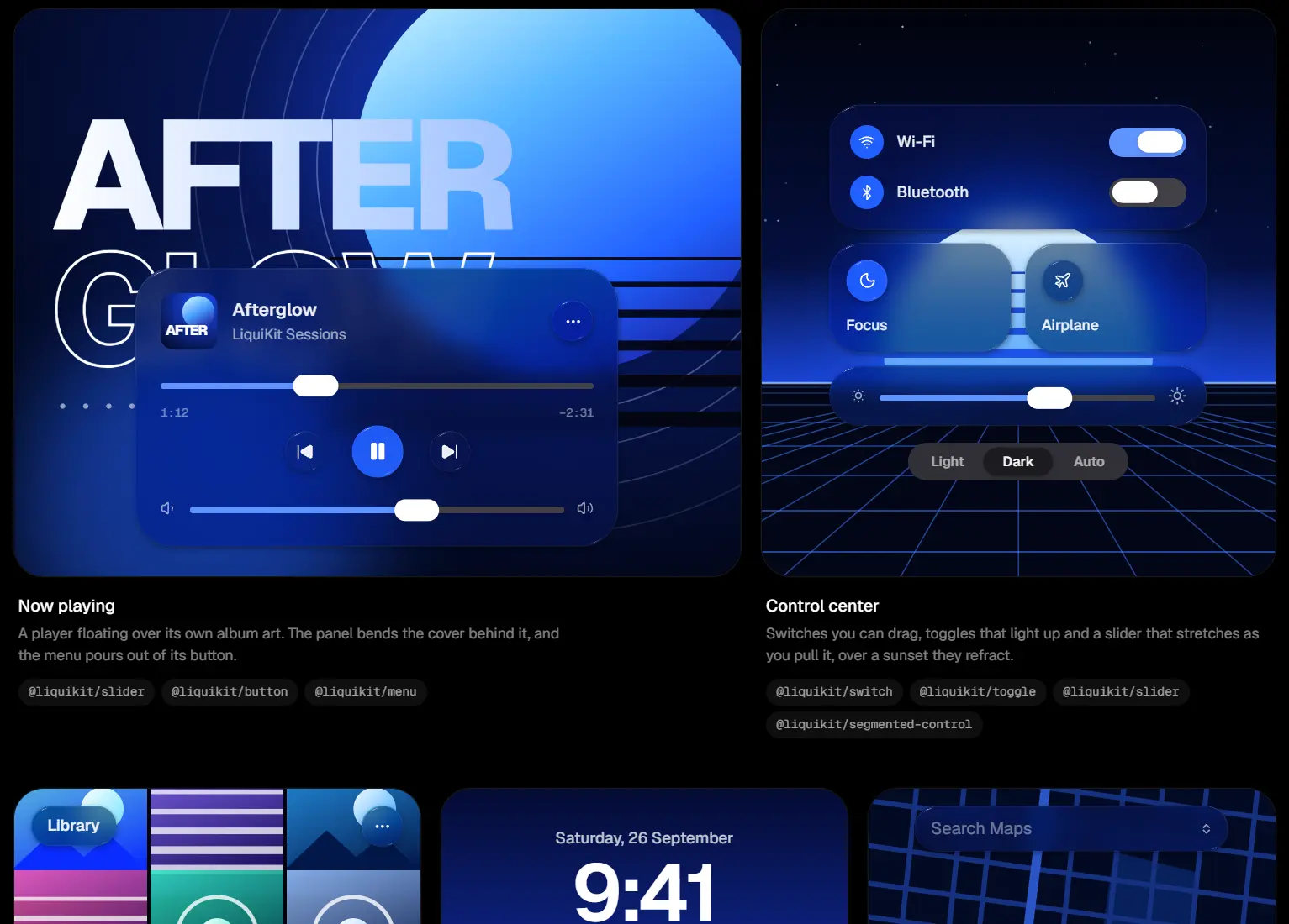
LiquiKit is a React UI component library with refracting glass controls for forms, menus, dialogs, and navigation.
Features
- 30+ UI components, from switches and number fields to navigation menus and toast notifications.
- SVG displacement maps based on a curved glass lens, with refraction activated during interaction.
- Draggable switch lenses, stretching sliders, animated tabs, and menus that expand from their triggers.
- Base UI keyboard and focus behavior for interactive controls.
- Light and dark themes, accent colors, and adjustable lens profiles.
- Individual shadcn registry installs or a single command for the whole library.
How To Install LiquiKit
Install shadcn/ui in your project:
npx shadcn@latest initAdd the LiquiKit registry to the existing components.json configuration:
{
  "registries": {
    "@liquikit": "https://liquikit.dev/r/{name}.json"
  }
}
Install a UI component:
npx shadcn@latest add @liquikit/switch @liquikit/menuOr install the complete UI component library:
npx shadcn@latest add @liquikit/allComponents are copied to
components/liquikit/, with shared glass code incomponents/liquikit/glass/. The registry also installs the required@base-ui/reactandmotiondependencies.
Basic Usage in Next.js
A Next.js App Router Server Component can render LiquiKit’s exports, including the individual parts of a menu. Use GlassScope around the background and controls that should refract together.
import { GlassScope } from "@/components/liquikit/glass";
import {
  MenuItem,
  MenuPopup,
  MenuRoot,
  MenuSeparator,
  MenuTrigger,
} from "@/components/liquikit/menu";
import { Switch } from "@/components/liquikit/switch";
export default function SettingsPage() {
  return (
    <main className="mx-auto max-w-3xl p-8">
      <GlassScope
        className="overflow-hidden rounded-3xl p-8"
        backdrop={
          <div className="h-full w-full bg-gradient-to-br from-amber-200 via-sky-200 to-indigo-400" />
        }
      >
        <div className="flex flex-wrap items-center gap-5">
          <Switch defaultChecked aria-label="Email notifications" />
          <MenuRoot>
            <MenuTrigger>Project actions</MenuTrigger>
            <MenuPopup>
              <MenuItem>Duplicate</MenuItem>
              <MenuItem>Rename</MenuItem>
              <MenuSeparator />
              <MenuItem>Archive</MenuItem>
            </MenuPopup>
          </MenuRoot>
        </div>
      </GlassScope>
    </main>
  );
}
Available UI Components
Forms and Data Entry
| Name | Description |
|---|---|
| Autocomplete | A text field that suggests matching options as you type. |
| Checkbox | Glass-styled checkboxes and checkbox groups. |
| Combobox | A searchable field with an animated dropdown list. |
| Field | Text inputs, field groups, fieldsets, and form controls. |
| Number Field | A numeric stepper with a draggable scrub area. |
| OTP Field | A one-time passcode input with individual character slots. |
| Radio | Glass-styled radio buttons and radio groups. |
| Search Field | A search input with a magnifying icon and clear button. |
| Select | A selection menu that expands from its trigger. |
| Slider | A range slider whose glass thumb stretches during dragging. |
| Switch | A toggle whose thumb lifts into a glass lens as it moves. |
Actions and Selection
| Name | Description |
|---|---|
| Button | A glass button with animated press and lighting effects. |
| Segmented Control | A selection control with a draggable glass indicator. |
| Tabs | Tab panels and a floating tab bar with a draggable lens. |
| Toggle | A glass button with pressed and unpressed states. |
| Toggle Group | Related toggle buttons joined into a glass capsule. |
| Name | Description |
|---|---|
| Context Menu | A contextual action menu that opens at the pointer position. |
| Menu | An animated glass menu that expands from its trigger. |
| Menubar | A row of menu triggers sharing a reshaping glass panel. |
| Navigation Menu | Navigation links with an animated panel that changes between items. |
| Toolbar | A glass capsule containing action buttons and separators. |
Overlays and Feedback
| Name | Description |
|---|---|
| Alert | An alert dialog that expands from a central glass droplet. |
| Dialog | A modal panel that expands from its trigger and closes back into it. |
| Popover | A glass popup that opens from an attached trigger. |
| Preview Card | A compact glass preview linked to another element. |
| Sheet | A glass panel that rises into view and can be dragged down. |
| Toast | Notifications that unfold from a capsule near the top edge. |
| Tooltip | A small glass popup for contextual labels or hints. |
Content and Layout
| Name | Description |
|---|---|
| Accordion | Expandable sections with spring-driven glass transitions. |
| Avatar | A profile image or initials displayed inside a glass disc. |
| Meter | Frosted meter and progress indicators. |
| Scroll Area | A scrollable container with an overlay scrollbar and separator. |
Alternatives and Related Resources