The Future of Web Dev
The Future of Web Dev
200+ Components for Building Interactive Svelte Apps – Svelte UX
200+ Svelte components, actions & utilities integrated with Tailwind CSS. Build interactive UIs quickly.
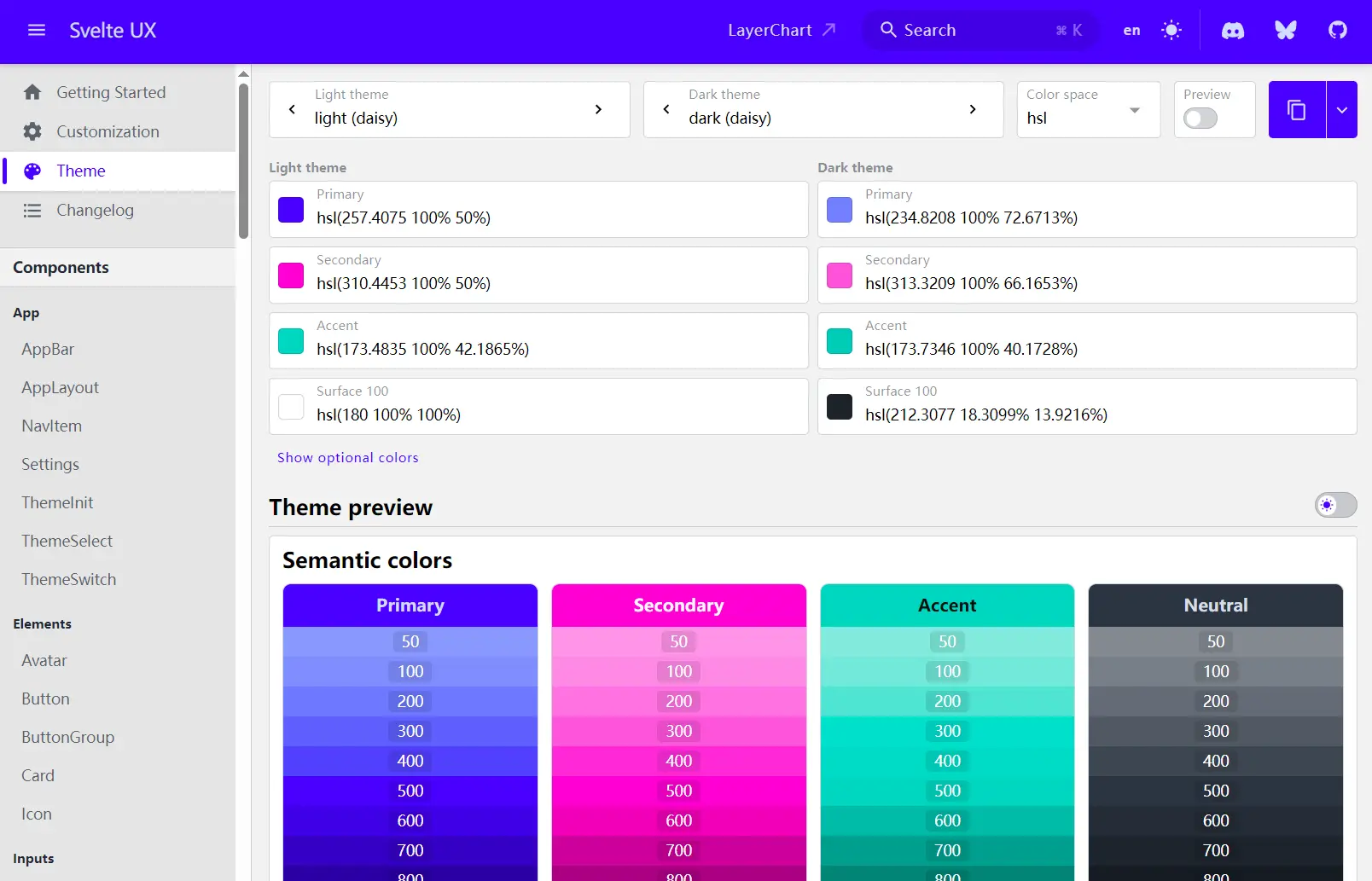
Svelte UX is a collection of Svelte components, actions, stores, and utilities. It helps you construct highly interactive and visual web applications. This library currently offers over 200 elements, with plans for continued expansion.
The components integrate with Tailwind CSS. They prioritize extensibility and customization through theming, variants, specific class overrides, and slots. A detailed design token system is also under development to provide finer control over the look and feel.
Use Svelte UX to accelerate the development of user interfaces that require rich interaction and visual feedback. It provides pre-built elements for forms, navigation, layout, modals, visualizations, and more, reducing the need to build these common patterns from the ground up.
Features
🧩 Extensive Component Library: Access over 200 components, actions, stores, and utilities covering various UI needs.
🖌️ Customization Focus: Offers theming, variants, class overrides, and slots for flexible adaptation.
🛠️ Utility Classes: Adds helpful Tailwind utilities like elevation-# for multi-layer shadows, grid-stack, and scrollbar-none.
📊 Visualization Components: Includes components for data visualization like BarStack.
🎨 Tailwind CSS Integration: Components are built using Tailwind CSS for utility-first styling.
🌗 Theming System: Includes built-in light and dark themes, configurable via tailwind.config.cjs.
⚙️ Actions & Stores: Provides Svelte actions and stores to manage state and side effects for interactive elements.
📅 Date/Time Utilities: Offers components and utilities for handling dates, times, and durations.
Use Cases
- Interactive Dashboards: Build dashboards with sortable tables, charts (
BarStack), date pickers (DateField,DateRangeField), and progress indicators (Progress,ProgressCircle). - Complex Forms: Create sophisticated forms using components like
TextField,SelectField,MultiSelectField,Checkbox,Radio,RangeSlider, andFormstate management. - Admin Panels: Develop administrative interfaces with consistent layouts (
AppLayout), navigation (NavItem,Breadcrumb,Tabs), data display (Table), and modal dialogs (Dialog,Drawer). - E-commerce Sites: Implement product displays (
Card), filtering (MultiSelectMenu), shopping carts (using stores), and checkout flows (Steps). - Content Management Systems (CMS): Construct interfaces for content creation and management using rich text inputs (potentially integrating external libraries with Svelte UX components), tree lists (
TreeList), and file uploads.
Installation
Option 1: Using Svelte CLI (sv)
1. Start a new SvelteKit project (if you haven’t already):
npm create svelte@latest my-app
cd my-app
npm install
2. Add Tailwind CSS (if not selected during SvelteKit setup):
npx svelte-add@latest tailwindcss
npm install
3. Install the Svelte UX package:
npm install svelte-ux @layerstack/tailwind4. Update your tailwind.config.cjs file:
const colors = require('tailwindcss/colors');
const layerstack = require('@layerstack/tailwind/plugin');
/** @type {import('tailwindcss').Config} */
module.exports = {
  content: [
    './src/**/*.{html,js,svelte,ts}',
    // Add this line:
    './node_modules/svelte-ux/**/*.{svelte,js}'
  ],
  theme: {
    extend: {},
  },
  // Add or modify the ux configuration:
  ux: {
    themes: {
      // Example light theme configuration
      light: {
        primary: colors['orange']['500'],
        'primary-content': 'white',
        secondary: colors['blue']['500'],
        'surface-100': 'white',
        'surface-200': colors['gray']['100'],
        'surface-300': colors['gray']['300'],
        'surface-content': colors['gray']['900'],
        'color-scheme': 'light'
      },
      // Example dark theme configuration
      dark: {
        primary: colors['orange']['500'],
        'primary-content': 'white',
        secondary: colors['blue']['500'],
        'surface-100': colors['zinc']['800'],
        'surface-200': colors['zinc']['900'],
        'surface-300': colors['zinc']['950'],
        'surface-content': colors['zinc']['100'],
        'color-scheme': 'dark'
      },
      // Add more custom themes here
    },
  },
  plugins: [
    // Add the layerstack plugin:
    layerstack, // Or layerstack({ colorSpace: 'oklch' })
  ],
};- The
contentarray addition ensures Tailwind processes Svelte UX classes. - The
ux.themesobject configures your application’s color schemes. - The
layerstackplugin injects theme variables and utility classes.
5. Import the base styles in your main layout file (e.g., src/routes/+layout.svelte):
<script>
  import '../app.css'; // Your global styles
  import 'svelte-ux/themes/all.css'; // Base Svelte UX styles/variables
</script>
<slot />
Option 2: Manual Setup
Follow the official Tailwind guide to set up a new SvelteKit project with Tailwind CSS first. Then, follow steps 3, 4, and 5 from Option 1 above.
Usage
Import and use components, actions, stores, or utilities directly from the svelte-ux package.
Here is a basic example using the Button component:
<script>
import { Button } from 'svelte-ux';
function handleClick() {
console.log('Button clicked!');
}
</script>
<Button on:click={handleClick}>Click Me</Button>
<!-- Example with variant -->
<Button variant="primary">Primary Button</Button>
<!-- Example with icon -->
<script>
import { Button, Icon } from 'svelte-ux';
import plus from '@iconify/icons-mdi/plus'; // Requires @iconify/icons-mdi
</script>
<Button>
<Icon data={plus} class="mr-1" />
Add Item
</Button>
Consult the official Svelte UX documentation for detailed examples and usage instructions for all available elements. You can search the documentation using ⌘K (Ctrl+K on Windows/Linux).
Related Resources
- Tailwind CSS: https://tailwindcss.com/ – The utility-first CSS framework used by Svelte UX. Understanding Tailwind concepts is beneficial.
- SvelteKit: https://kit.svelte.dev/ – The official Svelte application framework, recommended for use with Svelte UX.
- Layerstack Tailwind Plugin: https://github.com/techniq/layerstack/tree/main/packages/tailwind – The repository for the Tailwind plugin used for theming and utilities within Svelte UX.
FAQs
Q: Does Svelte UX require Tailwind CSS?
A: Yes, Svelte UX components are built using Tailwind CSS and require it for styling and theming. You need to install and configure Tailwind CSS in your Svelte project.
Q: How customizable are the Svelte UX components?
A: Components offer customization through Svelte props, CSS variables managed by the theming system, granular class overrides for specific elements within a component, and Svelte slots for injecting custom content.
Q: Can I create my own themes?
A: Yes, you can define custom light and dark themes (or entirely new themes) within the ux.themes section of your tailwind.config.cjs file.
Q: Is Svelte UX suitable for large applications?
A: Yes, its comprehensive set of components, utilities, and focus on structure make it suitable for building complex and large-scale Svelte applications.
Q: Does Svelte UX work with SSR (Server-Side Rendering)?
A: Yes, Svelte UX is compatible with SvelteKit’s server-side rendering capabilities. The components are designed to work in both client-side and server-side environments.
Preview