The Future of Web Dev
The Future of Web Dev
ShardsUI: Accessible Headless UI Components for Svelte
Create Svelte dialogs, menus, forms, tabs, selects, toasts, and more with headless components styled through CSS or Tailwind.
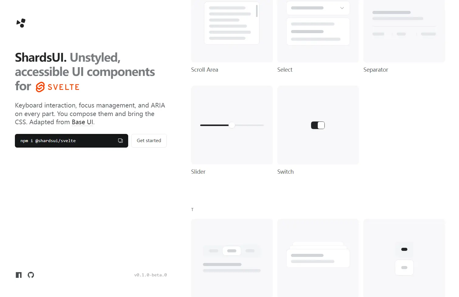
ShardsUI is a headless Svelte UI component library for building custom dialogs, menus, forms, navigation, selection controls, and feedback elements.
It handles the interaction logic, ARIA semantics, keyboard behavior, and focus management behind each component while leaving the styles to your CSS or Tailwind classes.
Features
- Unstyled components for project-specific CSS and Tailwind designs.
- ARIA roles, keyboard interaction, and focus management for interactive patterns.
- Controlled and uncontrolled state through Svelte 5 bindings and callbacks.
- State-based styling through
data-*attributes and live CSS variables. - Native form validation through
Form,Field, andFieldset. - CSS, Web Animations API, and JavaScript animation hooks for enter and exit states.
- TypeScript inference for props, bindings, callbacks, refs, snippets, and generic selection values.
- Portal-based rendering for dialogs, drawers, menus, popovers, tooltips, and related overlays.
How To Use It
Install ShardsUI
npm install @shardsui/svelteImport only the component family required by the current UI:
<script lang="ts">
  import { Dialog } from '@shardsui/svelte/dialog'
</script>
Basic Usage: Dialog Component
A dialog consists of a root, trigger, portal, backdrop, popup, title, and close control. ShardsUI supplies the behavior. Classes define the appearance.
<script lang="ts">
  import { Dialog } from '@shardsui/svelte/dialog'
</script>
<Dialog.Root>
  <Dialog.Trigger class="profile-trigger">
    Edit profile
  </Dialog.Trigger>
  <Dialog.Portal>
    <Dialog.Backdrop class="dialog-backdrop" />
    <Dialog.Popup class="dialog-popup">
      <Dialog.Title>Edit profile</Dialog.Title>
      <p>Update your account details.</p>
      <Dialog.Close>
        Close
      </Dialog.Close>
    </Dialog.Popup>
  </Dialog.Portal>
</Dialog.Root>
Styling ShardsUI Components
Each rendered part accepts class and style. Component state also appears on the underlying element through attributes such as:
data-opendata-closeddata-checkeddata-uncheckeddata-disableddata-selecteddata-highlighteddata-starting-styledata-ending-style
For example, a Switch can use the checked state directly in CSS:
<script>
  import { Switch } from '@shardsui/svelte/switch'
</script>
<Switch.Root class="switch">
  <Switch.Thumb class="switch-thumb" />
</Switch.Root>
.switch-thumb {
transform: translateX(0);
transition: transform 150ms;
}
.switch-thumb[data-checked] {
transform: translateX(1rem);
}Floating components use live measurements through CSS variables. Select and Popover positioners expose values such as --anchor-width, --available-height, and --transform-origin.
.select-popup {
  min-width: var(--anchor-width);
  max-height: var(--available-height);
  transform-origin: var(--transform-origin);
}
Svelte Scoped Style Caveat
A class passed to a ShardsUI part lands on the HTML element created inside the library component. Svelte’s normal scoped <style> selector contains a generated scope hash, but that generated element does not receive the same hash.
This scoped rule will not match:
<Menu.Popup class="menu-popup" />
<style>
  .menu-popup {
    border: 1px solid #222;
  }
</style>
Use a global selector:
<style>
  :global(.menu-popup) {
    border: 1px solid #222;
  }
</style>
Component State
Stateful components manage their initial state internally. Bind the state when another part of the application also needs to read or change it.
<script lang="ts">
  import { Dialog } from '@shardsui/svelte/dialog'
  let open = $state(false)
</script>
<button onclick={() => (open = true)}>
  Open settings
</button>
<Dialog.Root bind:open>
  <Dialog.Portal>
    <Dialog.Backdrop />
    <Dialog.Popup>
      <Dialog.Title>Settings</Dialog.Title>
      <Dialog.Close>Done</Dialog.Close>
    </Dialog.Popup>
  </Dialog.Portal>
</Dialog.Root>
Common bindable state props include open, value, and checked.
ShardsUI also exposes state change callbacks such as:
onOpenChangeonValueChangeonCheckedChangeonOpenChangeCompletefor popup components
These callbacks report changes initiated by the component. Updating your own bound variable directly does not invoke the corresponding change callback.
Function bindings can intercept a requested state update when application logic needs to reject it.
<Dialog.Root
  bind:open={
    () => open,
    (next) => {
      if (!next && hasUnsavedChanges) return
      open = next
    }
  }
>
  ...
</Dialog.Root>
Forms And Validation
Form, Field, and Fieldset use the browser constraint validation API. Native rules such as required, pattern, and input types remain available, while Field.Error renders the validation message inside the page.
<script lang="ts">
  import { Button } from '@shardsui/svelte/button'
  import { Field } from '@shardsui/svelte/field'
  import { Form } from '@shardsui/svelte/form'
  type ProfileValues = {
    email: string
  }
  function saveProfile({ email }: ProfileValues) {
    console.log(email)
  }
</script>
<Form onFormSubmit={saveProfile}>
  <Field.Root name="email">
    <Field.Label>Email address</Field.Label>
    <Field.Control
      type="email"
      required
      placeholder="[email protected]"
    />
    <Field.Error />
  </Field.Root>
  <Button type="submit">
    Save profile
  </Button>
</Form>
onFormSubmit returns the submitted fields as a plain object and calls preventDefault() on the native submit event. Use native onsubmit when the application needs the original FormData.
Server errors use an object keyed by each field’s name:
<script lang="ts">
  import { Form, type FormErrors } from '@shardsui/svelte/form'
  let errors: FormErrors = $state({
    username: 'This username is already taken.'
  })
</script>
<Form {errors}>
  ...
</Form>
The corresponding field receives the error state, and ShardsUI moves focus to the first invalid field.
SvelteKit Form Actions
Form renders a real <form>, so method and action work with SvelteKit form actions.
Svelte actions such as enhance cannot attach directly to a component. Svelte’s fromAction attachment passes enhance through to the form element rendered by ShardsUI.
<script>
  import { fromAction } from 'svelte/attachments'
  import { enhance } from '$app/forms'
  import { Form } from '@shardsui/svelte/form'
  import { Field } from '@shardsui/svelte/field'
  let { form } = $props()
</script>
<Form
  method="POST"
  {@attach fromAction(enhance)}
  errors={form?.errors}
>
  <Field.Root name="password">
    <Field.Label>Password</Field.Label>
    <Field.Control type="password" />
    <Field.Error />
  </Field.Root>
</Form>
Available Components
| Category | Components |
|---|---|
| Disclosure | Accordion, Collapsible |
| Overlays and menus | Alert Dialog, Context Menu, Dialog, Drawer, Menu, Popover, Preview Card, Tooltip |
| Forms and selection | Autocomplete, Button, Checkbox, Checkbox Group, Combobox, Field, Fieldset, Form, Input, Radio, Select, Slider, Switch, Toggle, Toggle Group |
| Navigation and commands | Menubar, Navigation Menu, Tabs, Toolbar |
| Feedback and status | Meter, Progress, Toast |
| Display and layout | Avatar, Scroll Area, Separator |
Animation
ShardsUI leaves motion styles to the application. Opening and closing elements expose data-starting-style and data-ending-style.
.dialog-popup {
  opacity: 1;
  transform: scale(1);
  transition:
    opacity 150ms,
    transform 150ms;
}
.dialog-popup[data-starting-style],
.dialog-popup[data-ending-style] {
  opacity: 0;
  transform: scale(0.96);
}
Supported overlay portals and disclosure panels also accept keepMounted. Closed content stays in the DOM, which preserves scroll position and element state.
<Dialog.Portal keepMounted>
  <Dialog.Popup>
    ...
  </Dialog.Popup>
</Dialog.Portal>
Alternatives And Related Resources