The Future of Web Dev
The Future of Web Dev
Salesforce-Style UI Component Library – Wisty UI
A React UI component library with Radix and Base UI editions, editable local source, and CRM components and blocks.
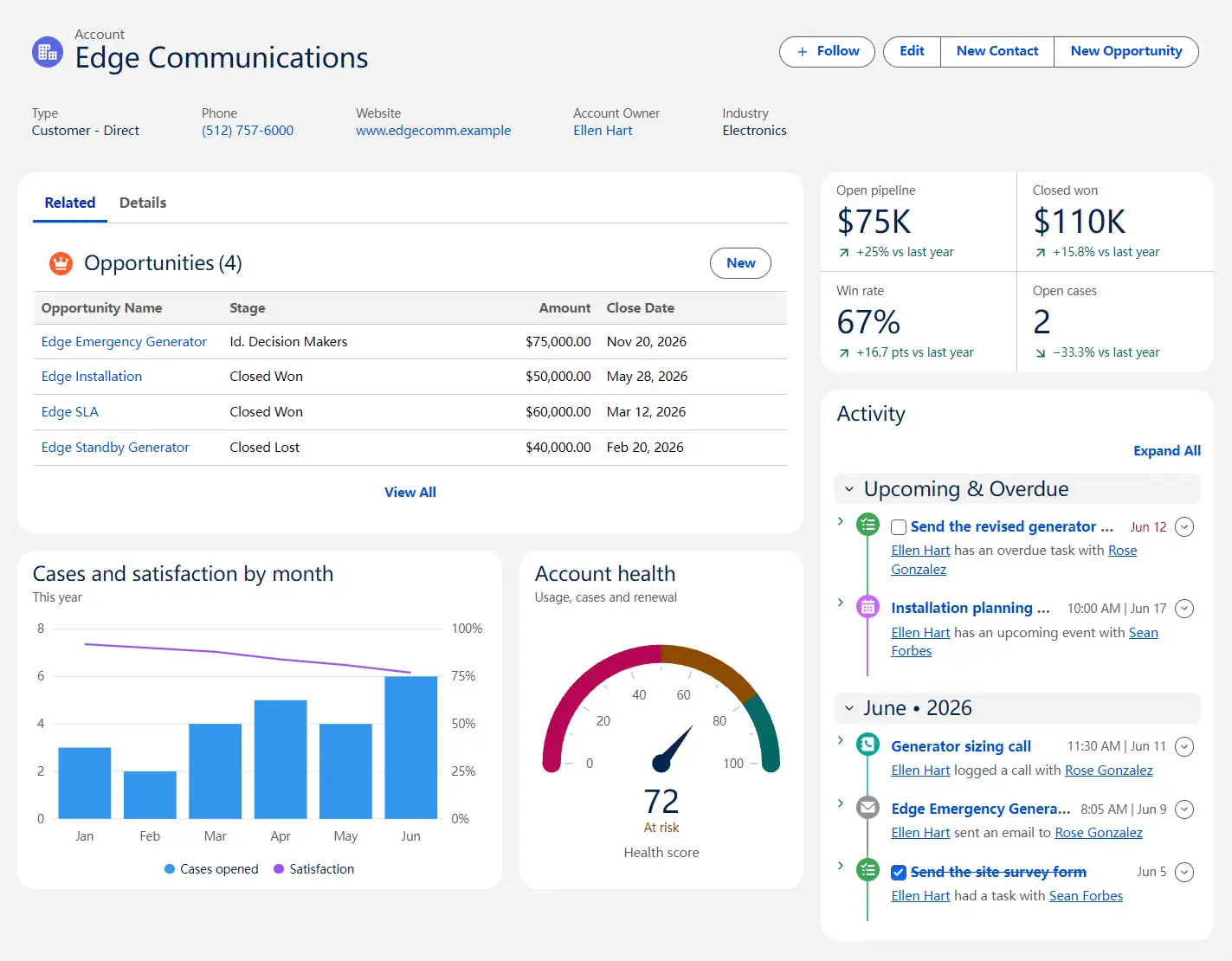
Wisty UI is a UI component library styled after Salesforce Lightning Design System 2 (SLDS 2).
It provides 80+ editable UI components and blocks for CRM, reporting, and admin dashboards.
Features
- Cosmos, Lightning Blue, and Neutral themes based on Salesforce Lightning styling.
- Radix UI and Base UI editions of shadcn primitives with familiar props and variants.
- Record lookup, data tables, date and time fields, stage indicators, and inline editing.
- Record pages, related lists, activity timelines, KPI summaries, and metric trends.
- Theme tokens for colors, radii, display density, and chart palettes.
Available UI Components
Components
| Name | Description |
|---|---|
| Accordion | Expandable sections with single or multiple open panels. |
| Alert | Inline messages and page-wide banners with optional actions. |
| Alert dialog | Modal confirmation for actions such as deleting records. |
| Avatar | Profile photos or initials for users and records. |
| Badge | Compact status labels and numeric indicators. |
| Breadcrumb | Links showing a page’s position in a hierarchy. |
| Button | Primary, secondary, and contextual action controls. |
| Button group | Joined controls for related record actions. |
| Calendar | Month view for selecting dates and date ranges. |
| Card | Titled containers for related content and actions. |
| Carousel | Navigable image or content panels with arrows or dots. |
| Chart | Bar, line, area, donut, scatter, and funnel charts. |
| Chart legend | Chart series labels with values or bubble sizes. |
| Checkbox | Boolean selections with an indeterminate state. |
| Collapsible | Trigger-controlled expandable content areas. |
| Combobox | Searchable single- or multi-select options with pills. |
| Command | Keyboard-searchable lists of pages, records, and actions. |
| Context menu | Right-click action menus for rows or items. |
| Data table | Sortable, selectable records with formatted columns and row actions. |
| Date picker | Date field with text input and calendar selection. |
| Datetime picker | Local date-and-time field with calendar and time choices. |
| Dialog | Modal window for focused tasks and confirmations. |
| Dropdown menu | Button-triggered menus for actions and choices. |
| Dual listbox | Ordered multi-selection by moving items between lists. |
| Dynamic icon | Animated status icons for calculations and trends. |
| Empty | Empty-state message with optional next action. |
| Expandable section | Titled panel that hides content while keeping it mounted. |
| Field | Form control layout with labels, help text, and errors. |
| File selector | File selection through a button or drag-and-drop. |
| Hover card | Hover previews for linked people or records. |
| Icon | Salesforce utility, object, action, and file icons. |
| Input | Single-line text entry. |
| Input group | Inputs with embedded buttons, labels, or icons. |
| Item | List row with icon, description, and actions. |
| Kbd | Keyboard key and shortcut labels. |
| Label | Accessible labels for form controls. |
| Linear scale | Single-value selection on a labeled numeric scale. |
| Lookup | Searchable record picker for single or multiple selections. |
| Markdown | Read-only rendering of Markdown text. |
| Menubar | Persistent menu row for application commands. |
| Metric | Numeric KPI with label, unit, and trend indicator. |
| Native select | Browser-native dropdown selection. |
| Number input | Locale-formatted amounts, quantities, and percentages. |
| Output field | Read-only labeled value with an edit action. |
| Page header | Page title, icon, metadata, and actions. |
| Page regions | Lightning-style page layout with header and responsive regions. |
| Pagination | Navigation between pages of records. |
| Path | Chevron-based record stages and related actions. |
| Pill | Removable tokens for selected records or values. |
| Popover | Small anchored panel for details or short forms. |
| Progress | Horizontal progress indicator for a running task. |
| Progress indicator | Step tracker for multistep setup or forms. |
| Progress ring | Circular completion indicator from zero to full. |
| Radio group | Single selection from visible choices. |
| Rating | Interactive star or icon-based score selection. |
| Scroll area | Fixed-size scrollable content with slim scrollbars. |
| Select | Dropdown for choosing one value. |
| Separator | Visual divider between content groups. |
| Sheet | Edge-sliding panel for adjacent tasks. |
| Sidebar | Collapsible app navigation with mobile sheet behavior. |
| Skeleton | Loading placeholder for pending content. |
| Slider | Draggable control for selecting a value or range. |
| Sonner | Non-blocking toast notifications for actions and errors. |
| Spinner | Indeterminate loading indicator. |
| Switch | Immediate on/off setting control. |
| Table | Read-only rows and columns of structured data. |
| Tabs | Switching between related content panels. |
| Textarea | Multiline text input. |
| Time picker | Time-of-day field with typing and list selection. |
| Toggle | Persistent pressed-state button. |
| Toggle group | One or multiple pressed toggles in a group. |
| Tooltip | Brief contextual hint on hover or keyboard focus. |
| Tree | Expandable hierarchy with single-item selection. |
| Visual picker | Large option cards for single or multiple selection. |
Charts
| Name | Description |
|---|---|
| Bar list | Ranked values with proportional bars and optional row actions. |
| Gauge | Dial, ring, bar, or dots for values against a maximum. |
Available UI Blocks
| Name | Description |
|---|---|
| Activity timeline | Chronological tasks, events, calls, and emails for a record. |
| KPI row | Dashboard header metrics with change indicators. |
| List view | Searchable, sortable, selectable table of records. |
| List view header | List selector, search box, and page actions. |
| Metric trend | Tabbed KPIs with a trend chart and period comparison. |
| Record detail | Read-only record fields grouped in sections. |
| Record form | New/edit form with required-field checks and save errors. |
| Record header | Record name, key fields, and primary actions. |
| Record inline edit | In-place record editing with Save and Cancel. |
| Record page | Editable record page with header, tabs, and sidebar. |
| Related list | Related records with New and View All actions. |
How to Use Wisty UI
1. Set up shadcn/ui
Initialize shadcn/ui:
npx shadcn@latest init2. Configure the Wisty registry
Add the @wisty registry to components.json.
{
  "registries": {
    "@wisty": "https://ui.wisty.ai/r/{style}/{name}.json"
  }
}
3. Install a theme and components
Install one theme, followed by the Button primitive:
npx shadcn@latest add @wisty/cosmos
npx shadcn@latest add @wisty/button
For a different color scheme, install
@wisty/lightning-blueor@wisty/neutralin place of@wisty/cosmos.
4. Add a CRM record page
npx shadcn@latest add @wisty/record-pageimport { RecordPage } from "@/components/wisty/record-page"
export default function AccountPage() {
return <RecordPage />
}The installation writes record-page.tsx and record-page-data.ts with an account example. Edit the page file to replace its fixture data and connect the record actions to your application’s handlers.
5. Render a quota gauge
npx shadcn@latest add @wisty/gaugeimport { Gauge } from "@/components/wisty/gauge"
export default function QuotaSummary() {
return (
<section className="max-w-sm">
<Gauge
label="Quarterly quota attainment"
value={72}
max={100}
unit="%"
reference={80}
referenceLabel="Team average"
bands={[
{ to: 50, tone: "error", label: "Behind" },
{ to: 80, tone: "warning", label: "At risk" },
{ to: 100, tone: "success", label: "On track" },
]}
/>
</section>
)
}6. Add Salesforce icons when needed
The Wisty Icon component uses SVG sprites from @salesforce-ux/icons. Install the registry item, then copy the icon assets into the application’s public folder:
npx shadcn@latest add @wisty/icon
mkdir -p public/assets/icons
cp -R node_modules/@salesforce-ux/icons/dist/salesforce-lightning-design-system-icons/. public/assets/icons/
Import Icon from @/components/wisty/icon and use names such as standard:account or utility:warning.
Noet that Salesforce icons are licensed under CC BY-ND 4.0: keep
License-for-icons.txt, use the artwork unaltered, and credit Salesforce.
Alternatives and Related Resources