The Future of Web Dev
The Future of Web Dev
Shadcn/ui and Base UI Component Library for Next.js – UIAble
Build forms, dashboards, navigation, data views, and page sections with UIAble components for Next.js and Tailwind CSS.
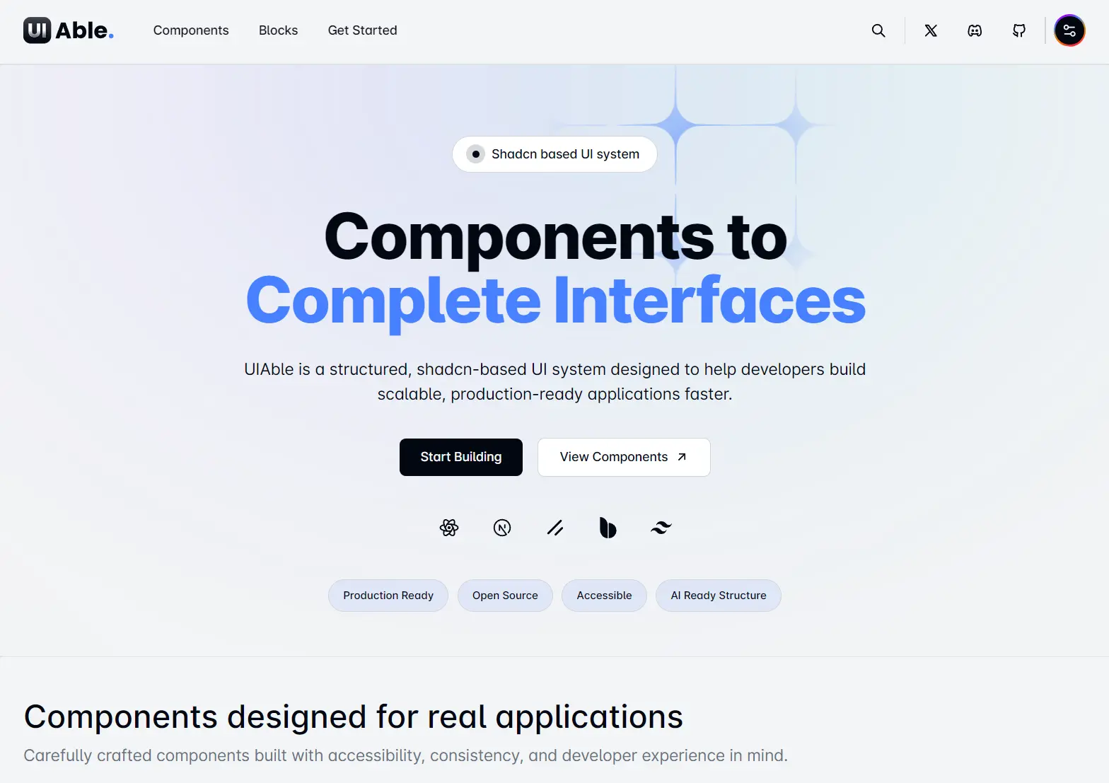
UIAble is a React and Next.js component library that provides a collection of editable Tailwind CSS components, variants, and UI blocks through a shadcn registry.
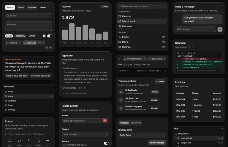
It covers forms, data displays, overlays, navigation, dashboards, account settings, and messaging interfaces. Installed React and TypeScript files remain inside your project.
Features
- Copy-paste installation with full source code ownership.
- 40+ accessible UI components built on Base UI primitives.
- Tailwind CSS v4 styling with global theming support.
- TypeScript-ready components with full type definitions.
- Next.js App Router compatible.
- Production-ready blocks and page templates.
Available Components
| Category | Components |
|---|---|
| Inputs | Button, Button Group, Checkbox, Combobox, Command, Date Picker, Input, Input Group, Input OTP, Item, Native Select, Radio, Radio Group, Select, Slider, Switch, Textarea, Toggle, Toggle Group, Calendar |
| Data Display | Attachment, Avatar, Badge, Bubble, Card, Carousel, Chart, Data Table, Empty, Field, Hover Card, Kbd, Label, Marker, Message, Message Scroller, List Group, Scroll Area, Separator, Table, Tooltip, Typography, Aspect Ratio, Skeleton |
| Feedback | Alert, Alert Dialog, Dialog, Drawer, Progress, Sheet, Sonner, Spinner |
| Navigation | Breadcrumb, Dropdown Menu, Menubar, Navbar, Navigation Menu, Pagination, Tabs, Sidebar |
| Surfaces | Accordion, Collapsible |
| Utils | Context Menu, Popover, Resizable |
Use Cases
- Build an administration shell from Sidebar and Breadcrumb, place records inside Data Table, and reserve Dialog or Alert Dialog for focused actions.
- Inside workspace settings, Tabs divide profile, billing, security, and notification areas. Switch, Select, and Input handle the individual preferences.
- During multi-step sign-in, Input Group collects account details, Input OTP handles verification, and Alert displays failed attempts or expired codes.
- When a conversation includes uploaded files, combine Message, Bubble, Attachment, Avatar, and contextual menu components within the thread.
- Start a SaaS landing page with the CTA, Contact, Content, and FAQ blocks. Replace the sample copy and connect their theme values to the rest of the product interface.
How To Use UIAble
Create or Prepare the React Project
For a new Next.js project, run:
npx create-next-app@latest my-uiable-app --typescript --tailwind --eslint
cd my-uiable-app
Choose the App Router and the default @/* import alias during setup. Add the src directory option when your project keeps application code under src/app.
Initialize shadcn/ui in the project. This command creates components.json, adds the cn() utility, installs the base dependencies, and configures theme variables.
npx shadcn@latest initRegister the UIAble Namespace
Open the existing components.json file and add the @uiable entry under registries:
{
  "registries": {
    "@uiable": "https://uiable.com/r/{name}.json"
  }
}
Merge this property into the existing configuration. Keep the current style, aliases, Tailwind CSS path, icon library, and React Server Components settings.
A typical alias setup places base primitives under components/ui, UIAble variants under components/uiable, shared hooks under hooks, and the class-name utility under lib/utils.ts. The shadcn CLI reads these paths from components.json.
Add a Component Variant
Install the bordered accordion variant:
npx shadcn add @uiable/accordion-bordersThe command adds accordion-borders.tsx, installs the base accordion primitive when needed, and resolves the packages declared by the registry item.
Basic Usage
Import the generated component from its local file:
import AccordionBorders from "@/components/uiable/accordion/accordion-borders";
export default function SupportPage() {
  return (
    <main className="mx-auto max-w-3xl px-6 py-12">
      <h1 className="mb-6 text-3xl font-semibold">
        Billing questions
      </h1>
      <AccordionBorders />
    </main>
  );
}
The generated variant contains its own example content. Replace that content inside components/uiable/accordion/accordion-borders.tsx before using it in a published interface. The registry does not wrap these examples in a remote runtime package.
Manual Copy-Paste Setup
The registry is the primary installation path, but each variant page also exposes its source code.
- Open a component in the UIAble catalog.
- Select the required variant.
- Copy its source.
- Create
src/components/uiable/[category]/[variant-name].tsx. - Add the referenced shadcn primitive under
src/components/ui. - Install every package imported by the copied files.
- Confirm that the required theme variables exist in
globals.css.
Some primitives require additional packages. The accordion primitive, for example, imports @base-ui/react. Review both the variant file and its base primitive before running a manual install.
Tailwind CSS Theme Customization
UIAble targets Tailwind CSS v4 and uses CSS-first theme configuration. Add project-level tokens to src/app/globals.css:
@import "tailwindcss";
@theme {
  --color-primary: #315efb;
  --spacing-sidebar-width: 18rem;
}
Component-level changes belong in the generated TSX files. Edit Tailwind classes, states, markup, icons, and local CVA definitions there. Global colors, spacing values, shadows, and radii belong in the project theme.
Alternatives and Related Resources
- Build Custom UI Components with Tailwind and shadcn – eo-n/ui
- Copy-Paste Accessible Components for React and Shadcn/ui – JollyUI
- Accessible React Component Library with shadcn – Pittaya UI
- 200+ Free Copy-Paste UI Components – shadcn.io
FAQs
Q: Is UIAble installed as an npm component package?
A: UIAble distributes components through a shadcn registry or manual source copying.
Q: Why does a UIAble component look unstyled after installation?
A: Check the Tailwind CSS version, theme variables in globals.css, and imported dependency files. The documented setup targets Tailwind CSS v4, and some variants depend on project-level tokens or animation styles.
Q: Do UIAble components need "use client" in Next.js?
A: Interactive primitives declare a client boundary when required. Add "use client" to your own wrapper only when it uses client-side state, effects, event handlers, or browser APIs.
Q: Can UIAble work in a Vite project?
A: The UIAble requirements include Vite 6+, React 19, and Tailwind CSS v4. The same registry and local component model applies after shadcn/ui has been initialized for Vite.
Q: Can I add UIAble components to a Tailwind CSS v3 project?
A: The current setup targets Tailwind CSS v4 and uses CSS-first theme configuration. A v3 project needs manual conversion of theme tokens, utilities, and any v4-specific syntax.