The Future of Web Dev
The Future of Web Dev
Copy-Paste UI Components for React/Next.js – Kokonutui
Open-source Tailwind CSS & Motion UI components for React/Next.js. Install via CLI for quick project integration. Build modern UIs faster.
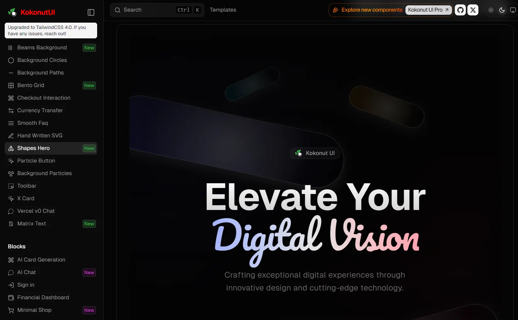
kokonutui is an open-source UI component library for Next.js that provides a collection of pre-built UI components and blocks ready for integration into your web applications.
This library focuses on components built with Tailwind CSS for styling and Framer Motion for animations. This combination provides modern aesthetics and smooth interactions suitable for React and Next.js projects.
You can add components to your application by copying and pasting code snippets or using a command-line interface (CLI) tool for easier dependency management.
Features
🎨 Tailwind CSS Styling: Components are built using Tailwind CSS utility classes for consistent and customizable styling.
⚛️ React & Next.js Focused: Specifically developed for use within React and Next.js environments.
✨ Modern UI Elements: Offers contemporary components like Bento Grids, Particle Backgrounds, and AI-focused interfaces.
🎬 Framer Motion Animation: Integrates Framer Motion for fluid animations and interactive effects.
🧩 Component & Block Variety: Includes individual components (buttons, inputs, cards) and larger “Blocks” (pre-composed sections like dashboards, sign-in forms).
🛠️ Easy Integration: Supports simple copy-paste integration or CLI installation via the shadcn/ui tool.
Use Cases
- Building Dashboards: Use the Financial Dashboard block or assemble grids and cards to create data-rich admin panels.
- Developing AI Applications: Integrate the AI Chat block, AI Card Generation, or AI-input component for machine learning interfaces.
- Creating Landing Pages: Employ elements like Shapes Hero, Background Particles, or Beams Background for engaging introductory sections.
- Setting up E-commerce Features: Utilize the Minimal Shop block or components like the Checkout Interaction for online store UIs.
- Implementing Authentication: The Sign-in block provides a ready-made structure for user login forms.
Installation
Follow these steps to start using kokonutui components in your project.
1. Install Utilities. kokonutui requires Tailwind CSS v4. Confirm it is installed in your project. Many components also use the cn utility function. Install it using the shadcn/ui CLI:
# Using npx
npx shadcn@latest add https://kokonutui.com/r/utils.json
# Using bun
bunx shadcn@latest add https://kokonutui.com/r/utils.json
# Using pnpm
pnpx shadcn@latest add https://kokonutui.com/r/utils.json
2. Install Components. Add individual components using the CLI. For example, to add card-05:
# Using npx
npx shadcn@latest add https://kokonutui.com/r/card-05.json
# Using bun
bunx shadcn@latest add https://kokonutui.com/r/card-05.json
# Using pnpm
pnpx shadcn@latest add https://kokonutui.com/r/card-05.json
3. Install Blocks. Blocks contain multiple files and require the CLI for installation. To install the ai-card-generation block:
# Using npx
npx shadcn@latest add https://kokonutui.com/r/ai-card-generation.json
# Using bun
bunx shadcn@latest add https://kokonutui.com/r/ai-card-generation.json
# Using pnpm
pnpx shadcn@latest add https://kokonutui.com/r/ai-card-generation.json
4. Optional Dependencies. Some components might need additional libraries. Check the documentation page for specific component dependencies and install them as needed.
5. Monorepo Setup. If you use a monorepo structure, specify the workspace path using the -c flag with the CLI command:
# Example for npx
npx shadcn@latest add https://kokonutui.com/r/card-05.json -c ./apps/www
Usage
After installation, you can import and use kokonutui components directly in your pages or other components.
bunx shadcn@latest add https://kokonutui.com/r/ai-input-17.json
"use client";
import {
  useState
} from "react";
import {
  Textarea
} from "@/components/ui/textarea";
import {
  cn
} from "@/lib/utils";
import {
  useAutoResizeTextarea
} from "@/hooks/use-auto-resize-textarea";
import {
  ArrowUpCircle,
  Paperclip,
  Globe,
  Figma
} from "lucide-react";
export default function AIInput_17() {
  const [value, setValue] = useState("");
  const {
    textareaRef,
    adjustHeight
  } = useAutoResizeTextarea({
    minHeight: 80,
    maxHeight: 200,
  });
  const handleKeyDown = (e: React.KeyboardEvent < HTMLTextAreaElement > ) => {
    if (e.key === "Enter" && !e.shiftKey) {
      e.preventDefault();
      if (value.trim()) {
        setValue("");
        adjustHeight(true);
      }
    }
  };
  return ( <
    div className = "p-4 min-w-full" >
    <
    div className = "relative" >
    <
    div className = "relative flex flex-col border border-black/10 dark:border-white/10 rounded-xl" >
    <
    div className = "overflow-y-auto" >
    <
    Textarea ref = {
      textareaRef
    }
    value = {
      value
    }
    onChange = {
      (e) => {
        setValue(e.target.value);
        adjustHeight();
      }
    }
    onKeyDown = {
      handleKeyDown
    }
    placeholder = "Ask me anything..."
    className = {
      cn(
        "w-full px-4 py-3",
        "resize-none",
        "bg-transparent",
        "border-none",
        "focus:outline-hidden",
        "focus-visible:ring-0 focus-visible:ring-offset-0",
        "placeholder:text-black/50 dark:placeholder:text-white/50",
        "align-top leading-normal",
        "min-h-[80px]"
      )
    }
    style = {
      {
        overflow: "hidden",
        outline: "none",
      }
    }
    /> <
    /div>
    <
    div className = "h-14" >
    <
    div className = "absolute left-3 right-3 bottom-3 flex items-center justify-between" >
    <
    div className = "flex items-center gap-2" >
    <
    button type = "button"
    className = "p-2 text-black/50 dark:text-white/50 hover:text-black dark:hover:text-white transition-colors rounded-lg border border-black/10 dark:border-white/10 hover:border-black/20 dark:hover:border-white/20" >
    <
    Paperclip className = "w-4 h-4" / >
    <
    /button> <
    button type = "button"
    className = "p-2 text-black/50 dark:text-white/50 hover:text-black dark:hover:text-white transition-colors rounded-lg border border-black/10 dark:border-white/10 hover:border-black/20 dark:hover:border-white/20" >
    <
    Globe className = "w-4 h-4 text-blue-500" / >
    <
    /button> <
    button type = "button"
    className = "p-2 text-black/50 dark:text-white/50 hover:text-black dark:hover:text-white transition-colors rounded-lg border border-black/10 dark:border-white/10 hover:border-black/20 dark:hover:border-white/20" >
    <
    Figma className = "w-4 h-4 text-pink-500" / >
    <
    /button> <
    /div> <
    button type = "button"
    className = {
      cn(
        "p-2 transition-colors",
        value.trim() ?
        "text-blue-500 hover:text-blue-600" :
        "text-black/30 dark:text-white/30"
      )
    } >
    <
    ArrowUpCircle className = "w-6 h-6" / >
    <
    /button> <
    /div> <
    /div> <
    /div> <
    /div> <
    /div>
  );
}
Related Resources
- shadcn/ui: https://ui.shadcn.com/ – The UI component collection whose CLI tool is used for installing kokonutui components. It shares a similar philosophy of copy-paste integration.
- Tailwind CSS: https://tailwindcss.com/ – The official documentation for the utility-first CSS framework used by kokonutui.
- Framer Motion: https://www.framer.com/motion/ – Documentation for the animation library used to add motion to kokonutui components.
- React: https://react.dev/ – The official website for the JavaScript library used to build the user interfaces.
- Next.js: https://nextjs.org/ – Documentation for the React framework often used with kokonutui.
FAQs
Q: How can I customize the appearance of KokonutUI components?
A: You can customize components by modifying the TailwindCSS classes in the component files after installation, or by passing props to the components when they support customization options.
Q: How do I add kokonutui components to my project?
A: You can copy the code directly from the website or use the recommended CLI method (shadcn@latest add [component-url]) for simpler dependency management.
Q: What are kokonutui Blocks?
A: Blocks are larger, pre-composed UI sections made from multiple individual components, like a complete dashboard layout or an AI chat interface. They must be installed using the CLI.
Q: Do I need shadcn/ui installed to use kokonutui?
A: You don’t need the shadcn/ui library itself, but you use its CLI tool (npx shadcn@latest ...) to install kokonutui components and manage dependencies correctly.
Preview: