The Future of Web Dev
The Future of Web Dev
Physics-Driven Gooey UI Component Library – goopUI
Add gooey motion to Vue and Nuxt forms, menus, and overlays with goopUI, a shadcn-style UI component library built on Reka UI primitives.
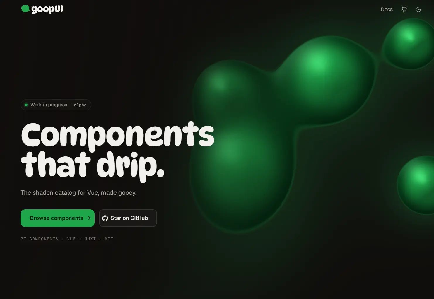
goopUI is a Vue and Nuxt UI component library that adds liquid, physics-driven animations to shadcn-style buttons, form controls, menus, dialogs, and other UI components.
It uses a decorative goo layer that responds to pointer input and changes in component state.
Features
- Vue components with shadcn-vue-style APIs, Reka UI primitives, and Tailwind CSS styling.
- Liquid motion for button presses, checkbox selection, menu opening, tab changes, and progress indicators.
- SVG-based goo effects with an optional canvas renderer powered by the shared physics engine.
- 3 animation presets:
subtle,playful, andwild. - Per-component effect controls through Vue props and
--goop-*CSS variables. - Nuxt module for component auto-imports, CSS registration, and Tailwind source detection.
- Static goo shapes in reduced-motion mode, with motion effects disabled.
How to Use goopUI
Clone the repository to try the components in the source playground.
Run the Source Playground
git clone https://github.com/Tmmcmasters/goopui.git
cd goopui
pnpm install
pnpm dev:playground
To run the documentation site locally at http://localhost:3001:
pnpm dev:wwwPackage Setup
Nuxt
Install the Nuxt module in a Nuxt 4 app with Tailwind CSS and shadcn theme variables:
pnpm add @goopui/nuxt// nuxt.config.ts
export default defineNuxtConfig({
modules: ['@goopui/nuxt'],
goop: { preset: 'subtle' },
})The module registers components with the Goop prefix and imports their stylesheet:
<template>
  <GoopButton variant="outline">Save changes</GoopButton>
</template>
Vue
Install the Vue package:
pnpm add @goopui/vueImport the package stylesheet after Tailwind in your CSS entry:
@import "tailwindcss";
@import "@goopui/vue/goop.css";
<script setup lang="ts">
import { GoopButton } from '@goopui/vue'
</script>
<template>
<GoopButton preset="playful">Save</GoopButton>
<GoopButton variant="destructive" :shockwave="false">Delete</GoopButton>
</template>For app-wide animation defaults, register GoopPlugin in main.ts:
import { createApp } from 'vue'
import { GoopPlugin } from '@goopui/vue'
import App from './App.vue'
createApp(App).use(GoopPlugin, { preset: 'subtle' }).mount('#app')
GoopToaster also requires vue-sonner and its vue-sonner/style.css stylesheet.
Available UI Components
Actions
| Component | Description |
|---|---|
| Button | A pressable control with size and style variants and liquid click effects. |
| Toggle (experimental) | A pressed-state control for switching options on or off; also includes Toggle Group. |
Forms
| Component | Description |
|---|---|
| Switch | An on/off switch with a liquid-like thumb animation. |
| Checkbox | A checkable control with animated selection feedback. |
| Radio Group | A group of options that allows one selection at a time. |
| Input (experimental) | A text-entry control; also includes Textarea. |
| Slider | A draggable control for selecting a value along a track. |
| Select (experimental) | A dropdown control for choosing an option from a list. |
| Combobox (experimental) | A searchable input for finding and selecting an option. |
| NumberField (experimental) | An input for entering and adjusting numeric values. |
| InputOTP (experimental) | A segmented input for one-time verification codes. |
| Label (experimental) | A text label associated with a form control. |
Overlays
| Component | Description |
|---|---|
| Popover | A floating content panel anchored to a trigger. |
| Dropdown Menu | A menu of actions opened from a trigger. |
| Tooltip | A short contextual hint displayed on hover or focus. |
| Dialog (experimental) | A modal window for focused content or tasks. |
| Alert Dialog (experimental) | A confirmation dialog for important actions. |
| Sheet (experimental) | A panel that slides into view from a screen edge. |
| Drawer (experimental) | A sliding panel for contextual content or controls. |
| Hover Card (experimental) | A preview card shown when a user hovers over a trigger. |
| Context Menu (experimental) | A menu opened through a context-menu interaction. |
| Component | Description |
|---|---|
| Tabs | A set of tabs for switching between related panels. |
| Page Transition (experimental) | Animated transitions between pages or views. |
| Command (experimental) | A searchable command menu for actions and navigation. |
| Sidebar (experimental) | A side panel for application navigation. |
Feedback
| Component | Description |
|---|---|
| Spinner | An animated indicator for loading states. |
| Progress | A visual indicator of task completion. |
| Toaster | A container for short toast notifications. |
| Skeleton (experimental) | Placeholder shapes shown while content loads. |
| Badge (experimental) | A compact label for status or category information. |
Layout
| Component | Description |
|---|---|
| Accordion (experimental) | Expandable content sections; also includes Collapsible. |
| Blob (planned) | A decorative liquid-shaped element planned for a future release. |
| Card (experimental) | A container for grouped content and actions. |
| Avatar (experimental) | An image or fallback representing a person or entity. |
| Separator (new) | A visual divider between content sections. |
Customize the Goo Effects
Component colors follow shadcn tokens such as --primary, --destructive, and --popover. Set animation presets and --goop-* variables on the root or a component parent.
:root {
  --goop-preset: playful;
}
.settings-panel {
  --goop-preset: subtle;
  --goop-shockwave: 0;
}
.product-hero {
  --goop-preset: wild;
  --goop-drip-size: 9;
}
Nuxt Module Options
Set module options under goop in nuxt.config.ts.
| Option | Behavior and default |
|---|---|
prefix | Auto-import prefix; defaults to Goop. Use '' for unprefixed component names. |
css | Registers @goopui/vue/goop.css; defaults to true. |
tailwindSource | Adds the Vue package to Tailwind v4’s source scan; defaults to true. |
preset | subtle, playful (default), or wild. |
renderer | svg (default) or canvas. |
finish | solid (default) or oil. |
splash | near (default), escape, or off. |
reducedMotion | auto (default), true, or false. |
sound | Opt-in audio through Cuelume; defaults to false. |
pageTransition | Experimental page transition; off by default, accepts true or an options object. |
Alternatives and Related Resources