The Future of Web Dev
The Future of Web Dev
PlopUI: Hand-Drawn React/Next.js UI Component Library
A hand-drawn UI component library for creative websites and apps. Forms, navigation, cards, and feedback share ink outlines, sticker interactions, and coordinated paper themes.
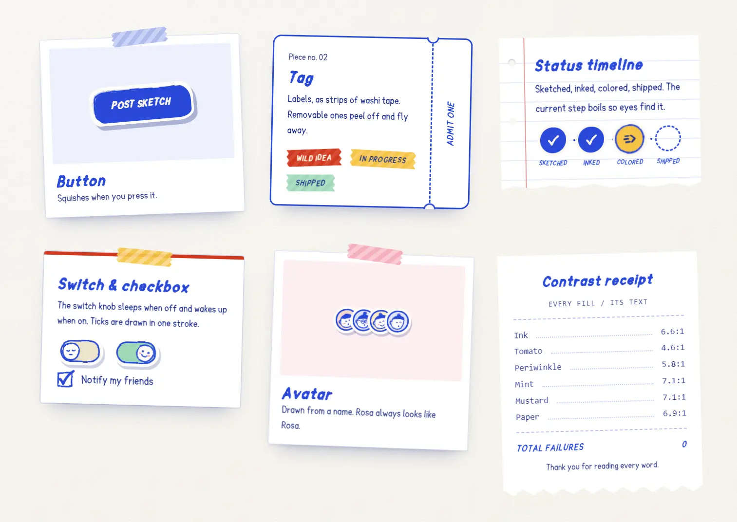
PlopUI is a React UI component library that gives forms, navigation, cards, and feedback a hand-drawn, sticker-style appearance.
Buttons squish on press, cards resemble paper stationery, and five themes keep that style consistent across product pages and dashboards.
Features
- UI components for actions, inputs, navigation, cards, loading states, and notifications.
- Seeded tilts, wobbly ink outlines, sticker shadows, and animated press feedback.
- 5 paper themes with light and dark colors, plus adjustable corner roundness.
- Sketchpop lettering and CSS variables for colors, typography, shadows, and motion.
- Native buttons and inputs, visible focus indicators, and reduced-motion settings.
- Optional haptics, sound effects, ink bursts, and character mascots.
- npm distribution and a shadcn registry for editable examples and ready-made blocks.
Use Cases
- Review teams track assigned tickets and approval stages on a sketchbook-style dashboard.
- Storefront customers adjust cart quantities and check their loyalty stamps.
- Portfolio contact forms display a matching toast after an inquiry is submitted successfully.
How To Use It
Install PlopUI
Install the React components and Sketchpop font package in your React app. Tailwind CSS is optional:
npm install @plop-ui/react @plop-ui/fontsSet Up the Next.js App Router
Import the styles in app/layout.tsx. Paint the background on <body> to fill short pages, and let PlopProvider manage the components’ effects and toast messages:
// app/layout.tsx
import "@plop-ui/fonts/fonts.css";
import "@plop-ui/react/styles.css";
import { PlopProvider } from "@plop-ui/react";
export default function RootLayout({
  children,
}: {
  children: React.ReactNode;
}) {
  return (
    <html lang="en">
      <body
        className="plop-surface"
        data-plop-surface="poster"
        style={{ margin: 0, minHeight: "100vh" }}
      >
        <PlopProvider surface="poster" paint={false}>
          {children}
        </PlopProvider>
      </body>
    </html>
  );
}
Basic Usage: A Sticker Button with Feedback
Create a Client Component for the click handler:
// app/components/review-button.tsx
"use client";
import { useState } from "react";
import { Button, toast } from "@plop-ui/react";
export function ReviewButton() {
  const [reviewed, setReviewed] = useState(false);
  function markReviewed() {
    setReviewed(true);
    toast.success("Review marked complete", { buddy: true });
  }
  return (
    <Button
      variant="ink"
      size="lg"
      buddy="peek"
      burst="sparkle"
      disabled={reviewed}
      onClick={markReviewed}
    >
      {reviewed ? "Reviewed" : "Mark as reviewed"}
    </Button>
  );
}
Install Through the shadcn Registry
PlopUI’s shadcn registry installs the npm packages, writes components/plop/plop-provider.tsx on the first run, and adds an editable components/plop/button-example.tsx:
npx shadcn@latest add @plopui/buttonImport PlopProvider from @/components/plop/plop-provider in your root layout for this installation path. Component implementations stay in @plop-ui/react. The direct button registry URL works with the CLI as well.
Install the ready-made blocks as editable TSX files:
npx shadcn@latest add @plopui/settings-panel
npx shadcn@latest add @plopui/signup-card
npx shadcn@latest add @plopui/empty-state
Available UI Components
Actions
Button, ButtonLink, IconButton, Menu, Tooltip.
Inputs
Select, MultiSelect, TextField, TextArea, Switch, Checkbox, RadioGroup, Radio, SearchField, Slider, NumberStepper.
Navigation
CommandPalette, Breadcrumb, Pagination, Tabs, TabList, Tab, TabPanel.
Cards and Display
Tag, Avatar, AvatarStack, AvatarSymbol, TicketCard, UnitCard, UnitCardRow, StickyNote, Eta, StampCard, Count, StatusDot, EmptyState.
Feedback and Loading
StatusTimeline, Progress, ProgressRing, Skeleton, SkeletonText, Spinner, SpinnerMark, Loader, Callout, Toast, Toaster, toast().
Characters and Lettering
Buddy, BuddyPeek, Heading, Lettering, WordSticker, Doodle, Sheet.
Foundations
PlopProvider, PlopFilters.
Hooks
usePlop, useHaptics, useSound, useBoil, useReducedMotion, useInkBurst, useDelayedLoading, useIsMac.
Utilities and Constants
onColor, contrastRatio, parseColor, luminance, seed, seededTilt, seededPick, hashString, STAMP_INKS, BUDDY_CAST, DOODLE_PATHS, BURST_COLORS, BURST_PRESETS, BURST_STYLES, HAPTIC_PATTERNS, DEEP_INK, CREAM.
Hand-Drawn Icons
PlusIcon, MinusIcon, CloseIcon, PinIcon, PhoneIcon, BellIcon, CheckIcon, CopyIcon, LinkIcon, SearchIcon, ArrowDownIcon, ArrowRightIcon, ExternalIcon, MenuIcon, HapticsIcon, SoundIcon, PaperIcon, CuttingMatIcon, InfoIcon, WarnIcon, ErrorIcon, SuccessIcon, MoreIcon, EditIcon, TrashIcon.
Try the Playground
Use the PlopUI Playground to arrange components on a sticker board, adjust their props, and copy example code. The lettering editor exports React, HTML, SVG, and PNG.
Advanced Example: A Server-Rendered Review Status Page
A review page can render TicketCard, Tag, and StatusTimeline in a Next.js Server Component. The timeline uses a zero-based current index and accepts labels or objects containing label and time.
// app/reviews/page.tsx
import { StatusTimeline, Tag, TicketCard } from "@plop-ui/react";
export default function ReviewsPage() {
  return (
    <main>
      <TicketCard
        title="Homepage illustrations"
        meta="Design review #1042"
        stub="In review"
      >
        <Tag tone="mint">Assigned</Tag>
      </TicketCard>
      <StatusTimeline
        label="Homepage illustration review"
        current={1}
        steps={[
          { label: "Submitted", time: "9:15 AM" },
          { label: "In review" },
          { label: "Approved" },
        ]}
      />
    </main>
  );
}
Styling and Theming
Choose a paper theme with the provider’s surface prop: poster (default), mat, notebook, kraft, or riso. Set theme to light, dark, or system (default).
<PlopProvider
  surface="kraft"
  theme="dark"
  roundness={0.75}
  stickerShadow="stripes"
>
  {children}
</PlopProvider>
Set --plop-roundness in your global CSS to adjust corners across the UI.
A value of 1 is the default, 0 produces square corners, and 2 makes corners more rounded.
The --plop-* tokens control ink colors, paper backgrounds, typography, and motion.
:root {
  --plop-roundness: 1.25;
}
PlopProvider Props
| Prop | Values and behavior |
|---|---|
children | Content inside the provider. |
surface | poster, mat, notebook, kraft, or riso; inherits an enclosing paper setting when omitted. |
theme | system (default), light, or dark. |
haptics | boolean; on by default and inherited from a parent provider when omitted. |
sound | boolean; off by default and inherited from a parent provider when omitted. |
reducedMotion | system (default), always, or never; inherited from a parent provider when omitted. |
stickerShadow | soft (default), solid, stripes, outline, or none. |
paint | true (default); use false when <body> paints the background. |
toaster | true (default); controls the toast area rendered by the provider. |
toastBackdrop | solid (default), dots, or none. |
roundness | Numeric corner multiplier; 1 is the default. |
className, style, native div attributes | Forwarded to the provider’s wrapping div. |
FAQs
Q: How do I use Next.js Link with a sticker button?
A: Import Link from next/link and render <ButtonLink as={Link} href="/projects">Projects</ButtonLink>.
Q: Can Select and MultiSelect submit values to a Next.js Server Action?
A: Yes. Set name on the component. Read a single Select value with formData.get(name) or multiple selections with formData.getAll(name) in the action.
Q: Why does a Buddy character overlap content above a button?
A: The mascot peeks roughly 30 pixels above the sticker. Leave enough vertical space around buttons using buddy or buddy="peek".
Alternatives and Related Resources