The Future of Web Dev
The Future of Web Dev
Dynamic Island Component for React with Live Activities – islandcn
Add a Dynamic Island component to React apps for live status updates. The activity API controls compact content, alerts, and expanded actions.
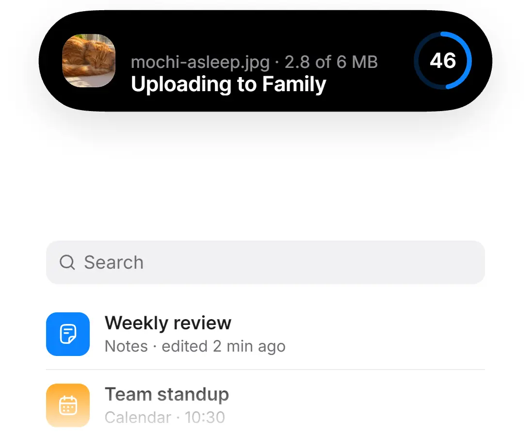
islandcn is a React Dynamic Island component that shows ongoing app tasks in an animated pill, expands for controls, and can split to display independent activities.
You can install editable source through shadcn and connect uploads, timers, media playback, calls, or custom status updates to its activity API.
Features
- Spring-driven transitions between idle, compact, expanded, and split layouts.
- Tap callbacks, long-press expansion, keyboard interactions, and temporary alerts.
- Priority rules and groups for concurrent activities.
- Ready-made activity presets and editable source files installed through shadcn.
- Reduced-motion transitions and screen-reader activity labels.
Use Cases
- Show a file upload at the top of a dashboard while users work in other panels.
- Display the countdown for a timed session alongside another active task.
- Show a ride’s arrival time and reveal a contact action in the expanded pill.
How To Use It
1. Install the Core Component
Initialize shadcn if components.json is missing:
npx shadcn@latest initInstall the island engine:
npx shadcn@latest add https://islandcn.dev/r/island-core.json2. Mount the Island in Next.js
In the App Router, put IslandProvider in a client component and render it from the root layout. Use the lib alias from components.json for imports.
// app/providers.tsx
"use client";
import type { ReactNode } from "react";
import { Island, IslandProvider } from "@/lib/island";
export function Providers({ children }: { children: ReactNode }) {
  return (
    <IslandProvider>
      <Island placement="viewport" />
      {children}
    </IslandProvider>
  );
}
// app/layout.tsx
import type { ReactNode } from "react";
import { Providers } from "./providers";
export default function RootLayout({ children }: { children: ReactNode }) {
return (
<html lang="en">
<body>
<Providers>{children}</Providers>
</body>
</html>
);
}3. Basic Usage: Start, Update, and End an Activity
Add this client component to a page under Providers to preview start, update, and end. Connect the handlers to your export job when integrating it.
// components/report-activity-demo.tsx
"use client";
import { useIslandActions } from "@/lib/island";
export function ReportActivityDemo() {
  const island = useIslandActions();
  return (
    <div className="flex flex-wrap gap-3">
      <button
        type="button"
        onClick={() =>
          island.start({
            id: "report-export",
            label: "Preparing customer report",
            compact: {
              leading: <span>CSV</span>,
              trailing: <span>Working</span>,
            },
            expanded: {
              center: <strong>Customer report</strong>,
              bottom: <span>Preparing export</span>,
            },
          })
        }
      >
        Start
      </button>
      <button
        type="button"
        onClick={() =>
          island.update("report-export", {
            compact: { trailing: <span>Ready</span> },
            expanded: { bottom: <span>Report ready to download</span> },
            alert: true,
          })
        }
      >
        Complete
      </button>
      <button type="button" onClick={() => island.end("report-export")}>
        Clear
      </button>
    </div>
  );
}
Advanced Example: Upload Progress
Install the upload activity preset:
npx shadcn@latest add https://islandcn.dev/r/upload-activity.jsonPass the selected file and actual upload progress from your application’s upload handler. Mount the component during the upload, show progress={1} briefly after completion, and unmount it when the status is cleared.
// components/upload-status.tsx
"use client";
import { UploadActivity } from "@/components/islandcn/upload-activity";
type UploadStatusProps = {
  file: File | null;
  progress: number;
  onCancel: () => void;
};
export function UploadStatus({ file, progress, onCancel }: UploadStatusProps) {
  if (!file) return null;
  return (
    <UploadActivity
      fileName={file.name}
      progress={progress}
      totalBytes={file.size}
      destination="Project files"
      onCancel={onCancel}
    />
  );
}
Available Activity Presets
Each preset installs through the shadcn registry. Installing one also adds island-core, island-content, and its dependencies if they are missing.
| Preset | Registry item and function |
|---|---|
| Upload | upload-activity: File thumbnail, progress ring, and completion check. |
| Timer | timer-activity: Countdown with pause and cancel controls. |
| Now Playing | now-playing-activity: Artwork, audio levels, and playback controls. |
| Incoming Call | call-activity: Caller details, answer and decline actions, and call timer. |
| Ride or Delivery ETA | eta-activity: Arrival countdown, driver details, and optional contact button. |
| Recording | recording-activity: Recording indicator, elapsed time, and audio levels. |
| Nearby Transfer | nearby-transfer-activity: File transfer status and stop control. |
| Battery | battery-activity: Charge level and charging state. |
| Split Demo | split-demo: Example showing timer and music activities together. |
Activity API
useIsland() and useIslandActions()
Use useIsland() when the component reads the current activities or presentation during render. Use useIslandActions() when it only starts or changes activities and does not need a subscription.
| Member | Behavior |
|---|---|
start(options) | Starts an activity and returns a handle with id, update(changes), and end(). Reusing an id updates it. |
update(id, changes) | Updates an existing activity. Nested content fields merge. |
end(id) | Ends an activity with the dismiss transition. |
expand(id?) | Expands the specified activity or the primary one. |
collapse() | Closes the expanded view. |
activities | Read-only list, including hidden members of a group. |
presentation | Current "idle", "compact", "minimal", or "expanded" state. |
ActivityOptions and Updates
| Field | Type, default, and behavior |
|---|---|
id | Required string. Stable activity identifier. |
label | string, defaults to id. Activity label for screen readers. |
priority | number, default 0. Higher values take the attached pill when activities split. |
group | Optional string. Activities in one group display one at a time. |
onPress | Optional () => void. Runs on a short tap. |
alert | boolean, default false. Temporarily expands the activity. |
compact | { leading?: ReactNode, trailing?: ReactNode }. Content on either side of the pill. |
minimal | Optional ReactNode. Fallback when the split is too wide. Defaults to compact.leading. |
expanded | { leading?: ReactNode, trailing?: ReactNode, center?: ReactNode, bottom?: ReactNode }. Expanded content. |
update() accepts compact, minimal, expanded, label, priority, onPress, alert, and transition. Use transition: "crossfade" to replace content with a fade. The default "update" changes content in place. An update merges nested slots, and setting a slot to undefined clears it.
Position, Motion, and Styling
<Island /> Props
| Prop | Type, default, and behavior |
|---|---|
placement | `”container” |
label | string, default "Live activities". Accessible region label. |
keyline | `”auto” |
backdrop | Optional string. Hex or rgb() background color used for keyline strength. |
className | Optional string. Class on the island region. |
style | Optional CSSProperties. Inline styles on the island region. |
<IslandProvider /> Props
| Prop | Type, default, and behavior |
|---|---|
children | Required ReactNode. Provider children. |
reducedMotion | `”user” |
motion | Optional IslandMotionOverrides. Spring and transition timing overrides. |
metrics | Optional IslandMetricsOverrides. Island position and geometry overrides. |
clock | Optional IslandClock. Custom timing source for tests and captures. |
devtools | `boolean |
In app/providers.tsx, configure the island’s spring response and its offset from the top:
<IslandProvider
  motion={{ shape: { expand: { response: 0.42, dampingFraction: 0.78 } } }}
  metrics={{ top: 10 }}
>
  <Island placement="viewport" keyline="auto" backdrop="#101114" />
  {children}
</IslandProvider>
Alternatives and Related Resources
- EasyUI: 110+ Animated React Components for shadcn/ui
- Animated Next.js UI Components with Tailwind CSS and Motion – Spark UI
- Copy-Paste UI Components with Tailwind and Framer Motion – Cult UI
- Morph UI: React View Transition Components
FAQs
Q: Why does useIsland() throw an error?
A: It needs an IslandProvider above the calling component. In Next.js, mount the client-side provider from the root layout and put activity components below it.
Q: Why is text cut off when two activities run?
A: Compact slots have a 72-pixel width limit, and the detached capsule leaves less space for its trailing value. Use a short number, ring, or glyph. Supply minimal content for the narrow split fallback.
Q: Can I use islandcn in a Vite React project?
A: Yes. Configure shadcn and the @ alias in tsconfig.json and vite.config.ts. Mount IslandProvider and Island around your app in src/main.tsx.
