The Future of Web Dev
The Future of Web Dev
Build Custom UI Components with Tailwind and shadcn – eo-n/ui
Build accessible, custom UI components with eo-n/ui. Uses Tailwind v4, shadcn, & Base UI for flexible development.
eo-n/ui is a collection of accessible and customizable UI primitives that help you build your own components easily using Tailwind CSS, shadcn/ui, and Base UI.
It provides the foundational elements rather than a pre-built library. You get primitives featuring the modern design principles of shadcn and the flexibility of Base UI’s themeable components.
Features
📦 35+ Core Components – From accordions to tooltips, covering essential UI patterns
♿ Accessibility First: Built with accessibility in mind from the ground up.
🧱 Primitive-Based: Provides foundational building blocks, not restrictive pre-styled components.
🔧 Flexible Theming: Leverages Base UI for components that adapt to your design system.
🎨 Highly Customizable: Offers full control over styling and behavior for unique implementations.
✨ Modern Aesthetics: Integrates shadcn for clean and elegant design patterns.
🚀 Easy Integration: Uses the shadcn CLI for straightforward component addition.
🧰 Design System Friendly – Create components that align perfectly with your design guidelines
Installation
1. Setup shadcn. Follow the shadcn installation guide to configure your project.
2. Install Base UI. Use your preferred package manager to install Base UI:
npm i @base-ui-components/reactor
pnpm add @base-ui-components/reactor
yarn add @base-ui-components/reactor
bun add @base-ui-components/react3. Setup Portals. Apply the Root class to your app layout:
<body>
<div className="Root">
{children}
</div>
</body>
4. Update Global Styles. Modify your globals.css:
@import "tailwindcss";
@layer base {
* {
@apply border-border;
}
body {
@apply bg-background text-foreground;
}
.Root {
@apply isolate;
}
}
5. Add Components. Add UI components easily through the shadcn CLI:
npm
npx shadcn@latest add "https://eo-n.vercel.app/r/accordion"
or
pnpm
pnpm dlx shadcn@latest add "https://eo-n.vercel.app/r/accordion"
or
yarn
yarn dlx shadcn@latest add "https://eo-n.vercel.app/r/accordion"
or
bun
bun x shadcn@latest add "https://eo-n.vercel.app/r/accordion"
Usage
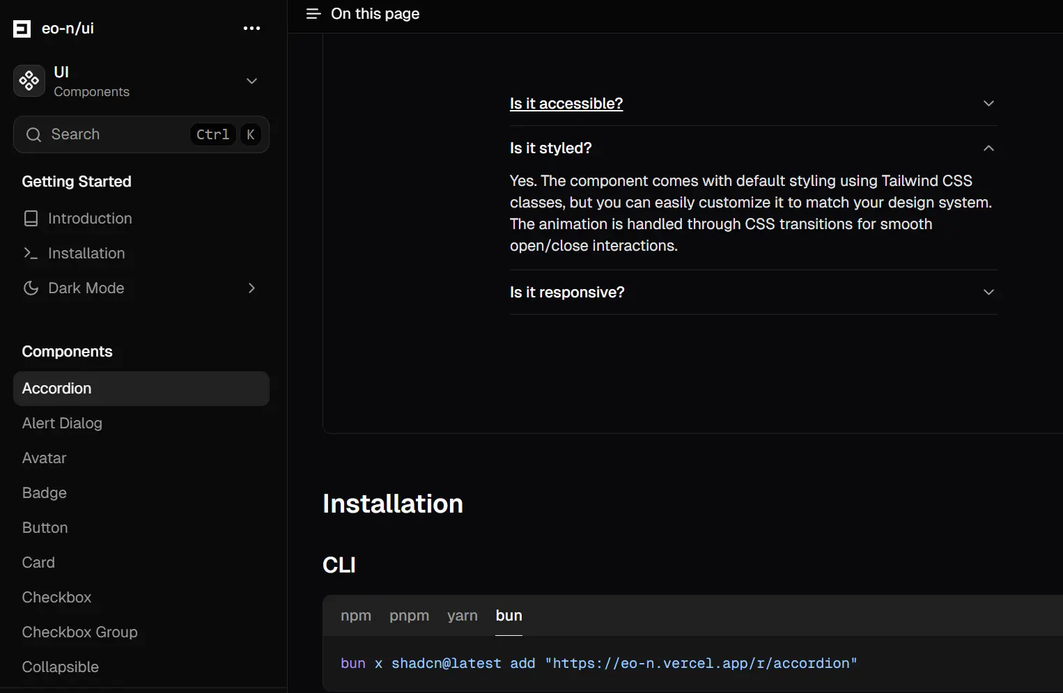
1. Visit the eo-n/ui documentation website to view the available UI primitives like Accordion, Button, Dialog, Input, etc.
2. Use the shadcn@latest add command followed by the specific component’s URL from the eo-n/ui registry. Replace "accordion" with the component you need.
# npm
npx shadcn@latest add "https://eo-n.vercel.app/r/accordion"
# pnpm
pnpm dlx shadcn@latest add "https://eo-n.vercel.app/r/accordion"
# yarn
yarn dlx shadcn@latest add "https://eo-n.vercel.app/r/accordion"
# bun
bun x shadcn@latest add "https://eo-n.vercel.app/r/accordion"
3. After adding a component, you can customize it to fit your needs:
import {
  Accordion,
  AccordionContent,
  AccordionItem,
  AccordionTrigger,
} from "@/components/ui/accordion";

export function AccordionDemo() {
  return (
    <Accordion className="mx-auto w-full max-w-md">
      <AccordionItem value="item-1">
        <AccordionTrigger>Is it accessible?</AccordionTrigger>
        <AccordionContent>
          Yes. It adheres to the WAI-ARIA design pattern and is fully keyboard
          navigable. The component is built with proper focus management and
          ARIA attributes for screen reader compatibility.
        </AccordionContent>
      </AccordionItem>
      <AccordionItem value="item-2">
        <AccordionTrigger>Is it styled?</AccordionTrigger>
        <AccordionContent>
          Yes. The component comes with default styling using Tailwind CSS
          classes, but you can easily customize it to match your design system.
          The animation is handled through CSS transitions for smooth open/close
          interactions.
        </AccordionContent>
      </AccordionItem>
      <AccordionItem value="item-3">
        <AccordionTrigger>Is it responsive?</AccordionTrigger>
        <AccordionContent>
          Absolutely. The accordion adapts to different screen sizes and works
          well on both desktop and mobile devices. The content area smoothly
          expands and collapses regardless of the amount of content inside.
        </AccordionContent>
      </AccordionItem>
    </Accordion>
  );
}
Available Components
- Basic elements: Button, Input, Textarea, Checkbox
- Layout components: Card, Separator, Collapsible
- Navigation: Tabs, Toggle Group, Toolbar, Dropdown Menu
- Feedback: Progress, Meter, Toast, Skeleton
- Overlay: Dialog, Popover, Alert Dialog, Tooltip
- And many more specialized components
FAQs
Q: Does this replace shadcn/ui?
A: No, it extends shadcn with additional components and Base UI integration.
Q: Can I use it without Tailwind?
A: The components rely on Tailwind for styling. Use PostCSS if migrating from another system.
Q: How does this differ from component libraries like MUI?
A: It provides primitives for building your own library rather than pre-designed solutions.