The Future of Web Dev
The Future of Web Dev
WA UI: WhatsApp UI Components for shadcn/ui
Get editable WhatsApp-style React components for messages, media, templates, reactions, contacts, and interactive Business UI.
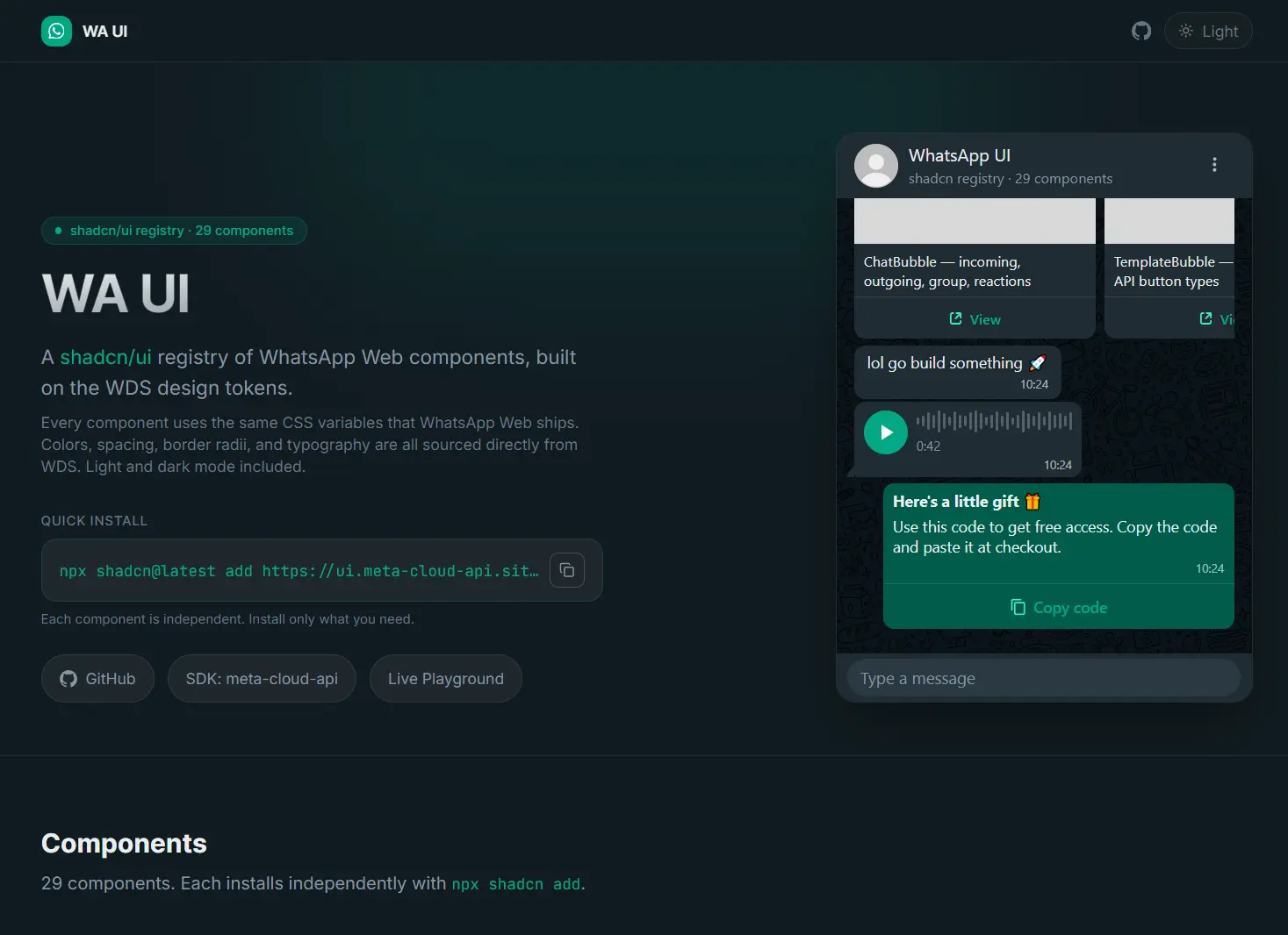
WA UI is a React and shadcn/ui registry for building WhatsApp Web-style chat UI from local TSX components based on WDS design tokens.
It currently includes 29+ UI components accross conversation UI, media messages, WhatsApp Business templates, interactive message types, contacts, locations, reactions, and message states.
Features
- Individually installable shadcn registry items.
- WhatsApp WDS colors, spacing, border radii, and typography tokens.
- Tailwind CSS theme mappings.
- Light and dark WhatsApp theme variables.
- WhatsApp Business templates and interactive message patterns.
- Local React and TypeScript component source.
Use Cases
- Customer support consoles with WhatsApp-style conversations, read receipts, attachments, reactions, and contact details.
- Shared team inboxes with conversation rows, unread states, message composers, and message status indicators.
- Meta Cloud API dashboards with previews for templates, interactive messages, media, contacts, and locations.
How To Use WA UI
Initialize shadcn/ui
Run the shadcn initializer when the project does not have a components.json file:
npx shadcn@latest initInstall a Basic Component
Components use individual registry URLs.
npx shadcn@latest add https://ui.meta-cloud-api.site/r/message-input.jsonImport it from the generated WhatsApp component directory:
"use client";
import { MessageInput } from "@/components/ui/whatsapp/message-input";
export default function ChatComposer() {
  function handleSubmit(message: string) {
    console.log(message);
  }
  return (
    <MessageInput
      placeholder="Message"
      onSubmit={handleSubmit}
    />
  );
}
Install ChatBubble
ChatBubble imports the shared message-status and reaction files. Install those registry items first:
npx shadcn@latest add https://ui.meta-cloud-api.site/r/message-status.json
npx shadcn@latest add https://ui.meta-cloud-api.site/r/reaction.json
npx shadcn@latest add https://ui.meta-cloud-api.site/r/chat-bubble.json
import { ChatBubble } from "@/components/ui/whatsapp/chat-bubble";
export default function Conversation() {
return (
<div className="space-y-1 bg-wa-conversation-bg p-6">
<ChatBubble timestamp="10:24" showTail>
Can you send the updated invoice?
</ChatBubble>
<ChatBubble
variant="outgoing"
timestamp="10:25"
status="read"
showTail
>
Sending it now.
</ChatBubble>
</div>
);
}All Available UI Components
| Category | UI Components |
|---|---|
| Conversation UI | chat-bubble, chat-list-item, chat-header, message-input, date-separator, typing-indicator, message-status, chat-menu |
| Media and message content | image-bubble, video-bubble, voice-message-bubble, file-attachment-bubble, sticker-bubble, contact-bubble, location-bubble |
| Business and interactive messages | template-bubble, carousel-template, call-permission, interactive-button-bubble, cta-url-bubble, list-message-bubble, interactive-reply-bubble |
| Message metadata and utilities | reaction-pill, reaction, system-message-bubble, reply-preview, forwarded-label, unsupported-message-bubble, action-button |
WhatsApp Business Templates
TemplateBubble renders text, image, video, document, and location headers. Button types include url, phone_number, quick_reply, copy_code, flow, catalog, otp, and call_permission.
The component imports Base UI’s Button primitive. Install Base UI first when the package is absent:
npm install @base-ui/react
npx shadcn@latest add https://ui.meta-cloud-api.site/r/template-bubble.json
import { TemplateBubble } from "@/components/ui/whatsapp/template-bubble";
export default function OrderTemplate() {
return (
<TemplateBubble
header={{
type: "text",
text: "Order update",
}}
body="Your order {{1}} has shipped."
footer="Acme Store"
timestamp="10:24"
buttons={[
{
type: "url",
label: "Track order",
url: "https://example.com/orders/1234",
},
{
type: "copy_code",
label: "Copy offer code",
code: "SAVE10",
},
]}
/>
);
}Styling and Dark Mode
WA UI stores its theme variables in:
components/ui/whatsapp/styles/whatsapp.cssOverride the installed variables after the WA UI stylesheet:
:root {
  --wa-msg-max-width: 68%;
  --wa-bubble-outgoing: #d9fdd3;
  --wa-chat-spacing: 18px;
}
Use either .dark or data-theme="dark" on a parent element:
<div data-theme="dark">
  <!-- WhatsApp components -->
</div>
The dark token set changes conversation surfaces, incoming and outgoing bubbles, text, icons, read receipts, form controls, and wallpaper colors.
Alternatives and Related Resources
- Chat UI Components for React and shadcn/ui – chatcn
- Copy-paste React Components for AI Chat UI – Nexus UI
- Build Modern AI Chatbots with Simple-AI UI Components
- Accessible Shadcn Chat Input for React Apps
FAQs
Q: Does WA UI require Next.js?
A: No. The components are React TSX files installed through the shadcn registry.
Q: Why does ChatBubble report missing imports?
A: Install the message-status and reaction registry items before chat-bubble.
Q: How do I switch WA UI to dark mode?
A: Set .dark or data-theme="dark" on a parent element. The stylesheet contains a dedicated dark WDS token set.
Q: Does WA UI send WhatsApp or Cloud API messages?
A: No. WA UI renders the frontend interface. Connect its components to your own Meta Cloud API, message state, persistence, and backend code.