The Future of Web Dev
The Future of Web Dev
Svelte Bits: Official React Bits Port for Svelte Projects
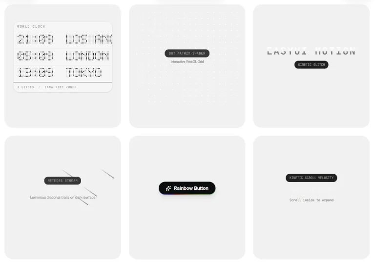
Explore 120+ React Bits animations rebuilt for Svelte projects, from animated text and cursor effects to interactive UI and WebGL backgrounds.
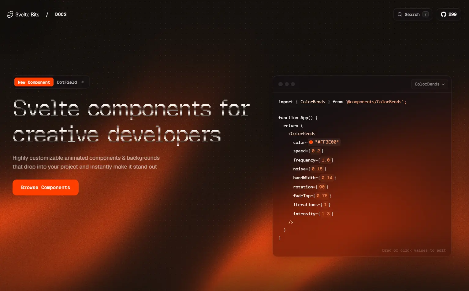
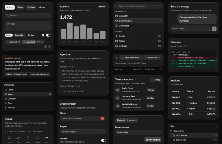
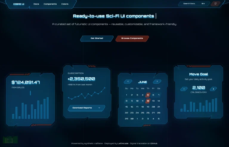
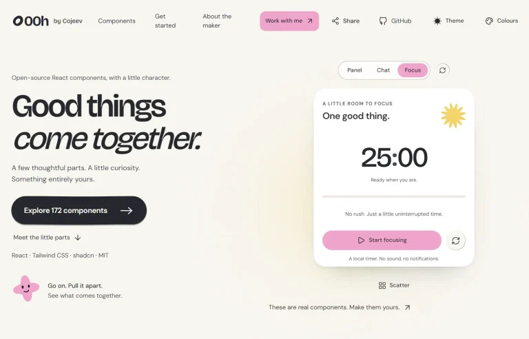
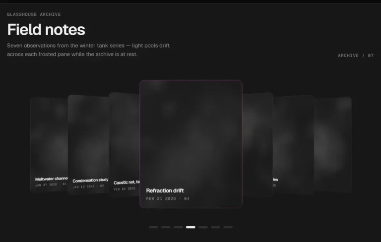
Svelte Bits is a Svelte 5 component library that ports React Bits text animations, interaction effects, UI components, and animated backgrounds to Svelte projects.
Each item installs as editable .svelte source through a direct shadcn registry URL, jsrepo, or manual copy-paste.
Features
- Official Svelte port of React Bits.
- 129 items across text animations, animations, UI components, and backgrounds.
- Original animation dependencies, shaders, physics, spring settings, props, and behavior.
- Standalone
.sveltefiles with component-specific dependencies.
What’s Included
| Category | Components |
|---|---|
| Animations | Animated Content, Fade Content, Electric Border, Orbit Images, Pixel Transition, Glare Hover, Antigravity, Logo Loop, Target Cursor, Magic Rings, Laser Flow, Magnet Lines, Ghost Cursor, Gradual Blur, Click Spark, Cursor Grid, Magnet, Sticker Peel, Pixel Trail, Cubes, Metallic Paint, Noise, Shape Blur, Crosshair, Image Trail, Ribbons, Splash Cursor, Meta Balls, Blob Cursor, Star Border |
| UI Components | Animated List, Scroll Stack, Bubble Menu, Magic Bento, Circular Gallery, Reflective Card, Card Nav, Stack, Pill Nav, Tilted Card, Masonry, Glass Surface, Dome Gallery, Chroma Grid, Folder, Staggered Menu, Model Viewer, Profile Card, Dock, Gooey Nav, Pixel Card, Carousel, Spotlight Card, Border Glow, Flying Posters, Card Swap, Glass Icons, Decay Card, Flowing Menu, Elastic Slider, Counter, Infinite Menu, Stepper, Bounce Cards |
| Backgrounds | Liquid Ether, Prism, Dark Veil, Light Pillar, Silk, Floating Lines, Light Rays, Pixel Blast, Color Bends, Evil Eye, Line Waves, Radar, Soft Aurora, Aurora, Plasma, Plasma Wave, Particles, Gradient Blinds, Grainient, Grid Scan, Beams, Pixel Snow, Lightning, Prismatic Burst, Galaxy, Dither, Faulty Terminal, Ripple Grid, Dot Field, Dot Grid, Threads, Hyperspeed, Iridescence, Waves, Grid Distortion, Ballpit, Orb, Letter Glitch, Grid Motion, Shape Grid, Liquid Chrome, Balatro |
How To Use Svelte Bits
Install a Component with shadcn
Install Animated List with its direct registry URL:
pnpm dlx shadcn@latest add https://sveltebits.xyz/r/animated-list.jsonInstall Components with jsrepo
Initialize the Svelte Bits registry once, then add individual items:
pnpm dlx jsrepo init https://sveltebits.xyz/r
pnpm dlx jsrepo add aurora
Manual Installation
Copy the required .svelte source into your project and install the dependencies for that component.
Basic Usage: Animated List
The shadcn registry writes Animated List to $lib/components/svelte-bits/AnimatedList.svelte. Import it from that location:
<script lang="ts">
  import AnimatedList from '$lib/components/svelte-bits/AnimatedList.svelte';
  const releases = [
    'Version 3.2',
    'Version 3.1',
    'Version 3.0',
    'Version 2.9',
    'Version 2.8'
  ];
  function handleReleaseSelect(release: string, index: number) {
    console.log(`Selected ${release} at index ${index}`);
  }
</script>
<AnimatedList
  items={releases}
  onItemSelect={handleReleaseSelect}
  showGradients={true}
  enableArrowNavigation={true}
  displayScrollbar={true}
/>
Animated List Props
| Prop | Type | Default | Description |
|---|---|---|---|
items | string[] | Item 1 through Item 15 | Values rendered in the scrollable list. |
onItemSelect | (item: string, index: number) => void | undefined | Runs when an item is clicked or selected with Enter. |
showGradients | boolean | true | Shows the top and bottom gradient overlays. |
enableArrowNavigation | boolean | true | Activates keyboard navigation. |
class | string | "" | Extra classes for the root container. |
itemClass | string | "" | Extra classes for each list item. |
displayScrollbar | boolean | true | Shows or hides the custom scrollbar. |
initialSelectedIndex | number | -1 | Sets the initial selected item index. |
Alternatives and Related Resources