The Future of Web Dev
The Future of Web Dev
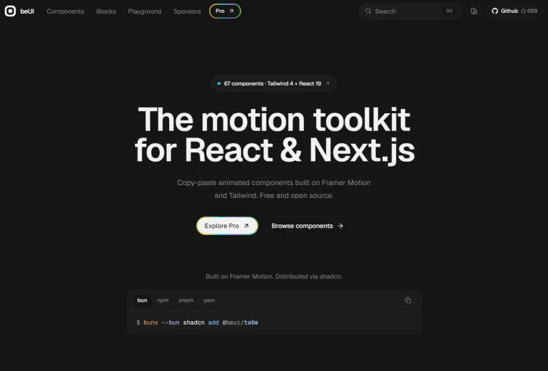
Copy-Paste TypeScript & Tailwind UI Components – Edil Ozi
Ready-to-use React UI components built with TypeScript and Tailwind CSS. Features dark/light modes, animations, and accessibility. Perfect for rapid development.

Edil Ozi is a React UI component library built with TypeScript and Tailwind CSS.
It provides a curated collection of production-ready UI components that can be directly copied and pasted into projects without complex installation processes.
Features
🎨 Dark and Light Mode Support – Every component includes both theme variants.
⚡ TypeScript First – All components written in TypeScript for better development experience.
🎭 Animation Rich – Built-in animations using Framer Motion and CSS transitions.
📱 Responsive Design – Mobile-first components that work across all screen sizes.
♿ Accessibility Focused – Proper focus states, ARIA attributes, and keyboard navigation.
🔧 Customizable – Easy to modify colors, sizes, and behaviors to match your brand.
🚀 Framework Agnostic Styling – While built for React, styling patterns work elsewhere.
Installation
1. Install the required dependencies in your React project:
npm install -D tailwindcss@latest clsx tailwind-merge framer-motionNote: Some components require additional dependencies like GSAP. Each component page displays badges indicating any extra requirements.
2. Create a utility file for className merging:
// lib/utils.ts
import clsx, { ClassValue } from "clsx";
import { twMerge } from "tailwind-merge";
export function cn(...inputs: ClassValue[]) {
  return twMerge(clsx(inputs));
}
3. Browse to any component page on the Edil Ozi website and copy the source code directly into your project. Each component includes complete implementation details and usage examples.
Here’s how to implement one of the button components:
// components/edil-ozi/buttons.tsx

import { FC } from "react";

import useCopyToClipboard from "@/hooks/useCopyToClipboard";

import CardWrapper from "@/components/card-wrapper";

interface Props {}

const Buttons: FC<Props> = () => {
  const { copy } = useCopyToClipboard();

  const buttons = [
    {
      name: "Base",

      component: (
        <button className="rounded-md px-8 py-2 text-sm font-semibold text-black transition hover:bg-gray-100 focus:outline-none focus:ring-gray-400 focus-visible:ring-2 dark:text-white dark:hover:bg-gray-900 dark:focus:ring-gray-700">
          Base
        </button>
      ),
    },

    {
      name: "Shimmer",

      component: (
        <button
          type="button"
          className="inline-flex h-12 animate-shimmer items-center justify-center rounded-md border border-slate-200 bg-[linear-gradient(110deg,#fff,45%,#f1f1f1,55%,#fff)] bg-[length:200%_100%] px-6 font-medium text-slate-600 transition-colors focus:outline-none focus:ring-slate-700 focus:ring-offset-2 focus:ring-offset-slate-400 focus-visible:ring-2 dark:border-slate-800 dark:bg-[linear-gradient(110deg,#000103,45%,#1e2631,55%,#000103)] dark:text-slate-400 dark:focus:ring-slate-300"
        >
          Shimmer
        </button>
      ),
      code: `
        // Button code
        <button className="inline-flex h-12 animate-shimmer items-center justify-center rounded-md border border-slate-200 dark:border-slate-800 bg-[linear-gradient(110deg,#fff,45%,#f1f1f1,55%,#fff)] dark:bg-[linear-gradient(110deg,#000103,45%,#1e2631,55%,#000103)] bg-[length:200%_100%] px-6 font-medium text-slate-600 dark:text-slate-400 transition-colors focus:outline-none focus-visible:ring-2 focus:ring-slate-700 focus:ring-offset-2 focus:ring-offset-slate-400 dark:focus:ring-slate-300">
          Shimmer
        </button>

        // tailwind.config.js code
        {
          "animation": {
            shimmer: "shimmer 2s linear infinite"
          },
          "keyframes": {
            shimmer: {
              from: {
                "backgroundPosition": "0 0"
              },
              to: {
                "backgroundPosition": "-200% 0"
              }
            }
          }
        }
      `,
    },

    {
      name: "Hover me",

      component: (
        <button
          type="button"
          className="group relative h-10 rounded-sm bg-slate-300 px-6 text-sm font-medium text-slate-800 shadow-md focus:outline-none focus:ring-slate-400 focus:ring-offset-1 focus:ring-offset-transparent focus-visible:ring dark:bg-slate-600 dark:text-white"
        >
          Hover me
          <div className="absolute inset-0 h-full w-full scale-0 rounded-sm transition-all duration-200 group-hover:scale-100 group-hover:bg-black/10 group-active:bg-black/20 dark:group-hover:bg-white/20"></div>
        </button>
      ),
    },

    {
      name: "Shiny day",

      component: (
        <button
          type="button"
          className="h-12 w-full rounded-sm border-none bg-[linear-gradient(325deg,#0044ff_0%,#2ccfff_55%,#0044ff_90%)] bg-[280%_auto] px-6 py-2 font-medium text-white shadow-[0px_0px_20px_rgba(71,184,255,0.5),0px_5px_5px_-1px_rgba(58,125,233,0.25),inset_4px_4px_8px_rgba(175,230,255,0.5),inset_-4px_-4px_8px_rgba(19,95,216,0.35)] transition-[background] duration-700 hover:bg-right-top focus:outline-none focus:ring-blue-400 focus:ring-offset-1 focus:ring-offset-white focus-visible:ring-2 dark:focus:ring-blue-500 dark:focus:ring-offset-black"
        >
          Shiny Day
        </button>
      ),
    },

    {
      name: "Gradient Borders",

      component: (
        <button
          type="button"
          className="group relative inline-block cursor-pointer rounded-full border-none bg-slate-100 p-0.5 text-xs font-semibold leading-6 text-white no-underline outline-none focus:ring-slate-400 focus:ring-offset-1 focus:ring-offset-slate-100 focus-visible:ring-1 dark:bg-slate-800 dark:focus:ring-slate-400 dark:focus:ring-offset-slate-950"
        >
          <span className="absolute inset-0 overflow-hidden rounded-full">
            <span className="absolute inset-0 rounded-full bg-[image:radial-gradient(75%_100%_at_50%_0%,rgba(189,56,222,1)_0%,rgba(56,189,248,1)_75%)] opacity-40 transition-opacity duration-500 group-hover:opacity-100 dark:bg-[image:radial-gradient(75%_100%_at_50%_0%,rgba(189,56,222,0.8)_0%,rgba(56,189,248,0.4)_75%)] dark:opacity-0" />
          </span>
          <div className="relative z-10 flex h-8 items-center space-x-2 rounded-full bg-slate-100 px-4 text-black/80 ring-2 ring-white/10 dark:bg-slate-950 dark:text-white/80">
            <span>Gradient Borders</span>
          </div>
          <span className="absolute bottom-0 left-[1.125rem] h-px w-[calc(100%-2.25rem)] bg-gradient-to-r from-emerald-400/0 via-emerald-400/90 to-emerald-400/0 transition-opacity duration-500 group-hover:opacity-40" />
        </button>
      ),
    },

    {
      name: "Diagonal Swipe",

      component: (
        <button
          type="button"
          className="relative overflow-hidden rounded-sm border-2 border-solid border-emerald-500 px-4 py-2 text-sm text-black transition-colors duration-700 ease-out before:absolute before:-left-10 before:top-0 before:z-[-1] before:h-full before:w-[0%] before:skew-x-[45deg] before:bg-emerald-500 before:transition-all before:delay-75 before:duration-700 before:content-[''] hover:before:w-[150%] focus:outline-none focus:ring-emerald-400 focus:ring-offset-1 focus:ring-offset-white focus:before:w-[150%] focus-visible:ring-2 dark:border-emerald-700 dark:text-white dark:before:bg-emerald-700 dark:focus:ring-emerald-800 dark:focus:ring-offset-black"
        >
          Diagonal Swipe
        </button>
      ),
    },

    {
      name: "Gradient",

      component: (
        <button
          type="button"
          className="group flex w-full items-center rounded-lg bg-[linear-gradient(144deg,#FF20F2,#2242F3_50%,#2ae120)] p-[3px] text-sm font-medium tracking-normal text-black transition-transform duration-200 hover:text-white hover:outline-none focus:outline-none focus:ring-gray-500 focus:ring-offset-1 focus:ring-offset-white focus-visible:ring-2 active:scale-90 active:outline-none dark:text-white dark:focus:ring-gray-500 dark:focus:ring-offset-black"
        >
          <span className="h-full w-full rounded-md bg-slate-100 px-4 py-2 duration-300 group-hover:bg-transparent dark:bg-slate-950">
            Gradient
          </span>
        </button>
      ),
    },

    {
      name: "Shimmer-v2",

      component: (
        <button
          type="button"
          className="group relative inline-flex h-12 items-center justify-center overflow-hidden rounded-md border border-slate-200 bg-white px-6 py-1.5 text-xs font-medium text-slate-600 transition-colors duration-300 ease-in hover:shadow-[#000103]/50 focus:outline-none focus:ring-slate-700 focus:ring-offset-2 focus:ring-offset-slate-400 focus-visible:ring-2 dark:border-slate-800 dark:bg-[#000103] dark:text-slate-400"
        >
          <span className="text-base">Shimmer-v2</span>
          <div className="absolute inset-0 flex h-full w-full justify-center [transform:skew(-13deg)_translateX(-100%)] group-hover:duration-1000 group-hover:[transform:skew(-13deg)_translateX(100%)]">
            <div className="relative h-full w-10 bg-black/5 dark:bg-white/15" />
          </div>
        </button>
      ),
    },

    {
      name: "Submit",

      component: (
        <button
          type="button"
          className="h-10 rounded-md border border-cyan-700 px-6 text-center text-sm font-medium text-cyan-700 transition hover:bg-cyan-600 hover:text-white focus:outline-none focus:ring-cyan-300 focus:ring-offset-2 focus:ring-offset-transparent focus-visible:ring-2 dark:border-cyan-500 dark:text-cyan-500 dark:hover:bg-cyan-600 dark:hover:text-white dark:focus:ring-cyan-800"
        >
          Submit
        </button>
      ),
    },
  ];

  return (
    <div className="w-full px-4 pb-40">
      <div className="mx-auto grid w-full max-w-7xl grid-cols-1 gap-10 md:grid-cols-2 lg:grid-cols-3">
        {buttons.map((btn) => (
          <CardWrapper
            key={btn.name}
            onClick={() => copy(btn)}
          >
            {btn.component}
          </CardWrapper>
        ))}
      </div>
    </div>
  );
};

export default Buttons;
All UI Components Included
- Buttons
- Base Inputs
- Checkboxes
- Toggle Inputs
- Accordion
- Background Grid
- Drawer
- Login Form
- Pricing Card
- Logo Carousel
- Tabs
- Dropdown
- Card Hover Effect
- Canvas Cursor
- Fluid Cursor
- Ink Cursor
- Fancy Click Effect
- Swipe Grid
- In View
- Perspective Grid
- Horizontal Scroll
- Infinite Scroll
- Dynamic Theme Change
- Scroll Velocity
- Two Way Y Parallax
- Zoom Parallax
- Infinite Text
- Rotate Between Words
- Text Reveal
- Text Glitch
FAQs
Q: Can I modify the component styles to match my brand?
A: Absolutely. The components are designed to be customizable. You can modify Tailwind classes, adjust animations, and change colors to match your design system.
Q: Do the components work with Next.js and other React frameworks?
A: Yes, since these are standard React components with TypeScript, they work with Next.js, Vite, Create React App, and other React-based frameworks.
Q: Do I need to install a whole library to use Edil Ozi components?
A: No, Edil Ozi is not a traditional component library that you install as a single package. You pick the components you need and copy their source code into your project.