The Future of Web Dev
The Future of Web Dev
BoardUI: React Design System for Agent UIs & Dashboards
Build Next.js agent UIs with BoardUI components, a BYOK chat starter, server-side streaming route, dashboard blocks, and TailwindCSS themes.
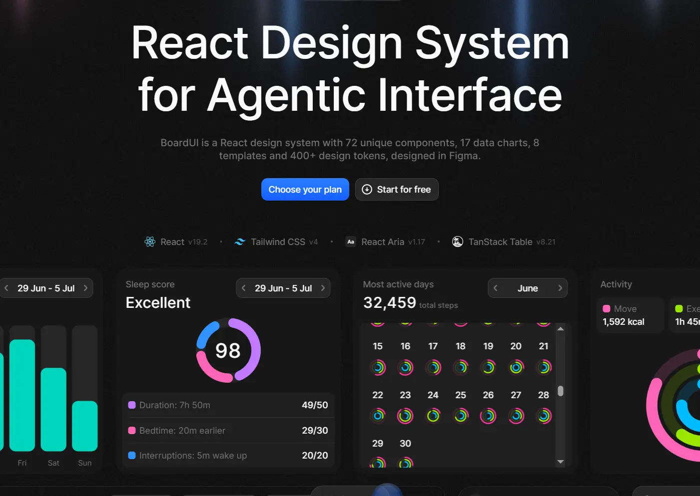
BoardUI is a React design system and UI component library for creating agent UIs and data-heavy dashboards.
Features
- 48 free components and blocks under the MIT license.
- Editable React and Tailwind source installed through the BoardUI CLI or MCP server.
- 400+ semantic tokens for color, typography, dark mode, radii, shadows, and chart styles.
- React Aria for form components, focus behavior, keyboard interaction, labels, and ARIA wiring.
- Agent UI blocks for thinking states, progress, composer controls, questionnaires, context usage, and research trails.
- Dashboard UI for tables, stat cards, navigation, notifications, authentication, settings, and charts.
- Free Next.js Chat Starter with a server-side model route, streaming replies, and browser-local chat history.
- MCP server for Claude Code, Cursor, VS Code, Codex, and other MCP clients, plus an installable agent skill.
Use Cases
- AI coding and agent products that need thinking states, progress, research activity, composer controls, and surrounding application UI.
- SaaS admin areas with authentication, navigation, settings, notifications, tables, and KPI cards.
- Analytics dashboards that need charts and application controls from one token system.
How To Use BoardUI
Initialize BoardUI
Run init from the project root. The command installs react-aria-components, tailwind-merge, and @remixicon/react, then writes the theme, typography, global styles, cx utility, and agent rules.
npx boardui@latest initImport the BoardUI Styles in Next.js
Replace the default global stylesheet import in app/layout.tsx with the generated BoardUI stylesheet.
import "@/styles/globals.css";Add Components
Pass one or more component names to the CLI. Internal BoardUI dependencies and required npm packages resolve during installation.
npx boardui@latest add button select date-pickerInspect or Install the Free Set
Use list to inspect installable items. add --all installs the free repository set.
npx boardui@latest list
npx boardui@latest add data-table
npx boardui@latest add --all
Basic Usage
Install the local Button source with the CLI. The generated file lives at components/base/buttons/button.tsx; import it through the standard @/* alias.
The Button source defines primary, secondary, ghost, and danger variants plus medium, small, and xs sizes. leadingIcon and trailingIcon take Remix Icon component references. Icon-only buttons use iconOnly with an accessible label.
npx boardui@latest add buttonimport { RiArrowRightLine } from "@remixicon/react";
import { Button } from "@/components/base/buttons/button";
export function ProjectActions() {
return (
<Button variant="primary" trailingIcon={RiArrowRightLine}>
Continue
</Button>
);
}Install BoardUI Through MCP
BoardUI runs its MCP server locally over stdio through npx. Claude Code, Cursor, VS Code, Codex, and other MCP clients can inspect component source, read usage examples, initialize BoardUI, and write selected files into the project.
Claude Code
claude mcp add boardui -- npx -y boardui@latest mcpUse BoardUI Through shadcn MCP
Projects that already use the shadcn MCP server can register BoardUI as a registry namespace in components.json and request items such as @boardui/button.
{
  "registries": {
    "@boardui": "https://www.boardui.com/r/{name}.json"
  }
}
Build the Free Chat Starter
Install the free Chat Starter into an existing Next.js project with its runtime and UI dependencies.
npx boardui@latest add agent-chatConfigure the Chat Starter
The starter stores chat history in the browser and sends model requests through app/api/chat/route.ts. Configure the model connection through environment variables.
| Variable | Purpose |
|---|---|
AI_API_KEY | Main model credential. Recognized key prefixes select OpenAI, Anthropic, Google Gemini, OpenRouter, Groq, xAI, or Vercel AI Gateway. |
CHAT_MODEL | Selects a different model. |
AI_PROVIDER | Identifies providers such as Mistral or DeepSeek when the key format does not identify the provider. |
AI_BASE_URL | Points the runtime at an OpenAI-compatible server such as Ollama, LM Studio, vLLM, LiteLLM, or Together. |
Before a Public Deployment
Requests sent through the chat route bill the owner of the model credential. Set a spending limit on the provider key where the provider exposes one, and put a rate limit in front of /api/chat before publishing the app.
All UI Components
| Area | Representative Items | Access |
|---|---|---|
| Base UI | Button, Checkbox, Date Picker, Dropdown, File Upload, Input, Pagination, Select, Slider, Switch, Table, Tabs, Tooltip | Free |
| Dashboard blocks | Auth Card, Data Table, Notification Center, Settings Modal, Sidebar, Stat Cards | Free |
| Agent blocks | Agent Thinking, Composer Loader, Agent Limits, Agent Progress, Composer, Questionnaire, Task List, Web Search | Free and Pro |
| Charts | Orders, Revenue, Area, Funnel, Heatmap, Line, Radar, Radial, Sankey, Scatter, Stage Bars, Steps | Free and Pro |
App Templates
| Template | Main UI | Access |
|---|---|---|
| Chat Starter | AI chat with sidebar, history, composer, streaming replies, dashboard, inbox, and auth screens | Free |
| AI Chat | Coding-agent chat with repository navigation, composer, code changes, and browser panel | Pro |
| AI Image Generation | Prompt thread, generation frame, feedback actions, and image gallery | Pro |
| AI Profile | Contribution activity, agent statistics, token trends, and profile UI | Pro |
| Finance Dashboard | Finance analytics and transaction UI | Pro |
| Home Dashboard | KPI cards, earnings chart, customer table, and application shell | Pro |
| Marketing Dashboard | Campaign KPIs, acquisition data, channel analytics, and campaigns table | Pro |
| Medical Profile | Patient overview and health-related chart cards | Pro |
Install Pro Components and Templates
Activate a BoardUI Pro license on the machine before installing a paid item.
npx boardui@latest login YOUR_LICENSE_KEYInstall a Pro Item
npx boardui@latest add agent-progressFree BoardUI source uses the MIT license. Pro source uses the BoardUI license.
Styling and Theming
npx boardui@latest init writes the token files into styles/. Semantic variables control text, surfaces, borders, icons, states, charts, radii, and shadows.
Change the --color-accent-* ramp in styles/theme.css for a different brand accent. Buttons, selection states, focus rings, tabs, switches, sliders, and other accent-driven controls reference these tokens.
Dark mode switches semantic values under the .dark class. BoardUI’s typography layer uses composite utilities such as text-title-1-medium, text-headline-medium, and text-body-medium.
Alternatives and Related Resources