The Future of Web Dev
The Future of Web Dev
Shadcn Dashboard Kit for Tailwind CSS Admin UIs
Build a shadcn/ui admin application from free React/Vite and Next.js starters with Tailwind CSS 4, Base UI, charts, tables, and forms.
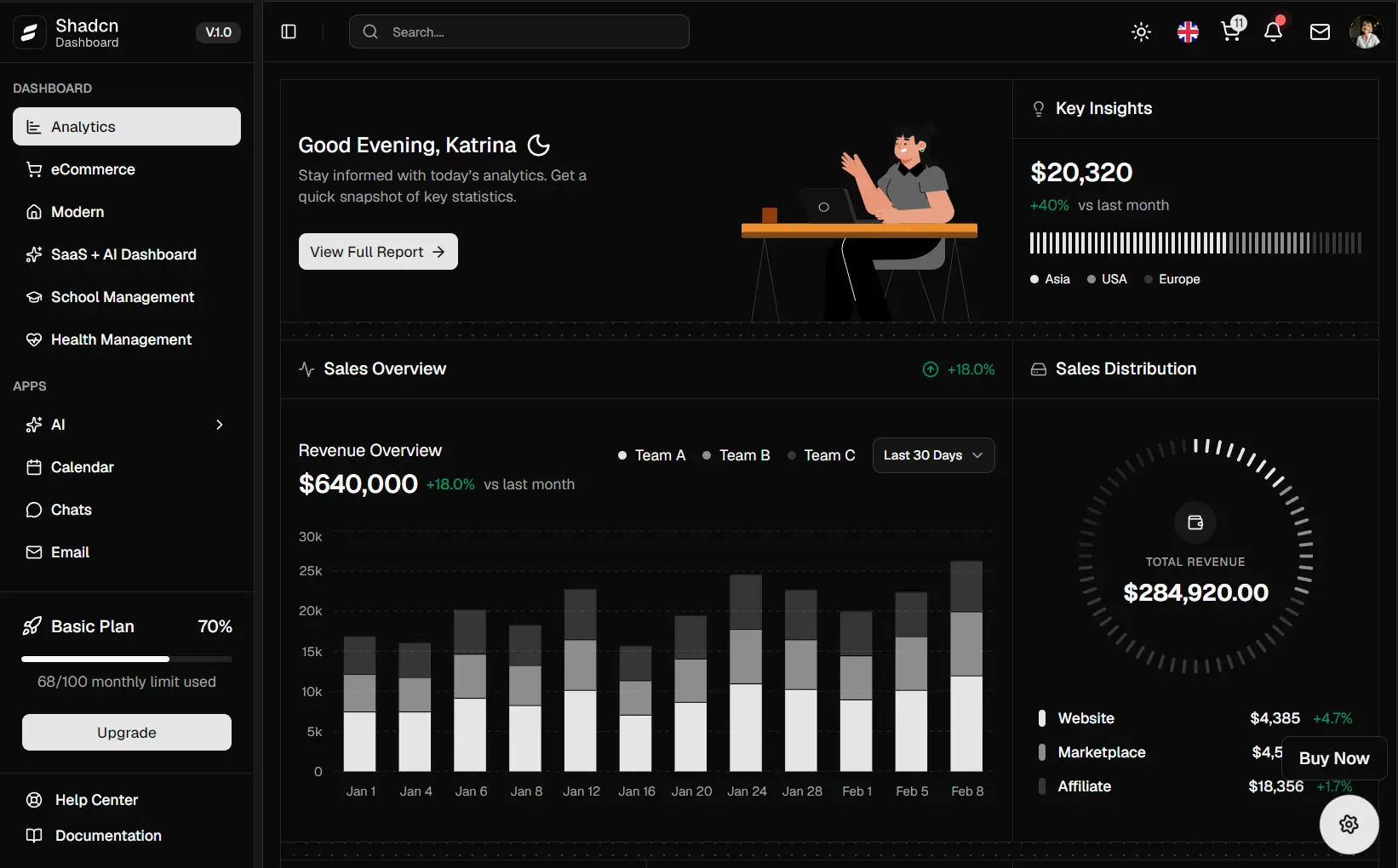
Shadcn Dashboard is a React and Next.js admin dashboard kit for building back-office applications with shadcn/ui, Base UI, and Tailwind CSS 4.
The free starters contain dashboard pages, Blog, Notes, Tickets, authentication screens, forms, data tables, profile views, charts, and a TipTap editor.
Your existing shadcn/ui applications can use individual components and larger dashboard blocks from the Registry.
Each item installs as local source code, which keeps its JSX, Tailwind classes, and application logic available for direct editing.
Features
- Free starter repositories target React/Vite and the Next.js App Router.
- React, TypeScript, Tailwind CSS, shadcn/ui, and Base UI form the main frontend stack.
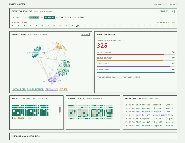
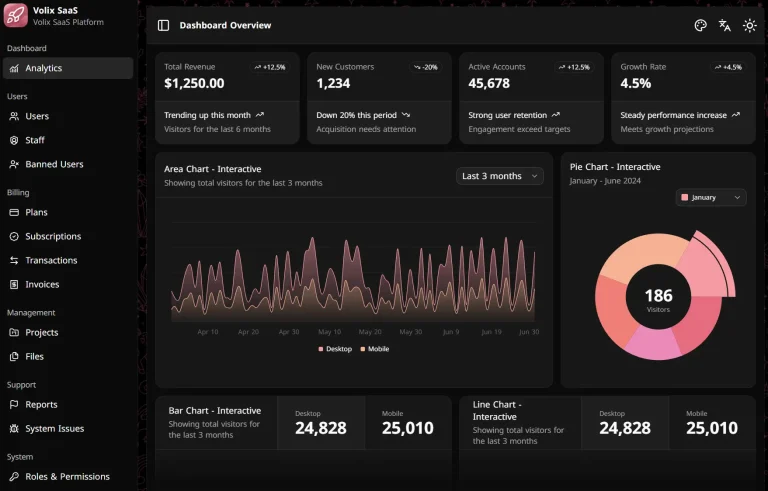
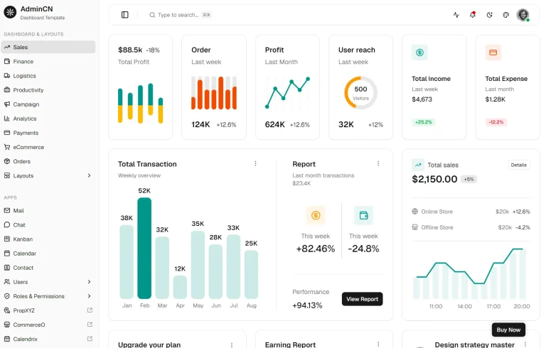
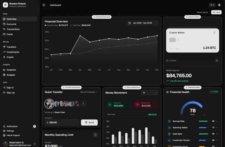
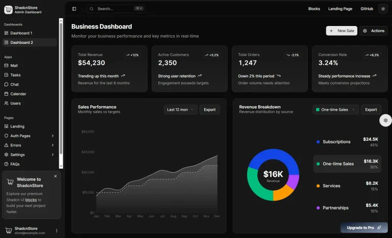
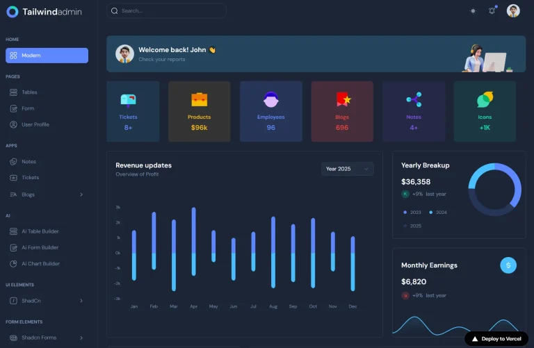
- Dashboard pages contain statistics, charts, cards, data tables, and navigation.
- Blog, Notes, Tickets, profile, authentication, error, and maintenance screens are already present.
- TanStack Table handles table logic, Recharts handles charting, and TipTap powers the Blog editor.
- Light and dark themes are built into both starters.
- Registry items install as editable React and TypeScript source files.
React/Vite or Next.js?
Use the Vite starter for a client-side React dashboard based on React Router. Choose the Next.js starter when the admin area belongs in an App Router application.
| React + Vite | Next.js | |
|---|---|---|
| Main stack | React 19 + Vite 8 | Next.js 16 + React 19 |
| Routing | React Router | App Router |
| Styling | Tailwind CSS 4 | Tailwind CSS 4 |
| shadcn style | base-nova | base-nova |
| UI primitives | Base UI | Base UI |
| Theme state | Custom theme context | next-themes |
| Development command | npm run dev | pnpm dev |
| Default port | 5173 | 3000 |
components.json RSC | false | true |
How To Use Shadcn Dashboard
Run the React/Vite Starter
The React starter requires Node.js 18, 20, or 22+ and uses npm in its setup instructions. Clone the repository, install its packages, and start Vite on port 5173.
git clone https://github.com/shadcndashboard/shadcndashboard.git
cd shadcndashboard
npm install
npm run dev
Create a Production Build
npm run build
npm run preview
Run the Next.js Starter
The Next.js starter requires Node.js 18, 20, or 22+. Its setup instructions use pnpm, and the development server runs on port 3000.
git clone https://github.com/shadcndashboard/next-shadcn-dashboard.git
cd next-shadcn-dashboard
pnpm install
pnpm dev
Build the Next.js Application
pnpm build
pnpm start
Install a Registry Component or Block
Registry installation requires an initialized shadcn/ui project and a valid components.json. Configure the @shadcn-dashboard namespace from the Shadcn Dashboard CLI documentation before installing namespaced items.
The free starter repositories already contain components.json, but the Registry namespace is not preconfigured there. The shadcn CLI also prompts when an installation conflicts with an existing local file. Review local edits before accepting a replacement.
Initialize shadcn/ui when your project does not already have its configuration:
npx shadcn@latest initInstall a component with the item name published in the Shadcn Dashboard catalog:
npx shadcn@latest add @shadcn-dashboard/button-06Larger blocks use the same Registry command format:
npx shadcn@latest add @shadcn-dashboard/update-bannerWhat’s in the Free Starters
Both starter repositories contain the main screens required for a dashboard application. The exact routing structure changes between Vite and Next.js, while the application areas stay closely aligned.
| Area | Pages and UI |
|---|---|
| Dashboard | Statistics, charts, cards, and widgets |
| Blog | Blog management views and TipTap editor |
| Notes | Notes application |
| Tickets | Ticket management application |
| Authentication | Login, registration, forgotten password, OTP, password reset, and two-step verification |
| Forms | Vertical and horizontal layouts plus form validation |
| Data | Data table views |
| User | Profile, connections, and activity |
| System | Error and maintenance screens |
| UI | Date pickers, calendar, file upload, OTP input, dialogs, navigation, and feedback elements |
| Theme | Light and dark modes |
Component Library
The components extend past the primitives used by the free starter. It contains dashboard-oriented charts, advanced inputs, navigation elements, feedback states, motion components, and developer UI.
| Category | Components |
|---|---|
| Charts | Area Chart, Bar Chart, Line Chart, Pie Chart, Radar Chart, Radial Chart |
| Inputs | Input, Textarea, Select, Checkbox, Radio Group, Switch, Slider |
| Advanced inputs | Date Picker, File Upload, Combobox, Autocomplete, Input Mask, Input OTP |
| Actions | Button, Button Group |
| Navigation | Tabs, Breadcrumb, Pagination, Command, Dropdown Menu, Context Menu |
| Overlays | Dialog, Popover, Tooltip |
| Feedback | Alert, Skeleton, Spinner, Sonner, Progress |
| Content | Accordion, Avatar, Badge, Carousel, Collapsible, Scroll Area |
| Motion | Animated List, Animated Text, Shine Border, Number Ticker |
| Developer UI | Code Block, KBD |
Dashboard Blocks
Blocks target larger pieces of an admin application. Use them when a project needs a complete sidebar, authentication screen, data section, form, chart area, or dashboard shell.
| Block Category | UI |
|---|---|
| Dashboard Shells | Full admin shells for several application types |
| Dashboard Layouts | Admin page layouts |
| Data Tables | Filterable and paginated data views |
| Chart UI Blocks | Dashboard chart sections |
| Card UI Blocks | Statistics and information cards |
| Sidebars | Dashboard navigation |
| Forms | Input and settings forms |
| Multi Step Forms | Multi-stage forms |
| Tables | Table layouts |
| Account Settings | Profile and account screens |
| Authentication | Login, registration, forgotten password, and OTP screens |
| Applications | Chat, Kanban, and Notes |
| Empty States | Empty-content screens |
| Dashboard Footers | Footer sections |
Customization
Theme tokens live in src/css/globals.css in the Vite starter and app/globals.css in the Next.js starter. Shared color changes belong in those CSS variables.
Component-level spacing, typography, layout, icons, and interaction logic live in the local React source. Registry items remain editable after installation.
For the Vite edition, dashboard navigation and shell changes belong under src/layouts, while new top-level screens require updates to src/routes/Router.tsx.
For Next.js, pages inside app/(dashboard-layout) inherit the admin shell. Authentication and account-recovery pages live under app/auth.
Blog, Notes, Tickets, dashboard widgets, and data tables keep feature-specific code in their related directories. Replace demo data inside the feature you are adapting before changing shared UI primitives.
Alternatives and Related Resources