The Future of Web Dev
The Future of Web Dev
Neobrutalist-style UI Component Library for Next.js – RetroUI
Add a unique retro/Neobrutalist style to your Next.js apps with RetroUI's Tailwind components. Easy to customize and type-safe.
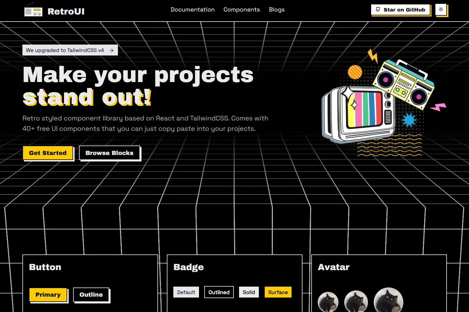
RetroUI is a retro/Neobrutalist styled Tailwind CSS component library built for React/Next.js applications.
It currently comes with 40+ ready-to-use UI components that you can simply copy and paste into your projects.
Features
🛡️ Complete TypeScript support for enhanced type safety
📱 Responsive design across different screen sizes
🌓 Built-in light and dark mode support
🔧 Simple installation process with CLI commands
Use Cases
- Portfolio Websites: Create a personal or agency portfolio with a memorable, vintage-inspired design that helps your work get noticed.
- Side Projects & MVPs: Quickly assemble a functional and uniquely styled interface for your new application or minimum viable product, saving development time.
- Niche E-commerce Sites: Develop an online store for products that benefit from a retro or alternative branding, making the shopping experience more thematic.
- Creative Blogs or Zines: Design a digital publication platform with a distinct visual identity that complements artistic or unconventional content.
- Event or Campaign Microsites: Build small, focused websites for specific events or marketing campaigns that require a quick turnaround and a standout look.
Installation
1. Set up a new Next.js project or prepare an existing one using the shadcn-ui CLI, which RetroUI utilizes for component management.
npx shadcn@latest init2. If your project does not already have a libs/utils.ts file, add it. This file contains helper functions.
npx shadcn@latest add https://retroui.dev/r/utils.json3. You can now add RetroUI components. Install them via the CLI or manually.
Usage
1. Import a UI component via shadcn/ui CLI
npx shadcn@latest add "https://retroui.dev/r/accordion.json"2. Add the accordion component to your app.
"use client";

import { Accordion } from "@/components/retroui/Accordion";

export default function AccordionStyleDefault() {
  return (
    <Accordion type="single" collapsible className="space-y-4 w-full">
      <Accordion.Item value="item-1">
        <Accordion.Header>Accordion Item 1</Accordion.Header>
        <Accordion.Content>
          This is the content of the first accordion item.
        </Accordion.Content>
      </Accordion.Item>
      <Accordion.Item value="item-2">
        <Accordion.Header>Accordion Item 2</Accordion.Header>
        <Accordion.Content>
          This is the content of the second accordion item.
        </Accordion.Content>
      </Accordion.Item>
      <Accordion.Item value="item-3">
        <Accordion.Header>Accordion Item 3</Accordion.Header>
        <Accordion.Content>
          This is the content of the third accordion item.
        </Accordion.Content>
      </Accordion.Item>
    </Accordion>
  );
}
3. You can also install & import it manually:
npm install @radix-ui/react-accordion lucide-react
"use client";

import * as React from "react";
import * as AccordionPrimitive from "@radix-ui/react-accordion";
import { ChevronDown } from "lucide-react";

import { cn } from "@/lib/utils";

const Accordion = AccordionPrimitive.Root;

const AccordionItem = React.forwardRef<
  React.ElementRef<typeof AccordionPrimitive.Item>,
  React.ComponentPropsWithoutRef<typeof AccordionPrimitive.Item>
>(({ className, ...props }, ref) => (
  <AccordionPrimitive.Item
    ref={ref}
    className={cn(
      "border-2 bg-background text-foreground shadow-md hover:shadow-sm data-[state=open]:shadow-sm transition-all overflow-hidden",
      className,
    )}
    {...props}
  />
));
AccordionItem.displayName = AccordionPrimitive.Item.displayName;

const AccordionHeader = React.forwardRef<
  React.ElementRef<typeof AccordionPrimitive.Trigger>,
  React.ComponentPropsWithoutRef<typeof AccordionPrimitive.Trigger>
>(({ className, children, ...props }, ref) => (
  <AccordionPrimitive.Header className="flex">
    <AccordionPrimitive.Trigger
      ref={ref}
      className={cn(
        "flex flex-1 items-start justify-between px-4 py-2 font-head cursor-pointer focus:outline-hidden [&[data-state=open]>svg]:rotate-180",
        className,
      )}
      {...props}
    >
      {children}
      <ChevronDown className="h-4 w-4 shrink-0 transition-transform duration-200" />
    </AccordionPrimitive.Trigger>
  </AccordionPrimitive.Header>
));
AccordionHeader.displayName = AccordionPrimitive.Header.displayName;

const AccordionContent = React.forwardRef<
  React.ElementRef<typeof AccordionPrimitive.Content>,
  React.ComponentPropsWithoutRef<typeof AccordionPrimitive.Content>
>(({ className, children, ...props }, ref) => (
  <AccordionPrimitive.Content
    ref={ref}
    className="overflow-hidden px-4 py-2 font-body bg-white text-gray-700 transition-all data-[state=closed]:animate-accordion-up data-[state=open]:animate-accordion-down"
    {...props}
  >
    <div className={cn("pb-4 pt-0", className)}>{children}</div>
  </AccordionPrimitive.Content>
));

AccordionContent.displayName = AccordionPrimitive.Content.displayName;

const AccordionComponent = Object.assign(Accordion, {
  Item: AccordionItem,
  Header: AccordionHeader,
  Content: AccordionContent,
});

export { AccordionComponent as Accordion };
All Available Components
- Accordion
- Alert
- Avatar
- Badge
- Breadcrumb
- Button
- Card
- Checkbox
- Dialog
- Input
- Label
- Menu
- Popover
- Progress
- Radio
- Select
- Slider
- Sonner
- Switch
- Tab
- Textarea
- Text
- Toggle
- Toggle Group
- Tooltip
Related Resources
- shadcn-ui: The underlying component system RetroUI uses. It offers a different aesthetic but similar component management. shadcn-ui Website
- Tailwind CSS: The utility-first CSS framework that powers RetroUI’s styling and customization. Tailwind CSS Documentation
- Next.js: The React framework for which RetroUI is optimized. Next.js Documentation
FAQs
Q: Is RetroUI free to use?
A: Yes, RetroUI provides over 40 free UI components that you can copy and paste into your projects.
Q: Can I customize the appearance of RetroUI components?
A: Yes, RetroUI is built with Tailwind CSS. You can customize components using Tailwind utility classes and by adjusting the theme variables.
Q: Do I need Next.js to use RetroUI?
A: RetroUI is specifically designed and optimized for Next.js applications. The installation process leverages shadcn-ui, which integrates well with the Next.js ecosystem.