The Future of Web Dev
The Future of Web Dev
Sakuga VFX: Anime-Style UI Component Library
An animated UI component library with springy controls, smoke bursts, hand-drawn effects, and manga lettering.
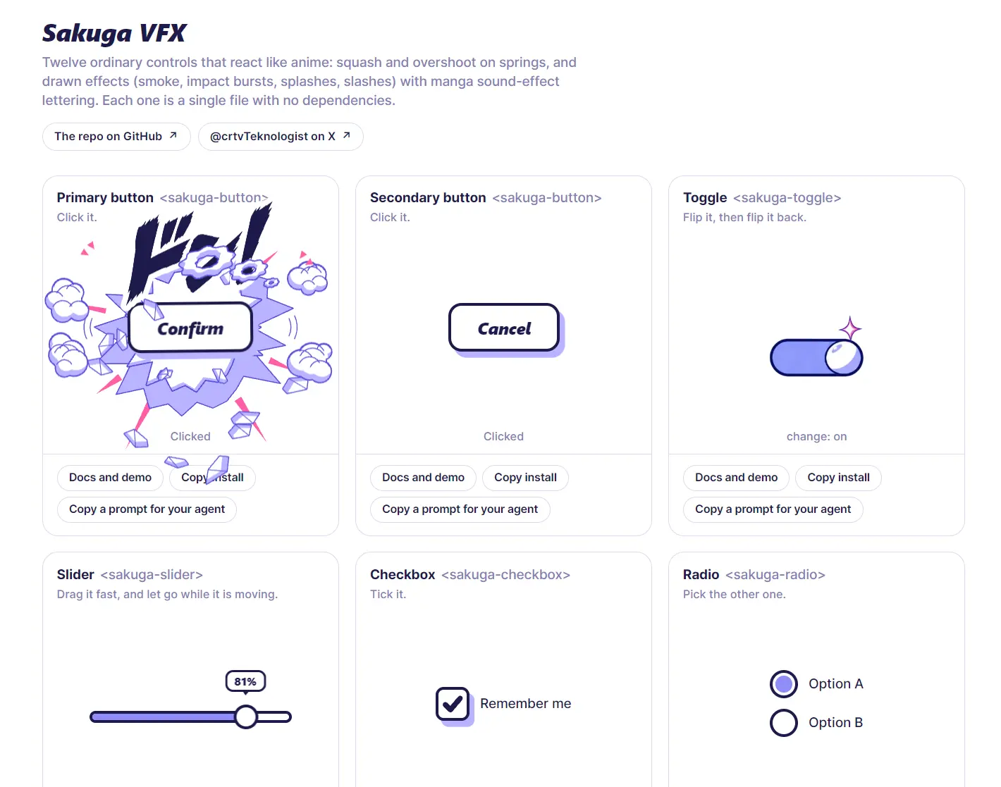
Sakuga VFX is a JavaScript UI component library that adds anime-style reactions to buttons, form controls, tabs, and notifications.
Presses trigger impact bursts, fast slider drags leave smoke trails, and completed actions land with manga sound-effect lettering.
Each control comes as a self-contained web component with no runtime dependencies. You can try the controls in the live gallery and install individual JavaScript files through the shadcn CLI.
Features
- Single-file JavaScript custom elements for controls, navigation, and feedback.
- Spring-based interactions with drawn smoke, slashes, splashes, and impact bursts.
- Form-associated inputs, switches, sliders, checkboxes, radio groups, and ratings.
- One shared page-wide canvas and animation loop for foreground effects.
- CSS variables for control colors, borders, shadows, and selected widths.
- Reduced-motion handling that removes drawn effects while retaining control behavior.
Available UI Components
| Component | Interaction |
|---|---|
Button (sakuga-button) | Squashes on press and throws an impact burst. done() displays a confirmation check. |
Toggle (sakuga-toggle) | Animates a painted switch and splash when flipped. |
Slider (sakuga-slider) | Stretches the thumb and emits smoke during fast drags. |
Checkbox (sakuga-checkbox) | Draws a checkmark with curved slashes and crystal chips. |
Radio (sakuga-radio) | Springs the selected dot into place with smoke and wedges. |
Input (sakuga-input) | Kicks up dust near the caret as you type. |
Tabs (sakuga-tabs) | Slides and stretches the selected tab before landing. |
Progress (sakuga-progress) | Follows progress with a storm cloud and plays a completion burst. |
Rating (sakuga-rating) | Animates star selection and a burst when all stars are selected. |
Toast (sakuga-toast) | Enters with speed lines and dust, then shrinks away. |
Tooltip (sakuga-tooltip) | Opens a speech bubble with spring motion and click lettering. |
How to Use It
Install the Controls
In a project configured for the shadcn CLI, install the components you need:
npx shadcn add finktheartist/sakuga-vfx/button
npx shadcn add finktheartist/sakuga-vfx/toggle
npx shadcn add finktheartist/sakuga-vfx/progress
Basic Usage
Load the scripts and use the registered HTML tags:
<script src="/sakuga-vfx/button.js"></script>
<script src="/sakuga-vfx/toggle.js"></script>
<sakuga-button>Confirm purchase</sakuga-button>
<sakuga-button variant="secondary">Cancel</sakuga-button>
<sakuga-toggle label="Email alerts" name="email-alerts"></sakuga-toggle>
Next.js App Router Example
For Next.js, load the installed script with next/script. This Client Component reads the toggle’s native change event and checked property:
// app/components/email-alerts.tsx
"use client";
import { createElement, useEffect, useRef, useState } from "react";
import Script from "next/script";
type SakugaToggle = HTMLElement & { checked: boolean };
export default function EmailAlerts() {
  const toggleRef = useRef<SakugaToggle>(null);
  const [enabled, setEnabled] = useState(false);
  useEffect(() => {
    const toggle = toggleRef.current;
    if (!toggle) return;
    const onChange = () => setEnabled(toggle.checked);
    toggle.addEventListener("change", onChange);
    return () => toggle.removeEventListener("change", onChange);
  }, []);
  return (
    <div>
      <Script src="/sakuga-vfx/toggle.js" strategy="afterInteractive" />
      {createElement("sakuga-toggle", {
        ref: toggleRef,
        label: "Email alerts",
        name: "email-alerts",
      })}
      <output>{enabled ? "Enabled" : "Disabled"}</output>
    </div>
  );
}
Advanced Examples
Confirm a Successful Save
Call done() after a successful response from your /api/preferences endpoint. The button’s click impact plays automatically.
<script src="/sakuga-vfx/button.js"></script>
<sakuga-button id="save-preferences">Save preferences</sakuga-button>
<script>
  const button = document.querySelector("#save-preferences");
  button.addEventListener("click", async () => {
    const response = await fetch("/api/preferences", { method: "POST" });
    if (response.ok) button.done();
  });
</script>
Animate an Upload Progress Bar
Use a numeric ratio from 0 to 1. This example expects an application upload endpoint at /api/uploads and plays the completion effect only after a successful server response.
<script src="/sakuga-vfx/progress.js"></script>
<form id="upload-form">
  <input type="file" name="file" required>
  <button type="submit">Upload file</button>
</form>
<sakuga-progress id="upload-progress" label="Uploading file"></sakuga-progress>
<script>
  const form = document.querySelector("#upload-form");
  const progress = document.querySelector("#upload-progress");
  form.addEventListener("submit", (event) => {
    event.preventDefault();
    progress.reset();
    const request = new XMLHttpRequest();
    request.upload.addEventListener("progress", (event) => {
      if (event.lengthComputable) {
        progress.set(Math.min(0.95, event.loaded / event.total));
      }
    });
    request.addEventListener("load", () => {
      if (request.status >= 200 && request.status < 300) {
        progress.set(1);
      } else {
        progress.reset();
      }
    });
    request.addEventListener("error", () => progress.reset());
    request.open("POST", "/api/uploads");
    request.send(new FormData(form));
  });
</script>
Alternatives and Related Resources