The Future of Web Dev
The Future of Web Dev
Pin UI: Pinterest-Inspired React UI Component Library & Blocks
An open-source React UI component library based on Pinterest designs. Install selected pieces as editable TSX and CSS.
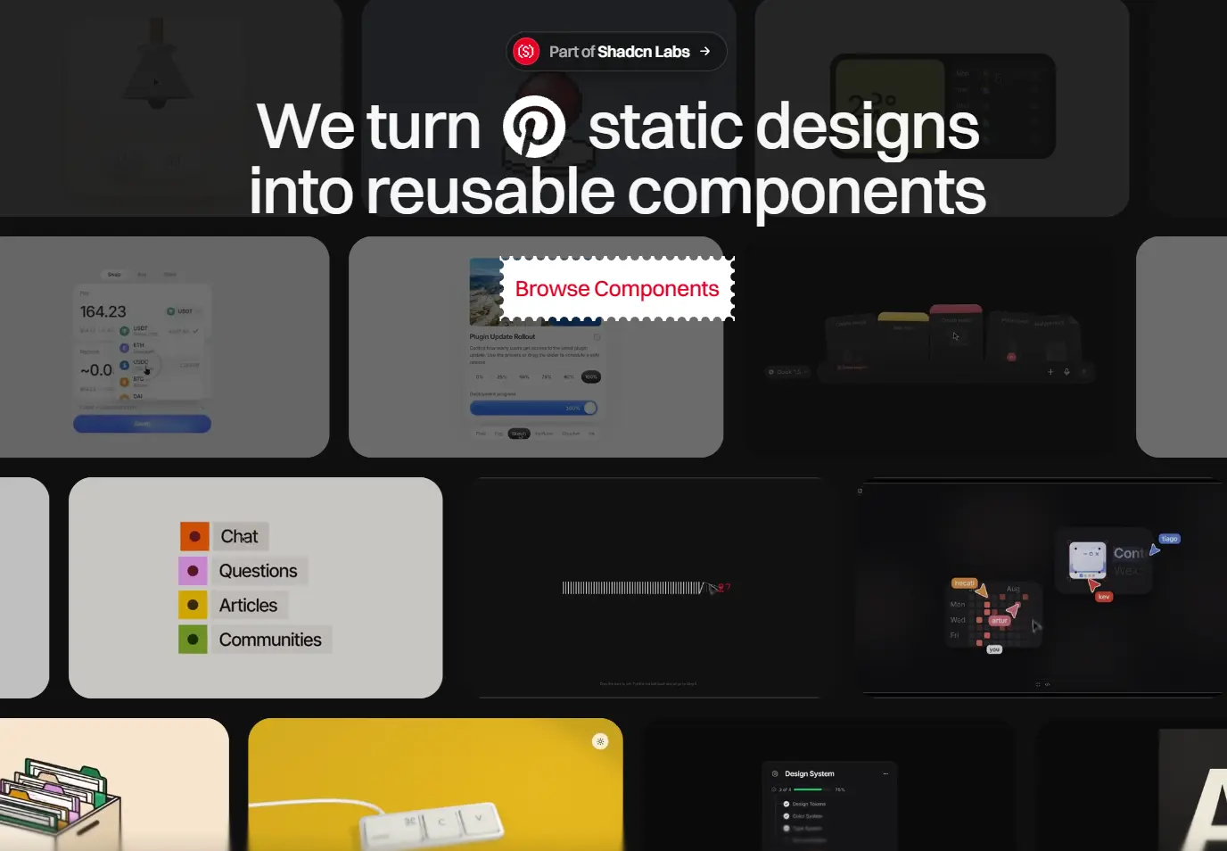
Pin UI is a React UI component library that recreates Pinterest designs as interactive controls, cards, and app widgets.
It also introduces Blocx, which adds animated sections for marketing and sign-in pages, with live previews and editable React and CSS source.
Features
- Spring-based sliders, magnetic selection, card transitions, and 3D interactions.
- Component-specific CSS files and light/dark options for supported components.
- Motion-based transitions, native browser animations, and selected WebGL effects.
- Blocx previews at desktop, tablet, and mobile widths.
- Individual shadcn registry installs for local TSX, supporting files, and CSS.
How To Use It
1. Install a React Component
Initialize shadcn:
npx shadcn@latest initInstall a UI component. In this example, the registry writes SlingSlider.tsx and sling-slider.css to components/pinui/ and installs the dependencies declared by that item.
2. Basic Usage in Next.js
// app/settings/page.tsx
"use client";
import { useState } from "react";
import SlingSlider from "@/components/pinui/SlingSlider";
export default function SettingsPage() {
  const [volume, setVolume] = useState(36);
  return (
    <main>
      <h1>Playback settings</h1>
      <SlingSlider
        label="Playback volume"
        defaultValue={36}
        theme="light"
        onChange={setVolume}
      />
      <output>Volume: {volume}%</output>
    </main>
  );
}
3. Install a Blocx Section
Add Odometer Pricing:
npx shadcn@latest add "https://pinui.xyz/r/blocx/odometer-pricing.json"Import the installed block into a pricing route:
// app/pricing/page.tsx
import OdometerPricing from "@/components/blocx/OdometerPricing";
export default function PricingPage() {
  return <OdometerPricing />;
}
Edit components/blocx/OdometerPricing.tsx to replace the sample PLANS data (price.monthly, price.annual, and features). Replace the trial button’s demo onClick handler, which calls preventDefault(), with your signup action.
Advanced Example: A Custom Selection List
npx shadcn@latest add "https://pinui.xyz/r/selection-list.json"// app/settings/NotificationChannel.tsx
"use client";
import { useState } from "react";
import SelectionList, {
type SelectionListItem,
} from "@/components/pinui/SelectionList";
const channels: SelectionListItem[] = [
{ label: "Email", accent: "#d9edff", dark: "#245a83", activeText: "#163149" },
{ label: "Push", accent: "#e9dcff", dark: "#6741a6", activeText: "#271745" },
{ label: "SMS", accent: "#def4de", dark: "#2e773e", activeText: "#15391d" },
];
export default function NotificationChannel() {
const [selectedIndex, setSelectedIndex] = useState<number | null>(0);
return (
<section>
<SelectionList
label="Notification channel"
items={channels}
defaultValue={0}
onChange={setSelectedIndex}
/>
<p aria-live="polite">
{selectedIndex === null
? "No channel selected"
: `Selected: ${channels[selectedIndex].label}`}
</p>
</section>
);
}Available UI Components
Inputs & controls
Sling Slider, Theme Switch, Search Card, Desk Computer, Copy Paste Pad, Progress Image, Prompt Composer, Lamp Switch, Joystick, Chips, Egg OTP.
Cards & widgets
Presence Cards, Reader Card, File Box, Task Card, Magnify, Calendar, Swap Card, Thermal Dial, Weather, Taxi, Balance Card, Add To Cart.
Audio & media
Liquid Voice, Recorder.
Lists & pickers
Selection List, Liquid Tabs, Add Member, Countdown.
Available Blocx Sections
| Section | Blocks |
|---|---|
| Hero | Storybook Hero, iPartyLabs Hero, Luna Hero, Orbit Hero |
| Pricing | Odometer Pricing, Smart Pricing |
| Contact | Contact Form |
| Sign-in | Halo Sign In, Pixelkit Sign In |
| Footer | CareMetric Footer, Synais Footer |
Component Props and Styling
Sling Slider
| Prop | Type and behavior |
|---|---|
defaultValue | number, default 36. Initial value from 0 to 100. |
onChange | (value: number) => void. Reports whole-number changes from dragging, slinging, and keyboard input. |
label | string, default "Value". Accessible slider name. |
theme | "light" | "dark", default "dark". Slider color scheme. |
hint | boolean, default true. Toggles the interaction hint. |
Selection List
| Prop | Type and behavior |
|---|---|
theme | "light" | "dark", default "light". List color scheme. |
items | SelectionListItem[]. Each item has label, accent, dark, and activeText. Defaults to four sample choices. |
defaultValue | number | null, default 0. Initially selected index, or null for no initial selection. |
onChange | (index: number | null) => void. Reports the selected index or cleared selection. |
label | string, default "Content types". Accessible group name. |
Alternatives and Related Resources