The Future of Web Dev
The Future of Web Dev
100+ Beautiful Components for Vue & Nuxt – Inspira UI
Create stunning Vue applications with Inspira UI's 100+ free components. Copy-paste animations, backgrounds, and effects for modern web development.
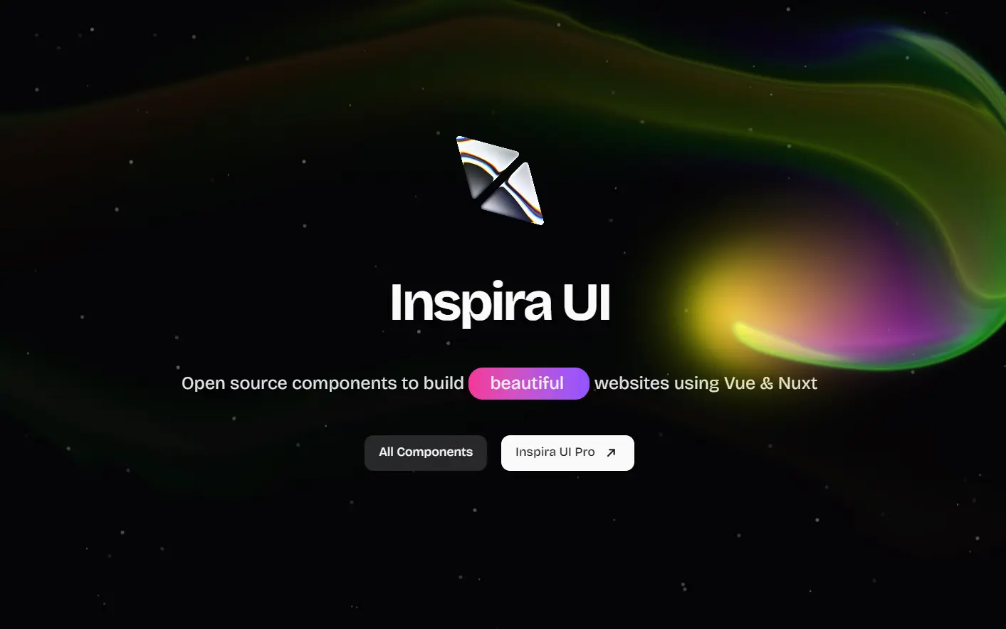
Inspira UI is a Vue/Nuxt components collection that includes over 100 components covering backgrounds, animations, special effects, and interactive elements.
The library allows developers to select, customize, and adapt components to fit specific project requirements. You can use it to build a variety of applications, from single-page applications to complex web platforms.
Features
⚡ Vue 3 & Nuxt Compatible – Built specifically for modern Vue applications with full SSR support
🌙 Dark Mode Support – Built-in light and dark theme configurations
📱 Mobile-First Design – All components are responsive and optimized for mobile devices
🎛️ Highly Customizable – Pick and modify components to fit your exact design requirements
🚀 Zero Bundle Bloat – Copy only the components you need, no unnecessary dependencies
🎭 Animation-Rich – Smooth animations and transitions using motion-v library
Use Cases
- Landing Pages – Create stunning hero sections with animated backgrounds, particle effects, and interactive elements that capture visitor attention
- Portfolio Websites – Showcase work with 3D card effects, image galleries, testimonial sliders, and smooth scrolling animations
- SaaS Applications – Build professional dashboards with animated charts, progress bars, hover effects, and micro-interactions
- E-commerce Sites – Enhance product pages with image carousels, comparison tools, spotlight effects, and engaging call-to-action buttons
- Marketing Websites – Develop high-converting pages with animated testimonials, feature highlights, pricing tables, and scroll-triggered animations
Installation
To get started with Inspira UI, you need to have a Vue or Nuxt project with Tailwind CSS set up. If you are using shadcn-vue, you can skip some of the installation steps.
1. Install Tailwind CSS dependencies and utilities:
npm install -D clsx tailwind-merge class-variance-authority tw-animate-css2. Install VueUse and other supporting libraries:
npm install @vueuse/core motion-v3. Add the following code to your main.css file to set up the variables required for the components:
@import "tailwindcss";
@import "tw-animate-css";
@custom-variant dark (&:is(.dark *));
:root {
  --card: oklch(1 0 0);
  --card-foreground: oklch(0.141 0.005 285.823);
  --popover: oklch(1 0 0);
  --popover-foreground: oklch(0.141 0.005 285.823);
  --primary: oklch(0.21 0.006 285.885);
  --primary-foreground: oklch(0.985 0 0);
  --secondary: oklch(0.967 0.001 286.375);
  --secondary-foreground: oklch(0.21 0.006 285.885);
  --muted: oklch(0.967 0.001 286.375);
  --muted-foreground: oklch(0.552 0.016 285.938);
  --accent: oklch(0.967 0.001 286.375);
  --accent-foreground: oklch(0.21 0.006 285.885);
  --destructive: oklch(0.577 0.245 27.325);
  --destructive-foreground: oklch(0.577 0.245 27.325);
  --border: oklch(0.92 0.004 286.32);
  --input: oklch(0.92 0.004 286.32);
  --ring: oklch(0.705 0.015 286.067);
  --radius: 0.625rem;
  --background: oklch(1 0 0);
  --foreground: oklch(0.141 0.005 285.823);
}
.dark {
  --background: oklch(0.141 0.005 285.823);
  --foreground: oklch(0.985 0 0);
  --card: oklch(0.141 0.005 285.823);
  --card-foreground: oklch(0.985 0 0);
  --popover: oklch(0.141 0.005 285.823);
  --popover-foreground: oklch(0.985 0 0);
  --primary: oklch(0.985 0 0);
  --primary-foreground: oklch(0.21 0.006 285.885);
  --secondary: oklch(0.274 0.006 286.033);
  --secondary-foreground: oklch(0.985 0 0);
  --muted: oklch(0.274 0.006 286.033);
  --muted-foreground: oklch(0.705 0.015 286.067);
  --accent: oklch(0.274 0.006 286.033);
  --accent-foreground: oklch(0.985 0 0);
  --destructive: oklch(0.396 0.141 25.723);
  --destructive-foreground: oklch(0.637 0.237 25.331);
  --border: oklch(0.274 0.006 286.033);
  --input: oklch(0.274 0.006 286.033);
  --ring: oklch(0.442 0.017 285.786);
}
4. Add the following utility to lib/utils.ts:
import { type ClassValue, clsx } from "clsx";
import { twMerge } from "tailwind-merge";
export function cn(...inputs: ClassValue[]) {
  return twMerge(clsx(inputs));
}
5. After installation, you can start using Inspira UI components in your project. Choose the components you need, copy the code, and integrate them into your application. The code is yours to use and modify as you like.
For example, to use the Aurora Background component, you would copy its code and place it in your Vue component. You can then customize it using props and CSS variables.
<template>
  <AuroraBackground>
    <Motion
      as="div"
      :initial="{ opacity: 0, y: 40, filter: 'blur(10px)' }"
      :while-in-view="{
        opacity: 1,
        y: 0,
        filter: 'blur(0px)',
      }"
      :transition="{
        delay: 0.3,
        duration: 0.8,
        ease: 'easeInOut',
      }"
      class="relative flex flex-col items-center justify-center gap-4 px-4"
    >
      <div class="text-center text-3xl font-bold md:text-7xl dark:text-white">
        Background lights are cool you know.
      </div>
      <div class="py-4 text-base font-extralight md:text-4xl dark:text-neutral-200">
        And this, is chemical burn.
      </div>
      <button
        class="w-fit rounded-full bg-black px-4 py-2 text-white dark:bg-white dark:text-black"
      >
        Burn it now
      </button>
    </Motion>
  </AuroraBackground>
</template>

<script setup lang="ts">
import { Motion } from "motion-v";
</script>
6. For a better UI experience, it is recommended to install Iconify for icon support.
FAQs
Q: Can I use Inspira UI components in commercial projects?
A: Yes, Inspira UI is released under the MIT license, which allows free use in both personal and commercial projects without restrictions.
Q: Do I need to install the entire library to use one component?
A: No, Inspira UI follows a copy-paste approach. You only need to copy the specific component code you want to use, along with its dependencies.
Q: How do I customize the animations and styling?
A: Each component comes with customizable props and CSS variables. You can modify the source code directly since you copy it into your project.