The Future of Web Dev
The Future of Web Dev
Logoforge: 900+ Brand Logos for React & shadcn/ui
Use 900+ developer brand logos through React components, raw SVGs, a JSON API, or MCP tools for Claude, Cursor, Windsurf, and VS Code.
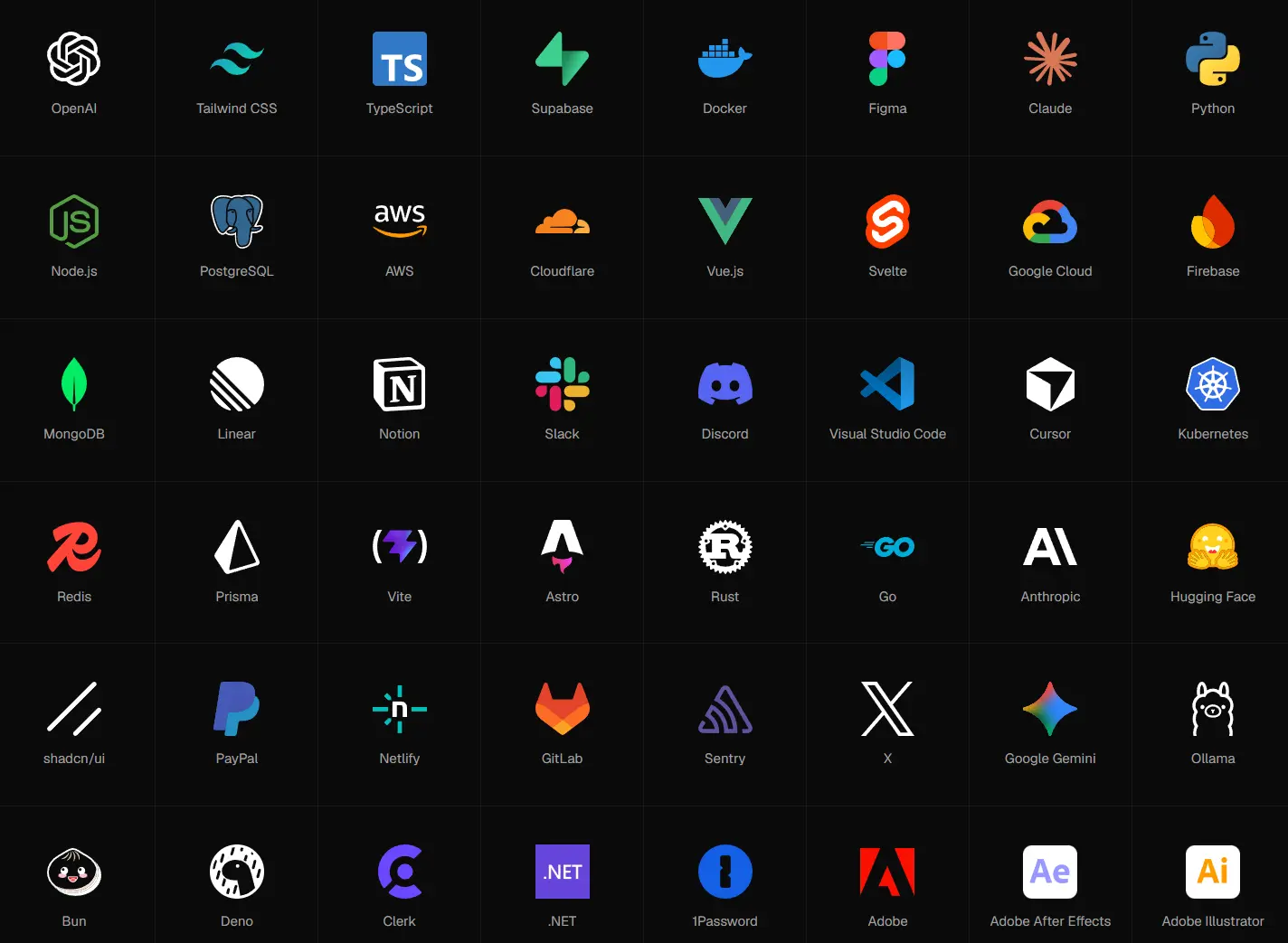
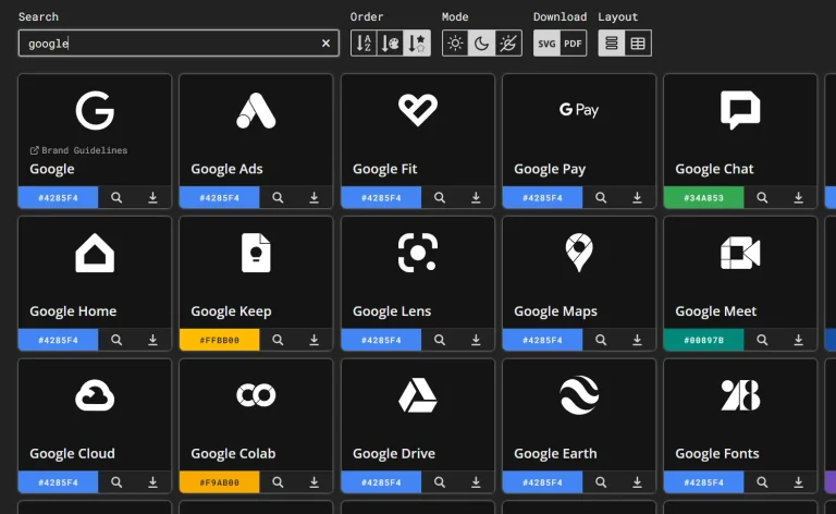
Logoforge is a React and shadcn/ui component registry that allows you to use 900+ brand logos as typed local React files.
The TypeScript props mirror the SVG files each brand actually has. A component only exposes its real mono, wordmark, and dark options.
Features
- Brand-color SVGs and
currentColormono variants for applicable logos. - Dark files for marks that need light artwork on dark backgrounds.
- Icon and wordmark lockups when both forms exist.
- Grid, marquee, and bento logo-cloud registry sections.
- Raw SVG endpoints and a static JSON metadata API.
- Six MCP tools for search, category lookup, logo metadata, SVG source, React source, and logo-cloud generation.
- African brand set with MTN, M-Pesa, Flutterwave, Paystack, Moniepoint, OPay, Kuda, and other regional brands.
Use Cases
- Customer and partner logo rows on SaaS landing pages.
- Integration directories and documentation pages for developer products.
- Payment, authentication, cloud, database, and analytics provider lists.
- Shared design-system asset folders that need brand-color, mono, wordmark, or dark files.
How To Use Logoforge
Install Logos with the shadcn CLI
@logoforge is part of the shadcn Registry Directory. If the project does not yet have a components.json file, initialize shadcn first:
npx shadcn@latest initInstall one logo or pass several registry items in one command:
npx shadcn@latest add @logoforge/stripe @logoforge/vercelBasic Usage
Import the generated files from components/logos/:
import { StripeLogo } from "@/components/logos/stripe";
import { VercelLogo } from "@/components/logos/vercel";
export function PartnerLogos() {
  return (
    <div className="flex items-center gap-6">
      <StripeLogo className="size-8" />
      <StripeLogo
        variant="mono"
        className="size-8 text-muted-foreground"
      />
      <VercelLogo type="wordmark" className="h-6 w-auto" />
    </div>
  );
}
Logo Props and Variant Rules
| Prop | Values and Default | Availability / Behavior |
|---|---|---|
variant | "color" by default; "mono" when available | Every component has "color". "mono" appears in the type union only when an icon-mono file exists. |
type | "icon" by default; "wordmark" when available | Generated only for logos with a wordmark file. |
mode | "auto" by default; "light" or "dark" | Generated when the logo has at least one dark file. The selected icon or wordmark switches only when that form has its own dark file. |
title | Brand name by default | Pass "" for a decorative logo. The component sets aria-hidden in that case. |
| SVG props | Native SVG attributes | className, style, dimensions, ARIA attributes, and other SVG props pass to the rendered SVG. |
Dark Mode
For a logo with dedicated dark artwork, mode="auto" uses Tailwind’s .dark class to swap the light and dark SVG files. Logoforge generates the required classes for Tailwind CSS 3 and 4.
mode="light" and mode="dark" select a file directly when that icon or wordmark has a dark variant. These forced modes do not rely on Tailwind theme switching.
import { VercelLogo } from "@/components/logos/vercel";
export function VercelMarks() {
  return (
    <div className="flex items-center gap-6">
      <VercelLogo mode="auto" className="size-8" />
      <VercelLogo mode="dark" className="size-8" />
      <VercelLogo variant="mono" className="size-8 text-foreground" />
    </div>
  );
}
Available Logos
| Category | Logos | Category | Logos |
|---|---|---|---|
| AI | 66 | Frameworks | 89 |
| Libraries | 47 | UI & CSS | 35 |
| Languages | 46 | Runtimes | 10 |
| Databases | 65 | Cloud & hosting | 68 |
| DevOps | 61 | Developer tools | 61 |
| Learning | 22 | Editors & IDEs | 28 |
| Testing | 30 | Build tools | 43 |
| Design | 26 | Payments | 39 |
| Auth & security | 23 | Monitoring | 29 |
| Analytics | 23 | Communication | 37 |
| Productivity | 37 | CMS & e-commerce | 35 |
| OS & hardware | 35 | Browsers | 12 |
| Social | 31 | Web3 | 16 |
| African brands | 14 |
Build a Logo Cloud
Select brands in the Logoforge cloud builder and choose a grid, marquee, or bento layout. The generated shadcn command installs the section plus every logo file imported by that section.
Use Raw SVG Files
Each available asset also has a direct SVG file:
https://logoforge.terravidhal.me/logos/<slug>/<variant>.svg| File | Purpose |
|---|---|
icon.svg | Brand-color icon |
icon-mono.svg | currentColor mono icon when available |
icon-dark.svg | Dark-background icon when available |
wordmark.svg | Full wordmark when available |
wordmark-dark.svg | Dark-background wordmark when available |
JSON API
Read all logo metadata or one logo record from the static JSON API. It requires no API key and accepts cross-origin requests.
curl https://logoforge.terravidhal.me/api/logos.json
curl https://logoforge.terravidhal.me/api/logos/stripe.json
MCP Server
The MCP server exposes search_logos, list_categories, get_logo, get_logo_svg, get_logo_component, and build_logo_cloud tools for your AI coding agents like Claude Code:
claude mcp add --transport http logoforge https://logoforge.terravidhal.me/mcpAlternatives and Related Resources