The Future of Web Dev
The Future of Web Dev
Halaska UI: React & shadcn UI Kit for AI Products
Create chat and agent workflow screens from one React file with AI-specific patterns for plans, approvals, tool activity, and recovery.
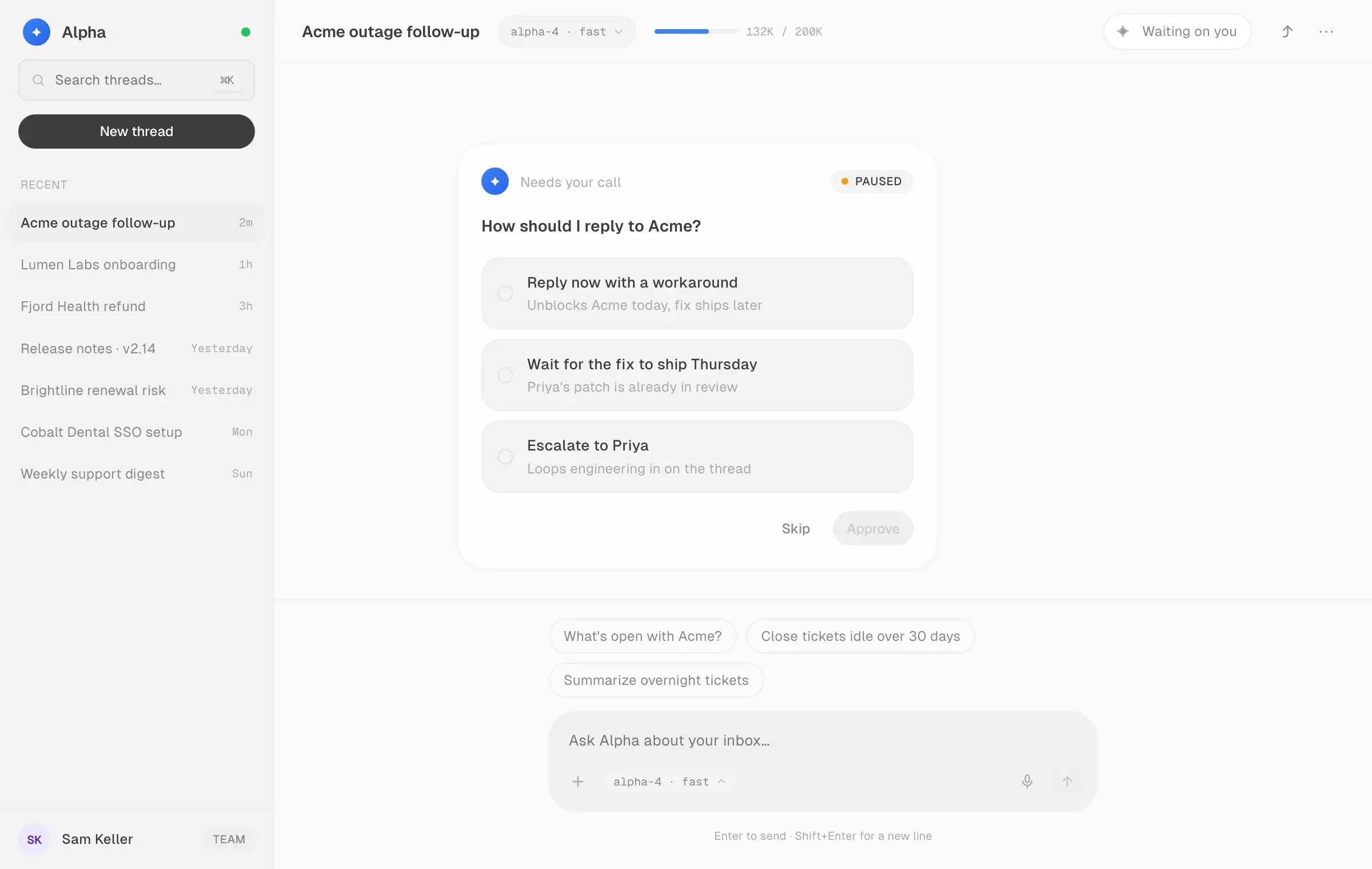
UI by Halaska is a React UI kit that adds chat, agent workflow, approval, streaming, recovery, and generative UI patterns to AI products.
It packages 38 UX patterns and around 100 styled components into halaska-kit.jsx, with react and react-dom as its only dependencies.
The UI kit uses shadcn/ui foundations but follows a different distribution model. You can hand its installation prompt to a coding agent or place the entire kit directly inside your React codebase as an editable JSX file.
Features
- 38 UX patterns for conversation, trust, agent control, generated output, and ambient AI interactions.
- Around 100 styled React components in one JSX source file.
- Chat and Canvas workflow example screens built entirely from the kit.
- Eight configurable lifecycle patterns with data, timing, state, and callback props.
- AI-specific elements for streaming text, thinking states, confidence, agent status, comparisons, and model interactions.
- Light and dark themes with a swappable accent color.
- Geist typography, 8px spacing tokens, 1px icons, and iOS-style corner radii.
- Runtime controls for font and motion presets through
setKitFontandsetKitMotion. - MIT license.
Use Cases
- AI assistants that need thinking states, streamed answers, citations, follow-up prompts, and source context.
- Autonomous agent products with plan review, human approval, pause, redirect, handoff, and action receipts.
- Coding and developer products that need snippets, file trees, browser frames, phone frames, or generated artifacts.
- Workflow builders that present tasks, checkpoints, audit history, structured output, and human intervention.
- Existing coding-agent prototypes that need a consistent component system across multiple screens.
How To Use UI by Halaska
Use the Coding Agent Workflow
The primary setup flow starts from the live UI by Halaska site.
The official workflow is built around an existing application. The coding agent receives the kit plus instructions for replacing or refining the current UI screen by screen.
- Open UI by Halaska.
- Click Copy prompt.
- Paste the prompt as the first message in Claude Code, Cursor, Codex, Windsurf, or another coding agent that can fetch a remote file.
- Let the agent download the kit and apply its components and UX patterns to the project screens.
Install the JSX File Manually
Download the kit directly into src:
curl -o src/halaska-kit.jsx https://ui.halaska.com/halaska-kit.jsxFor a TypeScript project, download the declaration shim as well:
curl -o src/halaska-kit.d.ts https://ui.halaska.com/halaska-kit.d.tsA minimal project placement looks like this:
src/
  halaska-kit.jsx
  halaska-kit.d.ts
  app/
    ai-dashboard/
      page.jsx
Basic Usage
Import individual components, patterns, hooks, and tokens from the local kit file:
import {
  Card,
  Heading,
  Orb,
  Stack,
  Text,
  ThemeProvider,
} from "../../halaska-kit";
export default function AgentOverview() {
  return (
    <ThemeProvider theme="dark">
      <Card padding={24}>
        <Stack gap={16}>
          <Orb
            variant="pulse"
            size={24}
            label="Research agent"
            theme="dark"
          />
          <Heading level={2} theme="dark">
            Research in progress
          </Heading>
          <Text secondary theme="dark">
            Reviewing the selected sources and preparing the response.
          </Text>
        </Stack>
      </Card>
    </ThemeProvider>
  );
}
Use a Configurable AI UX Pattern
Eight lifecycle patterns expose data, timing, text, and callback props.
"use client";
import { PlanPreviewPattern } from "../../halaska-kit";
export default function PlanReview() {
  const steps = [
    "Review failed deployment logs",
    "Prepare a rollback plan",
    "Create a deployment summary",
  ];
  return (
    <PlanPreviewPattern
      title="Deployment agent has a recovery plan"
      subtitle="Review the actions before execution."
      steps={steps}
      proceedLabel="Run plan"
      editLabel="Edit actions"
      handoffLabel="Take control"
      onProceed={(approvedSteps) => {
        console.log("Approved:", approvedSteps);
      }}
      onHandoff={() => {
        console.log("Human took control");
      }}
    />
  );
}
Available UI Component
| Category | Exports |
|---|---|
| Foundations | tokens, motion, usePal, ThemeProvider, AccentContext, setKitMotion, setKitFont |
| Typography | Text, Heading, Label, Caption, Code |
| Buttons | Button, IconButton, ButtonGroup, LinkButton, SplitButton |
| Inputs and selectors | TextInput, TextArea, Select, Checkbox, RadioGroup, SwitchToggle, Slider, Combobox, DatePicker, SearchInput, Rating |
| Layout and data | Card, Stack, Badge, Avatar, ListItem, Stat, Table, DataTable, Pagination, Sparkline |
| Feedback and status | Progress, ProgressCircle, Skeleton, Spinner, Toast, AlertBanner, EmptyState, Stepper |
| Navigation | Breadcrumb, Tabs, Accordion, Collapsible, ContextMenu, Menubar, CommandPalette, CommandMenu |
| Overlays | Dialog, AlertDialog, FormDialog, Sheet, Popover, DropdownMenu, Tooltip, HoverCard |
| Developer surfaces | Snippet, FileTree, BrowserFrame, PhoneFrame |
| AI elements | Orb, StreamingText, ThinkingIndicator, ThinkingSteps, ConfidenceBar, AISuggestionBadge, CompareSlider, AgentGlyph |
38 AI UX Patterns
| Group | Patterns |
|---|---|
| Conversation core | PromptInputPattern, MessageThreadPattern, StreamingAnswerPattern, AgentChatPattern, CodeBlockPattern, ModelContextPattern |
| Trust and transparency | ThinkingTracePattern, CitationsPattern, ContextSourcesPattern, ConfidencePattern, RecommendationPattern, FeedbackPattern |
| Agentic control | PlanPreviewPattern, ApprovalCardPattern, AutonomyPattern, PermissionScopePattern, QueuePattern, AgentStatusPattern, ToolStreamPattern, AgentTasksPattern, HandoffPattern, ActionReceiptPattern, CheckpointPattern, AuditLogPattern, ErrorRepairPattern |
| Output and generative UI | ArtifactPattern, DiffViewPattern, DiffTablePattern, StructuredDataPattern, InsightCardsPattern, ComparisonPattern |
| Ambient and beyond chat | TaskboardPattern, InlineAssistPattern, NudgePattern, DigestPattern, NotificationCenterPattern, CommandSearchPattern, AgentSetupPattern |
Configurable Lifecycle Patterns
Eight patterns expose a fuller public API for app data and interaction callbacks. The other UX patterns act as working reference implementations that you can extract from halaska-kit.jsx and adapt to the application.
| Pattern | Key Inputs and Callbacks |
|---|---|
ThinkingTracePattern | steps, stepMs, autoCollapse, autoplay, onDone, onToggle |
StreamingAnswerPattern | segments, sources, followups, thinkMs, tickMs, autoplay, onFollowup, onDone |
PlanPreviewPattern | title, subtitle, steps, labels, stepDelayMs, onProceed, onComplete, onEdit, onHandoff |
ApprovalCardPattern | question, options, labels, onSelect, onApprove, onSkip |
AgentStatusPattern | phases, redirectPhases, labels, phaseMs, autoplay, onPause, onResume, onRedirect, onWaiting, onDone |
HandoffPattern | reason, context, labels, timing values, onTakeOver, onResume, onResumed |
ActionReceiptPattern | meta, before, after, unit, undoSeconds, onUndo, onExpire, onAudit |
ErrorRepairPattern | headline, acknowledgment, fixes, diff, beatMs, autoplay, onReview, onFlag |
Styling and Theming
Use ThemeProvider when a section shares one light or dark theme:
import {
  Button,
  Card,
  ThemeProvider,
} from "../../halaska-kit";
export default function DarkPanel() {
  return (
    <ThemeProvider theme="dark">
      <Card padding={24}>
        <Button>Continue</Button>
      </Card>
    </ThemeProvider>
  );
}
Set an application accent through AccentContext:
import {
  AccentContext,
  Button,
  ThemeProvider,
} from "../../halaska-kit";
export default function BrandedAction() {
  return (
    <AccentContext.Provider value="#7c3aed">
      <ThemeProvider theme="light">
        <Button>Generate report</Button>
      </ThemeProvider>
    </AccentContext.Provider>
  );
}
Using UI by Halaska with Next.js App Router
halaska-kit.jsx already starts with "use client". The file therefore defines its own Client Component boundary for Next.js applications.
A Server Component can render components imported from the kit. Interactive wrappers that create state or pass callback functions such as onProceed, onApprove, or onUndo belong in a Client Component. Next.js requires Client Component props crossing the server boundary to be serializable.
For an App Router project, keep data fetching and server-only code in the page or server component and move the interactive Halaska pattern into a client file:
src/
  halaska-kit.jsx
  app/
    agent/
      page.jsx
      plan-review.jsx
// app/agent/page.jsx
import PlanReview from "./plan-review";
export default async function AgentPage() {
const plan = await loadAgentPlan();
return <PlanReview steps={plan.steps} />;
}// app/agent/plan-review.jsx
"use client";
import { PlanPreviewPattern } from "../../halaska-kit";
export default function PlanReview({ steps }) {
return (
<PlanPreviewPattern
title="Review proposed actions"
steps={steps}
onProceed={(approvedSteps) => {
console.log(approvedSteps);
}}
/>
);
}Alternatives and Related Resources