The Future of Web Dev
The Future of Web Dev
MicroKit UI: 49+ Microinteractions for React & shadcn/ui
Get 49+ button, navigation, and input microinteractions. Copy JavaScript or TypeScript with CSS or Tailwind styling.
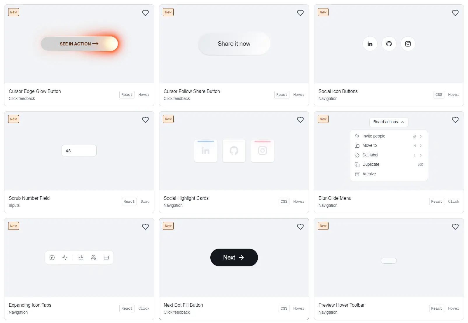
MicroKit UI is a React component library of 49 copy-paste microinteractions for buttons, navigation, and inputs.
It includes cursor-following glows, animated tab indicators, hover-triggered text and icon changes, and a draggable number field.
Install individual components through the shadcn CLI or copy their JavaScript, TypeScript, CSS, and Tailwind implementations.
Features
- 38 click-feedback components, 9 navigation interactions, and 2 inputs.
- 15 React-driven interactions and 34 CSS-driven effects.
- TypeScript and JavaScript source with Tailwind and plain CSS variants.
- Component-specific install commands.
- Editable local files through the official
@microkitshadcn registry.
How to Use MicroKit UI
Install a Component with shadcn
In an existing React or Next.js project with shadcn/ui configured, install the Cursor Edge Glow Button. The CLI copies editable TypeScript and Tailwind source into components/microkit/ under the configured component alias:
npx shadcn@latest add @microkit/cursor-edge-glow-buttonInitialize shadcn/ui first if the project has no components.json:
npx shadcn@latest initBasic Usage in Next.js
Import the component into a Next.js App Router page. Its source already includes “use client” for pointer-driven animations.
// app/page.tsx
import { CursorEdgeGlowButton } from "@/components/microkit/cursor-edge-glow-button";
export default function HomePage() {
  return (
    <main className="flex min-h-screen items-center justify-center bg-neutral-950">
      <CursorEdgeGlowButton />
    </main>
  );
}
Install a CSS-Driven Interaction
The Next Dot Fill Button changes its background and arrow on hover or keyboard focus. It uses CSS for the effect and lucide-react for the arrow icon. The CLI installs the icon dependency:
npx shadcn@latest add @microkit/next-dot-fill-button// app/components-demo/page.tsx
import { NextDotFillButton } from "@/components/microkit/next-dot-fill-button";
export default function ComponentsDemo() {
return <NextDotFillButton />;
}Find and Install Other Interactions
Search the registry:
npx shadcn@latest search @microkitInstall the Scrub Number Field:
npx shadcn@latest add @microkit/scrub-number-fieldThe registry also accepts a direct item URL:
npx shadcn@latest add https://microkit.co/r/cursor-edge-glow-button.jsonOr use the GitHub repository address:
npx shadcn@latest add henriquegpb/microkit/cursor-edge-glow-buttonCopy JavaScript or Plain CSS Instead
The registry installs TypeScript with Tailwind. For other variants, open an individual interaction page, switch to the Code tab, and select JavaScript or TypeScript plus CSS or Tailwind.
Copy the component source and its corresponding CSS when using the plain CSS option.
For example, the CSS implementation of Next Dot Fill Button imports ./styles.css; place that stylesheet beside the component or update the import to match your file structure.
When copying manually, install lucide-react only if the selected source imports it:
npm install lucide-reactAll Available Components
Click Feedback
Cursor, glow, and highlight effects
- Cursor Edge Glow Button
- Cursor Follow Share Button
- What’s New Glow Button
- Magnetic Fill Button
- Staggered Letter Glow Button
- Glow Arrow Button
- Neon Invert Button
- Aurora Download Button
- Subscribe Shine Button
Expanding fills and button shapes
- Next Dot Fill Button
- Expanding Contact Button
- Expanding Newsletter Button
- Get Started Circle Swap
- Outline Wipe Button
- Yellow Fill Preview Button
- White Contact Orbit Button
- Circle Surface Button
- Inset Circle Button
- Orange Circle Fill Button
- Layered Gradient Button
Arrows, contact links, and icon changes
- Contact Reveal Button
- Contact Details Reveal
- Next Reveal Button
- Pricing Slide Link
- Read More Swap
- Projects Arrow Button
- Preview in Browser Button
- Icon Swap Button
- Sliding Send Button
- Sliding Arrow Label
- Talk Arrow Reveal Button
- See More Swap Button
- Contact Underline Button
Text and processing feedback
- Secure Purchase Button
- Project Text Swap Button
- View More Text Swap
- Staggered Letter Text Swap
- Gradient Underline Button
| Component | Interaction |
|---|---|
| Social Icon Buttons | Social icons transition to brand-colored arrows on hover. |
| Social Highlight Cards | Colored highlights and icon changes on social links. |
| Blur Glide Menu | Nested menus transition through blurred, sliding panels. |
| Expanding Icon Tabs | The active icon tab expands to display its label. |
| Preview Hover Toolbar | Toolbar actions appear as the toolbar expands on hover. |
| Spotlight Indicator | A glowing indicator moves to the active navigation item. |
| Sliding Content Tabs | The active tab and content change with animated transitions. |
| Sliding Underline Tabs | An underline moves beneath the selected tab. |
| Floating Newsletter Button | The newsletter control lifts and glows on hover. |
Inputs
| Component | Interaction |
|---|---|
| Focus Field | Input focus styling with a CSS transition. |
| Scrub Number Field | Horizontal drag to change a number, with direct text entry. |
Working with the Scrub Number Field
Scrub Number Field starts at 48 and restricts values to 0–100. Drag horizontally to adjust the value, click to type, or use the Up and Down arrow keys. Hold Shift for 10-unit steps or Alt for 0.1-unit steps. These values and increments are defined in the component source.
// app/settings/page.tsx
import { ScrubNumberField } from "@/components/microkit/scrub-number-field";
export default function SettingsPage() {
  return (
    <section className="space-y-3 p-6">
      <h2 className="text-lg font-semibold">Number Scrubbing Demo</h2>
      <ScrubNumberField />
    </section>
  );
}
Connect the Input to Application State
The original ScrubNumberField() uses its own useState and does not accept value or onChange props.
To use it in a settings form or design editor, edit the installed file to expose controlled props, replace the internal value state with the prop, and call onChange where the source calls setValue.
Update its initial drag value and numeric bounds for the application’s requirements.
Alternatives and Related Resources