The Future of Web Dev
The Future of Web Dev
Editorcn: React Rich Text Editors for shadcn/ui
Install customizable Tiptap toolbar or Notion-style block editors into your React project using the shadcn CLI and Tailwind CSS tokens.
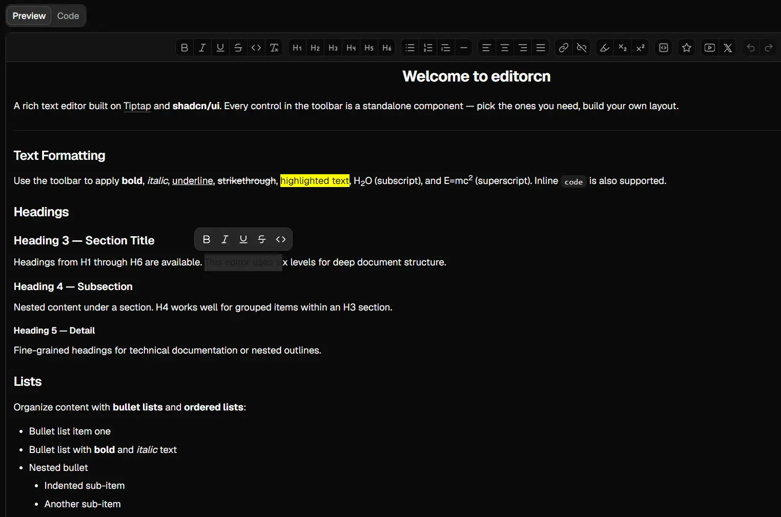
editorcn is a React rich text editor that creates toolbar-style and Notion-style Tiptap editors for shadcn/ui projects.
It works with React, Tailwind CSS, and Tiptap, with a shadcn registry option that copies editable editor source into the project.
Features
- Two editing models for toolbar and block-based UI.
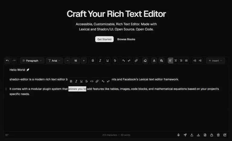
- 20+ toolbar controls for text formatting, headings, lists, links, alignment, embeds, and history.
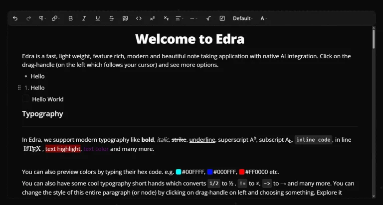
- Slash commands, block dragging, block actions, and inline formatting.
- Editable local source through the shadcn registry.
- shadcn/ui CSS variables for colors, typography, radius, light mode, and dark mode.
- HTML, JSON, and plain-text serialization through Tiptap.
- Static rendering for saved editor HTML.
Toolbar Editor or Block Editor?
| Editing Model | Package | Main UI |
|---|---|---|
| Traditional rich text editor | @editorcn/editor | Top toolbar with grouped formatting controls |
| Block editor | @editorcn/block-editor | Slash commands, drag handles, block actions, bubble menu |
| Both editing models | Install both packages | Use each package in the parts of the application that need it |
How To Use editorcn
1. Register editorcn with shadcn
Add the registry namespace to components.json:
{
  "$schema": "https://ui.shadcn.com/schema/registry.json",
  "registries": {
    "@editorcn": "https://editorcn.vercel.app/r/{name}.json"
  }
}
2. Install the Toolbar Editor
The registry version writes the editor source under components/editor/.
npx shadcn@latest add @editorcn/editorUse npm when the editor should stay as a versioned package:
npm install @editorcn/editor @tiptap/react @tiptap/pm @tiptap/starter-kit @tiptap/extension-link @tiptap/extension-placeholderThe example below uses Underline, TextAlign, and CharacterCount as well:
npm install @tiptap/extension-underline @tiptap/extension-text-align @tiptap/extension-character-count3. Import the Styles
Load the shadcn globals before the local editor stylesheet:
import "@/app/globals.css";
import "@/components/editor/style.css";
For an npm installation:
import "@editorcn/editor/style.css";Basic Toolbar Editor Usage
Use the editor in a client component and set immediatelyRender: false for the Next.js client-side editor instance:
"use client";
import { useEditor } from "@tiptap/react";
import StarterKit from "@tiptap/starter-kit";
import Underline from "@tiptap/extension-underline";
import TextAlign from "@tiptap/extension-text-align";
import Placeholder from "@tiptap/extension-placeholder";
import { CharacterCount } from "@tiptap/extension-character-count";
import { Link, RichTextEditor } from "@/components/editor";
import "@/components/editor/style.css";
export function PostEditor() {
  const editor = useEditor({
    immediatelyRender: false,
    shouldRerenderOnTransaction: false,
    extensions: [
      StarterKit.configure({
        heading: { levels: [1, 2, 3] },
      }),
      Link,
      Underline,
      TextAlign.configure({
        types: ["heading", "paragraph"],
      }),
      Placeholder.configure({
        placeholder: "Write your article...",
      }),
      CharacterCount,
    ],
    content: "",
  });
  return (
    <RichTextEditor editor={editor}>
      <RichTextEditor.Toolbar sticky>
        <RichTextEditor.ControlsGroup>
          <RichTextEditor.Bold />
          <RichTextEditor.Italic />
          <RichTextEditor.Underline />
          <RichTextEditor.Strikethrough />
        </RichTextEditor.ControlsGroup>
        <RichTextEditor.ControlsGroup>
          <RichTextEditor.H1 />
          <RichTextEditor.H2 />
          <RichTextEditor.H3 />
        </RichTextEditor.ControlsGroup>
        <RichTextEditor.ControlsGroup>
          <RichTextEditor.BulletList />
          <RichTextEditor.OrderedList />
          <RichTextEditor.Blockquote />
        </RichTextEditor.ControlsGroup>
        <RichTextEditor.ControlsGroup>
          <RichTextEditor.AlignLeft />
          <RichTextEditor.AlignCenter />
          <RichTextEditor.AlignRight />
        </RichTextEditor.ControlsGroup>
        <RichTextEditor.ControlsGroup>
          <RichTextEditor.Link />
          <RichTextEditor.Unlink />
          <RichTextEditor.Undo />
          <RichTextEditor.Redo />
        </RichTextEditor.ControlsGroup>
      </RichTextEditor.Toolbar>
      <RichTextEditor.Content />
      <RichTextEditor.Footer showWordCount />
    </RichTextEditor>
  );
}
Toolbar Editor API
| Component | Public Props |
|---|---|
RichTextEditor | editor, children, className, variant, labels, icons |
RichTextEditor.Toolbar | sticky, stickyOffset, className |
RichTextEditor.ControlsGroup | children, className |
RichTextEditor.Content | className |
RichTextEditor.Footer | showWordCount, sticky, stickyOffset, wordCountClassName, wordCountFormatter, className, children |
RichTextEditor.BubbleMenu | editor |
RichTextEditor.Control | active, interactive, standard button attributes |
variant accepts default, subtle, or compact. The default value is default.
Toolbar Controls and Extensions
The editorcn Link extension extends Tiptap’s link extension and powers the link popover and Mod-K shortcut.
YouTubeEmbed accepts standard YouTube watch URLs, Shorts URLs, live URLs, shortlinks, or video IDs. TwitterEmbed accepts twitter.com and x.com post URLs or numeric post IDs.
| Extension | Controls |
|---|---|
@tiptap/starter-kit | Bold, Italic, Strikethrough, ClearFormatting, Code, CodeBlock, H1 through H6, BulletList, OrderedList, Blockquote, Hr, Undo, Redo |
@tiptap/extension-underline | Underline |
@tiptap/extension-text-align | AlignLeft, AlignCenter, AlignRight, AlignJustify |
@tiptap/extension-highlight | Highlight |
@tiptap/extension-subscript | Subscript |
@tiptap/extension-superscript | Superscript |
editorcn Link extension | Link, Unlink |
| editorcn embed extensions | YouTubeEmbed, TwitterEmbed |
Syntax Highlighting
@editorcn/editor ships with CodeBlockLowlight and lowlight configuration for 21 languages. The code block UI can show language-specific icons through DEFAULT_LANGUAGE_ICONS.
Register another highlight.js language when it is not part of that built-in set:
import { common, createLowlight } from "lowlight";
import python from "highlight.js/lib/languages/python";
const lowlight = createLowlight(common);
lowlight.register({
  python,
});
Save Editor Changes
Read HTML inside Tiptap’s onUpdate callback when editor content belongs in form or application state:
interface ArticleEditorProps {
  value: string;
  onChange: (html: string) => void;
}
export function ArticleEditor({
  value,
  onChange,
}: ArticleEditorProps) {
  const editor = useEditor({
    extensions: [StarterKit],
    content: value,
    onUpdate: ({ editor }) => {
      onChange(editor.getHTML());
    },
  });
  return (
    <RichTextEditor editor={editor}>
      <RichTextEditor.Toolbar>
        <RichTextEditor.ControlsGroup>
          <RichTextEditor.Bold />
          <RichTextEditor.Italic />
        </RichTextEditor.ControlsGroup>
      </RichTextEditor.Toolbar>
      <RichTextEditor.Content />
    </RichTextEditor>
  );
}
Install the Block Editor
The registry version writes its source under components/block-editor/.
npx shadcn@latest add @editorcn/block-editorInstall the base npm package and required editor dependencies with:
npm install @editorcn/block-editor @tiptap/react @tiptap/pm @tiptap/starter-kit @tiptap/suggestion @tiptap/extension-drag-handle-react lucide-reactAdd extensions for the nodes and commands used by your implementation:
npm install @tiptap/extension-placeholder @tiptap/extension-underline @tiptap/extension-task-item @tiptap/extension-task-list @tiptap/extension-image @tiptap/extension-table @tiptap/extension-table-row @tiptap/extension-table-cell @tiptap/extension-table-headerBasic Block Editor Usage
"use client";
import { useEditor } from "@tiptap/react";
import StarterKit from "@tiptap/starter-kit";
import Placeholder from "@tiptap/extension-placeholder";
import {
  BlockEditor,
  SlashCommand,
  getSlashCommandSuggestion,
} from "@/components/block-editor";
import "@/components/block-editor/style.css";
export function WorkspaceEditor() {
  const editor = useEditor({
    immediatelyRender: false,
    shouldRerenderOnTransaction: false,
    extensions: [
      StarterKit.configure({
        heading: { levels: [1, 2, 3] },
      }),
      Placeholder.configure({
        placeholder: "Type / for commands...",
      }),
      SlashCommand.configure({
        suggestion: getSlashCommandSuggestion(),
      }),
    ],
  });
  return <BlockEditor editor={editor} />;
}
Block Editor API
| API | Purpose |
|---|---|
BlockEditor | Root editor UI |
editor | Tiptap Editor instance |
children | Custom child layout |
className | Root CSS classes |
labels | Partial BlockEditorLabels overrides |
icons | Partial BlockEditorIcons overrides |
BlockEditor.Content | Content area with drag handle and block actions |
BlockEditor.BubbleMenu | Floating inline-formatting menu |
SlashCommand | Tiptap extension for / commands |
defaultSlashCommandItems | Default command definitions |
getSlashCommandSuggestion() | Creates the Tiptap suggestion configuration |
DEFAULT_ICONS | Default Block Editor icons |
DEFAULT_LANGUAGE_ICONS | Code language icons |
Default Slash Commands
Task List content requires the Tiptap TaskList and TaskItem extensions. Syntax highlighting for Code requires @tiptap/extension-code-block-lowlight and lowlight.
Image and Table commands require their Tiptap extensions plus custom slash command items.
| Command | Node or Action |
|---|---|
| Text | Paragraph |
| Heading 1 | H1 |
| Heading 2 | H2 |
| Heading 3 | H3 |
| Bullet List | Unordered list |
| Numbered List | Ordered list |
| Task List | Checklist |
| Quote | Blockquote |
| Code | Code block |
| Divider | Horizontal rule |
Custom Slash Commands
A SlashCommandSuggestionItem can define id, title, description, keywords, icon, and command.
import Image from "@tiptap/extension-image";
import {
  SlashCommand,
  defaultSlashCommandItems,
  getSlashCommandSuggestion,
} from "@/components/block-editor";
import type {
  SlashCommandSuggestionItem,
} from "@/components/block-editor";
const commandItems: SlashCommandSuggestionItem[] = [
  ...defaultSlashCommandItems,
  {
    id: "image",
    title: "Image",
    description: "Insert an image by URL.",
    keywords: ["image", "photo"],
    command: ({ editor, range }) => {
      const url = window.prompt("Image URL");
      if (!url) return;
      editor
        .chain()
        .focus()
        .deleteRange(range)
        .setImage({ src: url })
        .run();
    },
  },
];
const editor = useEditor({
  extensions: [
    StarterKit,
    Image,
    SlashCommand.configure({
      suggestion: getSlashCommandSuggestion(commandItems),
    }),
  ],
});
Bubble Menu and Block Actions
The Block Editor bubble menu contains:
- Node type selector.
- Bold, italic, underline, strikethrough, and code.
- Link insertion and removal.
- Left, center, and right alignment.
The drag handle opens Copy and Delete actions for the active block. Drag the handle to change block order.
Save HTML, JSON, or Plain Text
Both editor packages use Tiptap serialization. Choose the output format before storing the document:
const html = editor.getHTML();
const json = editor.getJSON();
const text = editor.getText();
HTML preserves configured formatting and block nodes. JSON returns the ProseMirror document tree. Plain text removes formatting.
The Block Editor uses the identical serialization format. YouTube and Twitter embed extensions from @editorcn/editor can also be registered with the Block Editor.
Render Saved Content with StaticRenderer
Install the local source through the editorcn registry:
npx shadcn@latest add @editorcn/static-rendererFor npm:
npm install @editorcn/static-rendererImport the component and its stylesheet:
import { StaticRenderer } from "@/components/static-renderer";
import "@/components/static-renderer/style.css";
interface ArticleProps {
  content: string;
}
export function Article({ content }: ArticleProps) {
  return <StaticRenderer content={content} />;
}
StaticRenderer Props
StaticRenderer uses dangerouslySetInnerHTML. Sanitize editor HTML when content can come from an untrusted author.
YouTube and Twitter nodes render as placeholder cards in the static stylesheet. Replace their serialized data-type, data-src, and data-tweet-id nodes with the application iframe or widget when the published page needs live embeds.
| Prop | Type | Default |
|---|---|---|
content | string | Required |
as | ElementType | "div" |
className | string | None |
| Standard HTML attributes | HTMLAttributes | None |
Styling and Theming
editorcn reads the shadcn/ui CSS variables already defined by the application.
| Variable | Main Effect |
|---|---|
--background | Editor and toolbar background |
--foreground | Text |
--primary | Links, active controls, checkboxes, syntax accents |
--border | Editor border, toolbar dividers, blockquotes, code blocks |
--muted | Code and secondary backgrounds |
--muted-foreground | Placeholder and secondary text |
--destructive | Destructive actions and syntax errors |
--accent-foreground | Syntax accents |
--radius | Editor, code block, and checkbox radius |
--font-mono | Code |
--font-sans | Editor text |
Scope another token set around one editor:
.article-editor-theme {
  --primary: oklch(0.7 0.25 150);
  --radius: 0.25rem;
}
<div className="article-editor-theme">
<RichTextEditor editor={editor}>
<RichTextEditor.Toolbar>
<RichTextEditor.Bold />
</RichTextEditor.Toolbar>
<RichTextEditor.Content />
</RichTextEditor>
</div>Toolbar Variants
| Variant | Appearance |
|---|---|
default | Bordered editor with segmented toolbar controls |
subtle | Borderless card treatment with a soft shadow |
compact | Reduced spacing and smaller toolbar icons |
<RichTextEditor editor={editor} variant="compact">
  <RichTextEditor.Toolbar>
    <RichTextEditor.Bold />
    <RichTextEditor.Italic />
  </RichTextEditor.Toolbar>
  <RichTextEditor.Content />
</RichTextEditor>
Labels, Icons, and Custom Controls
Pass partial labels and icons objects to RichTextEditor. editorcn exports DEFAULT_LABELS, DEFAULT_ICONS, and DEFAULT_LANGUAGE_ICONS.
<RichTextEditor
  editor={editor}
  labels={{
    boldControlLabel: "Bold text",
    linkControlLabel: "Insert link",
  }}
  icons={{
    boldControlIcon: <CustomBoldIcon />,
  }}
>
  {/* editor UI */}
</RichTextEditor>
Build a custom toolbar action with RichTextEditor.Control and useRichTextEditorContext.
BlockEditor accepts its own labels and icons overrides for slash commands, the bubble menu, drag handle, block actions, and code language selector.
Registry Source Ownership and Updates
Registry installation copies editorcn source into components/editor/, components/block-editor/, or components/static-renderer/. Tiptap peer dependencies stay in node_modules.
| Installation | Source Location | Local Editing | Updates |
|---|---|---|---|
| shadcn registry | Project components/ directory | Full source editing | Re-run shadcn add |
| npm | node_modules/@editorcn/* | Props and CSS customization | Package manager update |
The shadcn CLI prompts before overwriting editor files. Review local modifications before accepting replacements.
npx shadcn@latest add @editorcn/editorAlternatives and Related Resources